

kye
-
Posts
7,854 -
Joined
-
Last visited
Content Type
Profiles
Forums
Articles
Posts posted by kye
-
-
On 10/18/2020 at 1:10 AM, KnightsFan said:
Yes, I think the glow helps a lot to soften those highlights and make them dreamier rather than sharp and pointy and make it more 3D in this instance where the highlights are in the extreme background (like you said, almost like mist between subject and background).
I agree, the relation between the subject and the other colors is critical and you can't really change that with different sensors or color correction. That's why I say it's mainly about what's in the scene. Furthermore, if your objects in frame don't have subtle variation you can't really add that in. The soft diffuse light comign from the side in the Grandmaster really allows every texture to have a smooth gradation from light to dark, whereas your subject in the boat is much more evenly lit from left to right.
I assume you're also not employing a makeup team? That's really the difference between good and bad skin tones, particularly in getting different people to look good in the same shot.
No, no makeup team for me!
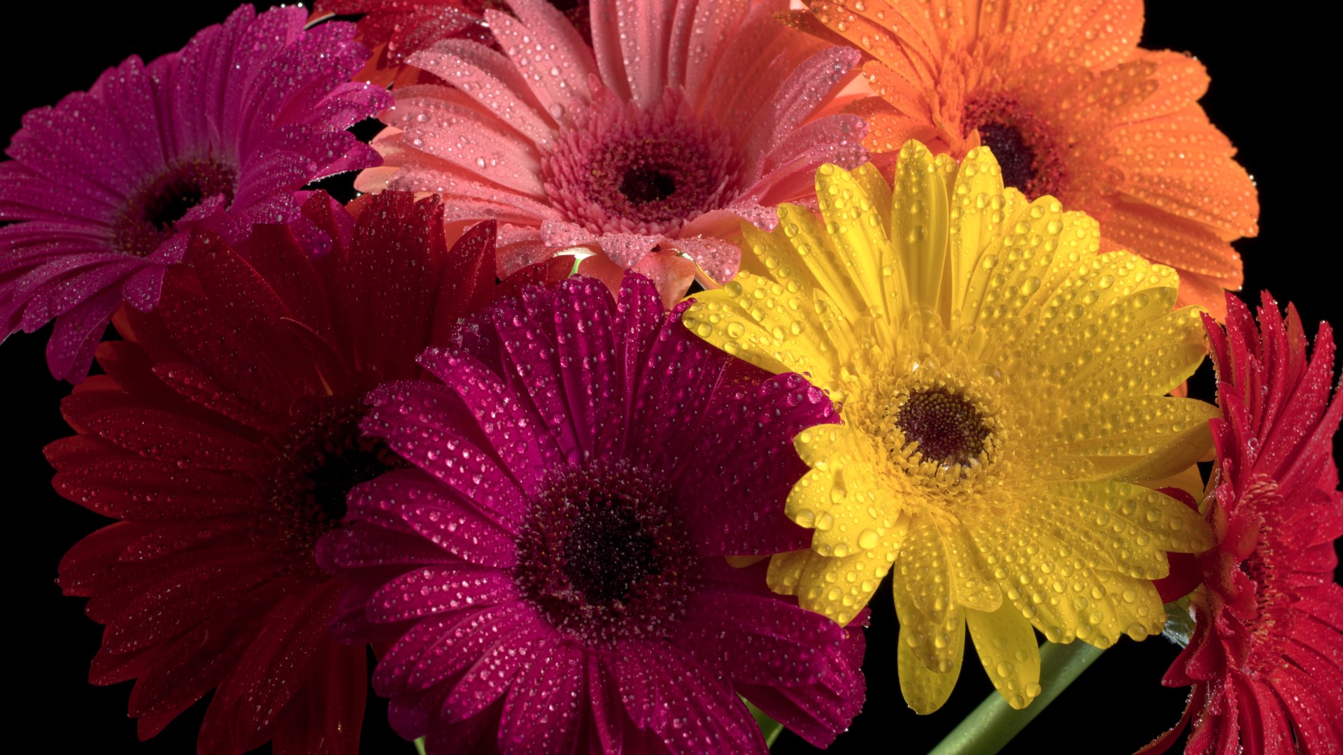
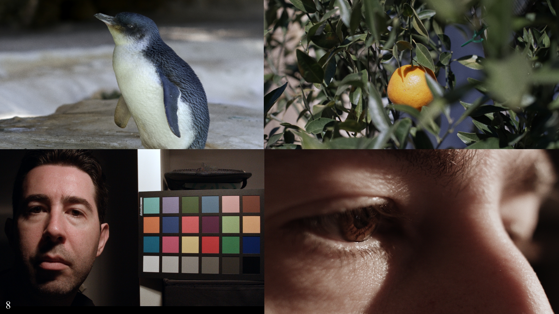
The people i'm filming have much more variability - more like in this image:

That's also a useful image for testing LUTs and seeing what they do to skintones BTW.
On 10/18/2020 at 3:00 PM, mat33 said:I think the light and amount of contrast of the scene makes a huge difference to the image thickness. When you have a good amount of contrast in your scene with areas of shadow and bright highlights, and your object is well exposed then you can bring the blacks down were they belong and help with the perceived thickness (and also reduce the perceived grain/noise). Were I notice the main difference with cameras that produce thicker images like the digital Bolex is with skin tones and also foliage/leaves/trees etc. Whether it's the tonality/colour gamut/saturation/shadow saturation or all of these when combined with good light they just look more alive. Here is a screen shot from the D16 (not mine) which while compressed to heck look 'thick' and alive to me.
Nice looking images. The DB certainly had a cult following.
18 hours ago, KnightsFan said:A lot of our examples have been soft, vintage, or film. I just watched the 12k sample footage from the other thread and I think that it displays thick colors despite being an ultra sharp digital capture. So I don't think that softening optics or post processing is a necessity.
Interesting. There were also some great sample shots from the UMP with skintones, I should look through them for good examples.
13 hours ago, tupp said:To me, the "thickness" of a film image is revealed by a rich, complex color(s). That color is not necessarily saturated nor dark.
That "thickness" of film emulsion has nothing to do with lighting nor with what is showing in the image. Certainly, for the thickness to be revealed, there has to be some object in the frame that reflects a complex color. An image of a white wall will not fully utilize the color depth of an imaging system. However, a small, single color swatch within a mostly neutral image can certainly demonstrate "thickness."
I don't think that's how it works. Of course, there is also reversal film.
Agreed. Digital tends to make skin tones mushy (plastic?) compared to film.
Look at the complex skin tones in some of these Kodachrome images. There is a lot going on in those skin tones that would be lost with most digital cameras. In addition, observe the richness and complexity of the colors on the inanimate objects.
Yes. Please note that most of the images in the above linked gallery are brightly lit and/or shot during broad daylight.
Agreed. I think that the quality that you seek is inherent in film emulsion, and that quality exists regardless of lighting and regardless of the overall brightness/darkness of an image.
Because of the extensive color depth and the distinctive color rendering of normal film emulsion, variations in tone are often more apparent with film. Not sure if that should be considered to be more of a gradual transition in chroma/luma or to be just higher "color resolution."
Those images are nice, but they seem thinner than the Kodachrome images in the linked gallery above.
The image is nicely crafted, but I read that it was shot on Fuji Eterna stock. Nevertheless, to me its colors look "thinner" than those shown in this in this Kodachrome gallery.
Great site! Thanks for the link!
I disagree. I think that the "thickness" of film is inherent in how emulsion renders color.
The cross-lighting in that "Grandmaster" image seems hard and contrasty to me (which can reveal texture more readily than a softer source). I don't see many smooth gradations/chirascuro.
Evidently, OP seeks the "thickness" that is inherent in film emulsion, regardless of lighting and contrast.
Nice shots!
Images from CCD cameras such as the Digital Bolex generally seem to have "thicker" color than their CMOS counterparts.
However, even CCD cameras don't seem to have the same level of thickness as many film emulsions.
That certainly is a pretty image.
Keep in mind that higher resolution begets more color depth in an image. Furthermore, if your image was shot with Blackmagic Ursa Min 12K, that sensor is supposedly RGBW (with perhaps a little too much "W"), which probably yields nicer colors.
I agree that thickness can happen with low and high key images, with saturated and not so saturated images too.
A few things keep coming up, and I think i'm starting to fit a few of them together.
One is the ability to render subtle variations in tone, and yet, we're looking at all these test images in 8-bit, and some in less than 8-bit, yet this doesn't seem to be a limiting factor.
I wonder if maybe we're thinking about colour subtlety and DR and bit-depth the wrong way. I mean literally, that we think we want more of these things, but that actually maybe we want less.
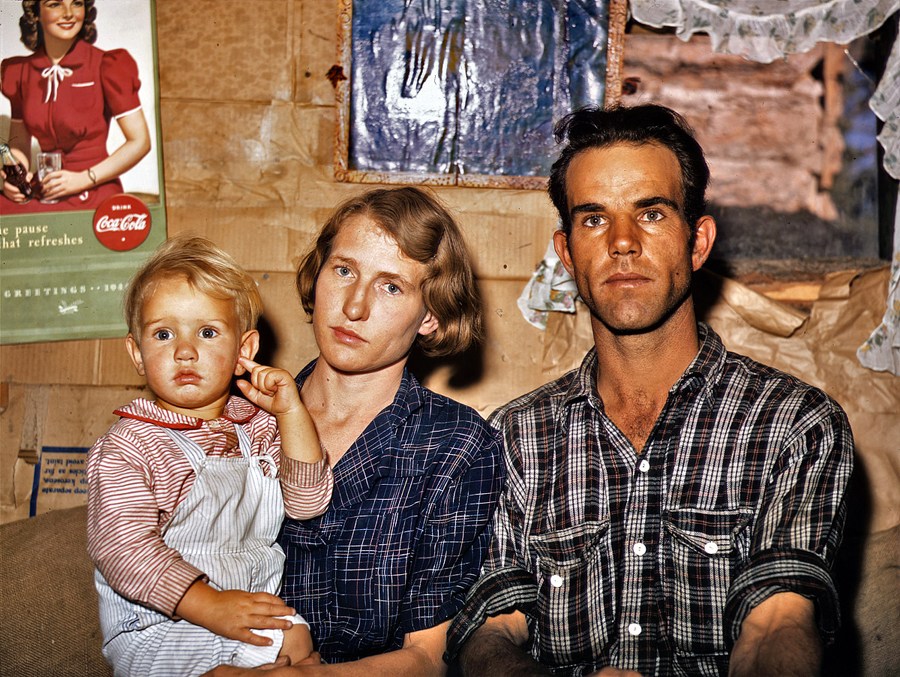
Take this image for example:
This image is contrasty and saturated. In fact, it's very contrasty. If you were looking at this scene in real life, these people wouldn't have so much variation in luminance and saturation in their skintones - that baby would have to have been sunbathing for hours but only on the sides of his face and not on the front.
In that sense, film and its high contrast is actually expanding and amplifying subtle luma differences, and when we increase contrast we increase saturation too, so it's amplifying those subtle hue variations.
One thing i've noticed about film vs digital in skintones is that digital seems to render people's skintones either on the yellow-side, on the pink-side, or in the middle and not that saturated. Film will show people with all those tones all at once.
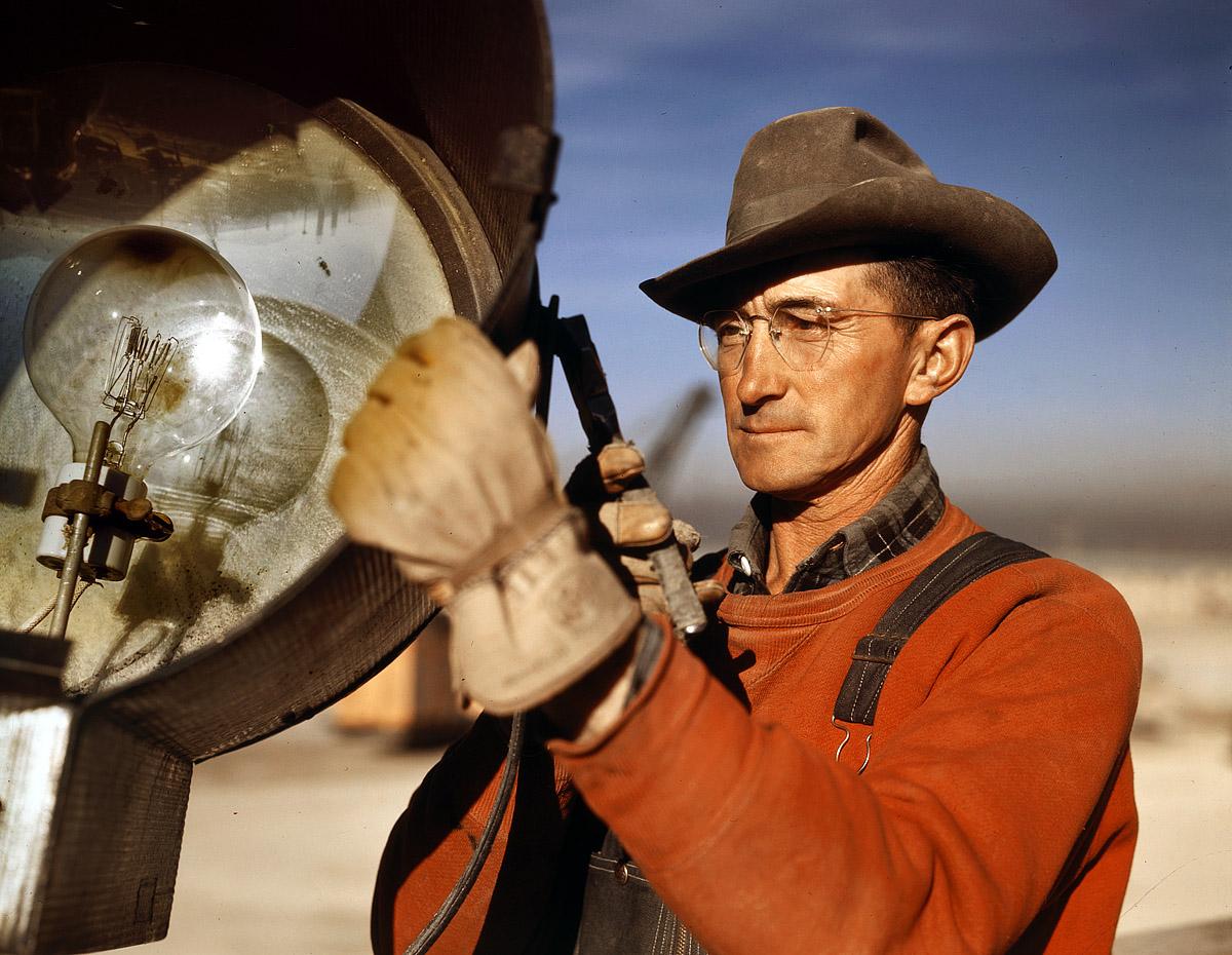
This guy is another example of a decent variation of hues in his skin:
-
I'd suggest using multiple layers of stabilisation.
As has been said before, gimbals are great but lose the horizon over time and cornering, and the super-duper-stabilistation modes on the GoPro and Osmo Action etc will also lose the horizon if kept out of level for some time (which is inevitable considering that roads are sloped to drain water away and corner nicely).
Due to these factors, I'd suggest a very solid mount (to eliminate wind buffering) combined with a very short shutter speed (to eliminate exposure blurs and RS wobbles from bumps) combined with in-camera floaty-smooth modes combined with stabilisation in post.
-
44 minutes ago, KnightsFan said:
@kyeI don't think those images quite nail it. I gathered a couple pictures that fit thickness in my mind, and in addition to the rich shadows, they all have a real sense of 3D depth due to the lighting and lenses, so I think that is a factor. In the pictures you posted, there are essentially 2 layers, subject and background. Not sure what camera was used, but most digital cameras will struggle in actual low light to make strong colors, or if the camera is designed for low light (e.g., A7s2) then it has weak color filters which makes getting rich saturation essentially impossible.
My images were all GH5, with the second one using the SLR Magic 8mm f4, and the others using the Voigtlander 17.5mm f0.95. I don't think that anyone would suggest the GH5 was designed for low light, and the boat image is actually significantly brighter than it was in real life. The floodlights in the background were the only lighting and we were perhaps 75-100m offshore, so the actual light levels were very low. I was gobsmacked at how good the images turned out considering the situation, but they're definitely not the controlled lighting situation that they're being compared to.
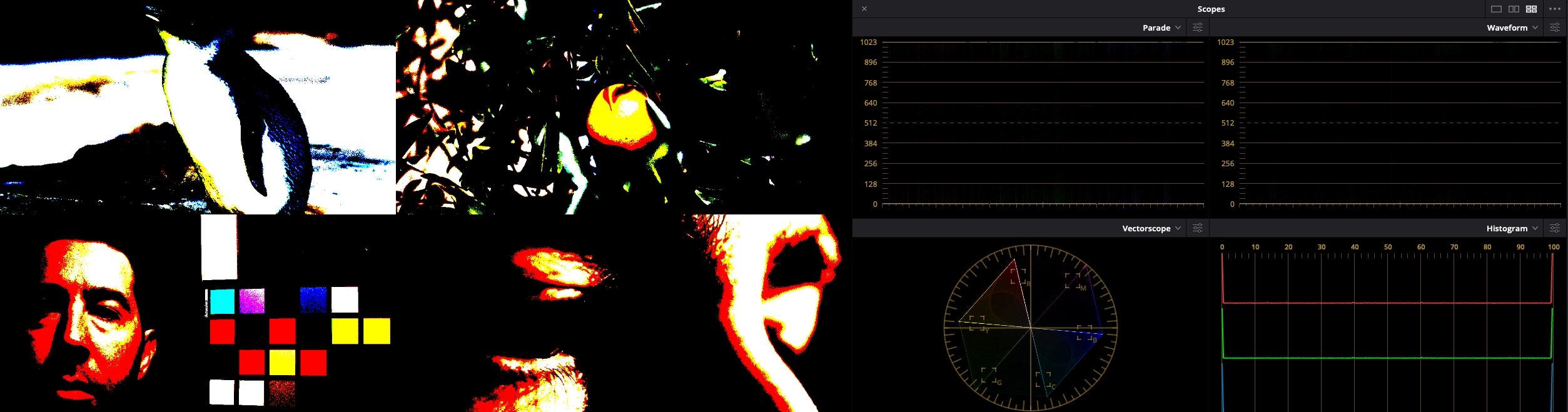
The scopes are very interesting and the idea that the good ones transition smoothly is fascinating, and is very different to the GH5 images.
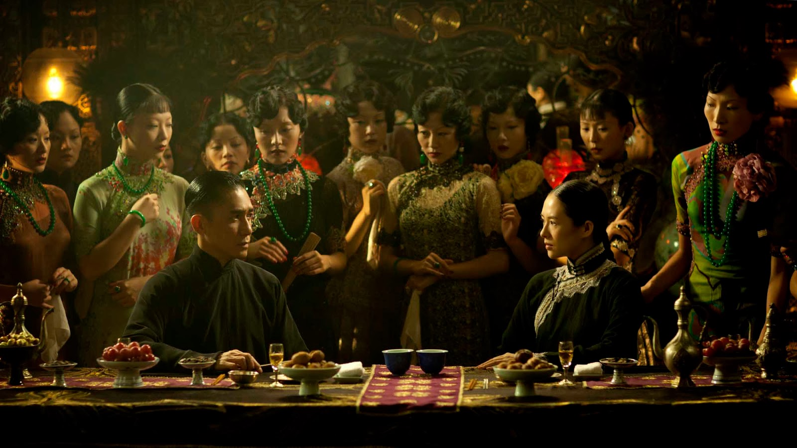
44 minutes ago, KnightsFan said:Here's a frame from The Grandmaster which I think hits peak thickness. Dark, rich colors, a couple highlights, real depth with several layers and a nice falloff of focus that makes things a little more dreamy rather than out of focus.
And the scopes which clearly show the softness of the tones and how mostly everything falls into shadows.
That is a spectacular image, and looks pretty thick to me!
It clearly has some diffusion applied (I'd say heavily) and I wonder how much that plays into the thickness of the image. Diffusion is very common in controlled shooting.
Just for some experimentation sake, I wonder if adding Glow helps us thicken things up a bit?
Original image posted above:
With a heap of Glow applied (to accentuate the effect):
Thicker? It makes is look like there was fog on the water 🙂
I can't match the brightness of the comparison image though, as in most well-lit and low-key narrative scenes the skin tones are amongst the brightest objects in frame, whereas that's not how my scene was lit.
44 minutes ago, KnightsFan said:Perhaps, do you have some examples? For example that bright daylight Kodak test posted earlier here
Has this scope (mostly shadow though a little brighter than the Grandmaster show, but fairly smooth transitions). And to be honest, I think the extreme color saturation particularly on bright objects makes it look less thick.
No examples offhand, just more anecdotal impressions I guess.
I must agree that the bright punchy colours in that image don't look the best. The colours in these two also don't look the best to me either.
I've been watching a lot of TV lately and the skin tones that I'm really liking seem to have a very strong look, but I'm yet to find what that maps out to in concrete terms. I suspect that the hues are very well controlled between the yellow and pink ends of the spectrum without either going too far, and the saturation also seems to be very well controlled with lots of skin area being quite saturated but the saturation being limited, in that it goes quickly up to a certain point but doesn't go much beyond that.
The skintones I'm used to dealing with in my own footage are all over the place in terms of often having areas too far towards yellow and also too pink, and with far too much saturation, but if you pull the saturation back on all the skin then when the most saturated areas come under control the rest of the tones are completely washed out.
I am focusing a lot on skin tones, but that's one half of the very common teal/orange look, so the scene will be skin tones, maybe some warmer colours, and then the rest will be mostly cool in temp.
I've been taking screen grabs whenever I see a nice shot and plan on pulling a bunch of them into Resolve and studying the scopes to see if I can see what is going on, and if I can learn from that.
-
On 10/16/2020 at 1:14 AM, hyalinejim said:
Don't forget about shadow saturation! It often gets ignored in talk about highlight rolloff. The Art Adams articles kye posted above are very interesting but he's only concerned with highlight saturation behaviour.
Indeed. Reminds me of this article:
https://www.provideocoalition.com/film-look-two/
Art Adams again. Long story short, film desaturates both the highlights and the shadows because on negative film the shadows are the highlights! (pretty sure that's the right-way around..)
On 10/16/2020 at 1:19 AM, Stab said:I definitely 'know' what you mean. When I see a good image, it's obvious. But most modern mirrorless can look awful and pretty good, but never have that 'pop' that 'real' video camera's have like BlackMagics, C300's, Alexa's, Varicams, etc.
But is this the processing of the image? Or the sensor? Or both?
I think it's the processing because almost all modern mirrorless camera's take damn good photo's in raw. And when you edit them in lightroom the color 'thickness' is definitely there. But in video mode that is different. So the fact that the same sensor can look great and 'meh' at the same time, should point to the processing part. But then again, I'm sure an Arri still looks better at 50 mbps than a GH5 with 10 times the bitrate.
So where / when is the 'secret sauce' introduced? And are manufacturers themselves aware of this? And is that the reason they will never put their top of the line color science / processing in their 'cheap' mirrorless camera's?
I definitely think it's in the processing. I view it as that there are three factors:
1) things that simply aren't captured by a cheaper camera (eg, clipping)
2) things that are captured and can be used in post without degrading the image below a certain threshold (ie, what image standards you or your client have)
3) things that aren't captured well enough to be used in post (eg, noisy shadows beyond redemption, parts of the DR that break if pushed around too much)
Obviously if you expose your skin tones in a range that is either completely lost (eg, clipped) or aren't in an area that can be recovered without exposing too much noise or breaking the image then there's nothing you can do.
What I am interested in is the middle part, where a properly exposed image will put the important things in the image, for example skin tones. Anything in this range should be able to be converted into something that looks great.
Let's take skin tones - let's imagine that they're well captured but don't look amazing, but that the adjustment to make them look amazing won't break the image. In that case, the only thing preventing the ok skin tones from looking great is the skill in knowing what transformations to make to get there.
Yes, if the skin tones are from a bad codec and there is very little hue variation (ie, plastic skin tones) then that's not something that can be recovered from, but if the hues are all there but just aren't nice, then that should be able to be made to look great.
This is where it's about skill, and why movies with professional colourists involved often look great. OF course, ARRI has built a lot of that stuff into their colour science too, so in a sense everything shot with an ARRI camera has a first pass from some of the worlds best colour scientists, so is already that much further ahead than other offerings.
Of course, many others aren't far behind on colour science, but in the affordable cameras its rare to get the best colour science combined with a good enough sensor and codec.
On 10/16/2020 at 6:49 AM, KnightsFan said:I've certainly been enjoying this discussion. I think that image "thickness" is 90% what is in frame and how it's lit. I think @hyalinejimis right talking about shadow saturation, because "thick" images are usually ones that have deep, rich shadows with only a few bright spots that serve to accentuate how deep the shadows are, rather than show highlight detail. Images like the ones above of the gas station, and the faces don't feel thick to me, since they have huge swathes of bright areas, whereas the pictures that @mat33 posted on page 2 have that richness. It's not a matter of reducing exposure, it's that the scene has those beautiful dark tonalities and gradations, along with some nice saturation.
That was something I had been thinking too, but thickness is present in brighter lit images too isn't it?
Maybe if I rephrase it, higher-key images taken on thin digital cameras still don't match those higher-key images taken on film. Maybe cheap cameras are better at higher-key images than low-key images, but I'd suggest there's still a difference.
11 hours ago, tupp said:Of course, a lot of home weren't properly exposed and showed scenes with huge contrast range that the emulsion couldn't handle. However, I did find some examples that have decent exposure and aren't too faded.
Interesting images, and despite the age and lack of resolution and DR, there is definitely some thickness to them.
I wonder if maybe there is a contrast and saturation softness to them, not in the sense of them being low contrast or low saturation, but more that there is a softness to transitions of luma and chroma within the image?
In other news...
I've been messing with some image processing and made some test images. Curious to hear if these appear thick or not.
They're all a bit darker, so maybe fall into the exposure range that people are thinking tends to be thicker.
-
2 hours ago, tupp said:
Not all additive color mixing works the same. Likewise, not all subtractive color mixing works the same.
However, you might be correct generally in regards to film vs. digital.
Im still working through it, but I would imagine there are an infinite variety. Certainly, looking at film emulations, some are quite different to others in what they do to the vector scope and waveform.
2 hours ago, tupp said:One has to allow for the boosted levels in each emulsion layer that counter the subtractive effects.
What do you mean by this?
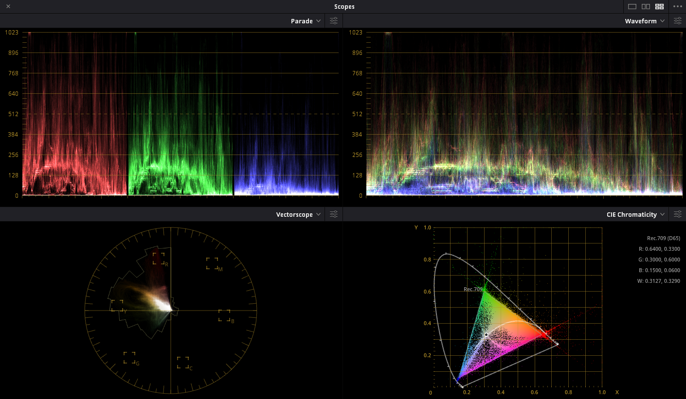
2 hours ago, tupp said:I don't think the scopes are mistaken, but your single trace histogram makes it difficult to discern what exactly is happening (although close examination of your histogram reveals a lot of pixels where they shouldn't be) . It's best to use a histogram with a column for every value increment.
I estimate that around 80%-90% of the pixels fall in between the proper bit depth increments -- the problem is too big to be "ringing artifacts."
There is a significant problem... some variable(s) that is uncontrolled, and the images do not simulate the reduced bit depths. No conclusions can be drawn until the problem is fixed.
OK, one last attempt.
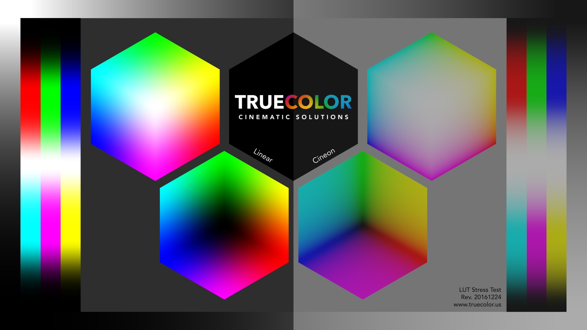
Here is a LUT stress test image from truecolour. It shows smooth graduations across the full colour space and is useful for seeing if there are any artefacts likely to be caused by a LUT or grade.
This is it taken into Resolve and exported out without any effects applied.
This is the LUT image with my plugin set to 1-bit. This should create only white, red, green, blue, yellow, magenta, cyan, and black.
This is the LUT image with my plugin set to 2-bits. This will create more variation.
The thing to look for here is that all the gradual transitions have been replaced by flat areas that transition instantly to another flat area of the next adjacent colour.
If you whip one of the above images into your software package I would imagine that you'd find the compression might have created intermediary colours on the edges of the flat areas, but if my processing was creating intermediate colours then they would be visible as separate flat areas, but as you can see, there are none.
-
14 minutes ago, John Matthews said:
The world is shit. People are shit. The end. Do you like my film proposal? Inspiring, isn't it? 🙂
I've heard the arguments for and against phones, social media, and gaming... On Sunday, I heard Leo Laporte talk about it again on the radio. I listen to other podcasts where they talk about it. I'm in my mid 40s and I too have struggled with issues with addiction to gaming, phones, and social media. I have real world experience with the "future leaders" of the world. My optimistic conclusion for the moment is looking more and more like WALL-E, the Disney/Pixar film. I don't knee-jerkingly say "everything new sucks." That's not me.
Just embracing everything tech can have its own issues. For one, humanity's demise. Remember, tech is often used for controlling people, winning wars, and total domination. Now, is it all innocent and good?
Read the book. The title isn't an accident.
-
2 hours ago, majoraxis said:
Anyways, someday the photos I take of paperwork at work (instead of scanning them) will be ready for the big screen.
and some time after that maybe they'll be able to take my photos of 2-3+ hours of vigorous whiteboard dissuasions and actually make people work together better! Now that would be the magic of cinema....
2 minutes ago, John Matthews said:I have taught 200-300 teenagers in the last few years. Phones, social media, and gaming have stifled their development in a traditional sense. It's not one or two- it's the majority! Doing something without their phone is a problem. The thought of going only one day without playing a video game is a problem. Is that addiction? I'm not sure, but sure does lack variety and it's so bad that now they don't allow phones at the school anymore. You're right, it's not at gunpoint, but do you know anyone who takes heroin at gunpoint? That's not how addiction works.
Unfortunately, I don't really see the value in these devices. 5G? ...4G and 3G were good enough for me. Camera? ...I'm happy with my proper camera. Screen size? ...I prefer the smaller screens if it's supposed to be portable. My point is "progress" is a very subjective term. I don't like what I see.
Everything has pros and cons. Typically the people who think something is bad are either unaware of what was gained, or don't value them as highly as the things that were lost. Most often things were better in the good old days, but what that doesn't take into account is that the good old days for the 60-year old were when they were in their early 20s and was what the 80-year old was referring to as "the end of civilised society" at the time.
The things we value and basically everything that our lives and the world are made of are the accumulation of all barbarity and demonic possession of civilised society through the entire history of time. See this for some examples: https://www.mentalfloss.com/article/52209/15-historical-complaints-about-young-people-ruining-everything
There's a great book on social media use that you might find interesting called It's Complicated: The Social Lives of Networked Teens by Danah Boyd which was an incredible read and actually suggested that teens aren't addicted to their phones, but to each other, and that when teens are looking at their phones its much more likely to be in aid of communicating with each other than when an adult is looking at their phone. A google search found a PDF of the whole thing from the authors website, so if you are looking then apparently it's easy to access.
-
1 hour ago, tupp said:
So, the first linked article echoed what I said (except I left out that the print itself is also "subtractive" when projected).
Is that except from the article (and what I said) what you mean when you refer to "additive" and "subtractive" color?
Ok, now I understand what you were saying. When you said "a digital monitor 'adds' adjacent pixels" I thought you were talking about pixels in the image somehow being blended together, rather than just that monitors are arrays of R, G, and B lights.
One of the up-shots of subtractive colour vs additive colour is that with subtractive colour you get a peak in saturation below the luminance level that saturation peaks at in an additive model. To compensate for that, colourists and colour scientists and LUT creators often darken saturated colours.
This is one of the things I said that I find almost everywhere I look. There are other things too.
1 hour ago, tupp said:Also from the first linked article:
I'm not so sure about this. I think that this notion could contribute to the film look, but a lot of other things go into that look, such as progressive scan, no rolling shutter, grain actually forming the image, color depth, compressed highlight roll-off (as you mentioned), the brighter tones are less saturated (which I think is mentioned in the second article that you linked), etc.
I'm sure that if you look back you'll find I said that it might contribute to it, and not that it is the only factor.
1 hour ago, tupp said:Of all of the elements that give the film "thickness," I would say that color depth, highlight compression, and the lower saturation in the brighter areas would be the most significant.
Cool. Let's test these. The whole point of this thread is to go from "I think" to "I know".
1 hour ago, tupp said:It might be possible to suggest the subtractive nature of a film print merely by separating the the color channels and introducing a touch of subtractive overly on the two appropriate color channels. A plug-in could be made that does this automatically. However, I don't know if such effort will make a substantial difference.
This can be arranged.
1 hour ago, tupp said:Thank you for posting the images without added grain/noise/dithering. You only had to post the 8-bit image and the "4.5-bit" image.
Unfortunately, most of the pixel values of the "4.5-bit" image still fall in between the 22.6 value increments prescribed by "4.5-bits." So, something is wrong somewhere in your imaging pipeline.
Your NLE's histogram is a single trace, rather than 255 separate columns. Is there a histogram that shows those 255 columns instead of a single trace? It's important, because your NLE histograms are showing 22 spikes with a substantial base that is difficult to discern with that single trace.
Something might be going wrong during the "rounding" or at the "timeline" phase.
Scopes make this kind of error all the time. Curves and right angles never mix because when you're generating a line of best fit with a non-zero curve inertia or non-infinite frequency response then you will get ringing in your curve.
What this means is that if your input data is 0, 0, 0, X, 0, 0, 0 the curve will have non-zero data on either side of the spike. This article talks about it in the context of image processing, but it applies any time you have a step-change in values. https://en.wikipedia.org/wiki/Ringing_artifacts
There is nothing in my code that would allow for the creation of intermediary values, and I'm seeing visually the right behaviour at lower bit-depths when I look at the image (as shown previously with the 1-bit image quality), so at this point I'm happy to conclude that there are no values in between and that its a scoping limitation, or is being created by the jpg compression process.
-
@Andrew Reid considering how good these things are getting, is it now possible to start ranking phones against cheaper cameras? All the discussion is phones vs phones or cameras vs cameras, but I'm curious when we can start comparing them directly.
Or maybe it's obvious and I'm out of the loop because I'm still using my iPhone 8..
20 hours ago, Nerv said:its funny but last i checked i thought glass was the most important part of a good image. why buy Zeiss Master Primes when you can use the plastic lens of a smartphone. it will be a sad day when processed images of a phone will mimic pro equipment...
It will be a great day when the image quality of a consumer device mimics Zeiss Master Primes.
Cameras are tools, and currently the best tools are inaccessible to the vast majority of people who would like to create with them. Democratisation of image quality is good for art, good for creators, and good for society in general. The only people it's not good for is technical elitists, or people that are obsessed with equipment and don't care about art.
16 hours ago, John Matthews said:Am I the only one saddened by AI? What ever happened to a good-old-fashioned camera? I don't want camera's inventing the experience, regardless the quality increase. I know you're going to say: "cameras already do that!" However, there's such a thing as the heavy-handed approach and the subtle approach- I prefer the latter. I'm actively trying to find ways to eliminate the smart phone completely from my life while others are trying to further (and willingly?) addict themselves.
You do realise that if my camera gets better then yours doesn't get worse, right?
and smartphones don't crawl from your nightstand and inject you with heroin while you're sleeping... improving the camera in a phone will help you to get access to traditional camera equipment, not hinder it, and owning a phone doesn't automatically mean that you are forced at gunpoint to browse social media.
These things are tools.
5 hours ago, fuzzynormal said:10 years just about EVERYBODY on the planet that can afford a phone will have the same motion picture IQ power we currently have.
Best to question "what exactly do I bring to the table when offering video production services?" If your answer is "the camera" you need to start getting really paranoid. Most clients are not going to fret about DXO scores. If that's where your attention lies (and there's nothing really wrong with that) I hope you're aspiring to a much higher echelon of production than I am!
I'm pretty close to retirement so my day in the sun with all this stuff is coming to an end. Looks like I'll be riding the imaging technical wave as it crashes onto the beach.
Agreed. It's a tough job to convince many people that a photographer is more than a camera-transportation-device, but the more that smartphones get better and people take photos and realise they're not that great even though the picture quality seems fine, the more they'll realise that there is a skill component to things.
The best way to educate the public is to give them the tools and then watch as they discover it's not so easy.
This transition from photographers being technicians who restrict access to the equipment to photographers being artists has been occurring for a very long time. It used to be that accessing and operating a 8x10 camera wasn't accessible, then it was lenses and lights, then with digital it was the megapixels and lenses, now it's just lenses, and once fake-bokeh is convincing then there will be no technical or ownership barriers at all, which is why the good photographers are the ones who specialise in lighting, composition, posing, set design, concepts, etc.
It's pretty easy to make an Alexa look like a home video. The equipment won't save the amateurs from needing to be artists.
-
+1 for a normal picture profile, like @TomTheDP says. This will mean controlling your lighting and DR in the scene and white-balancing meticulously.
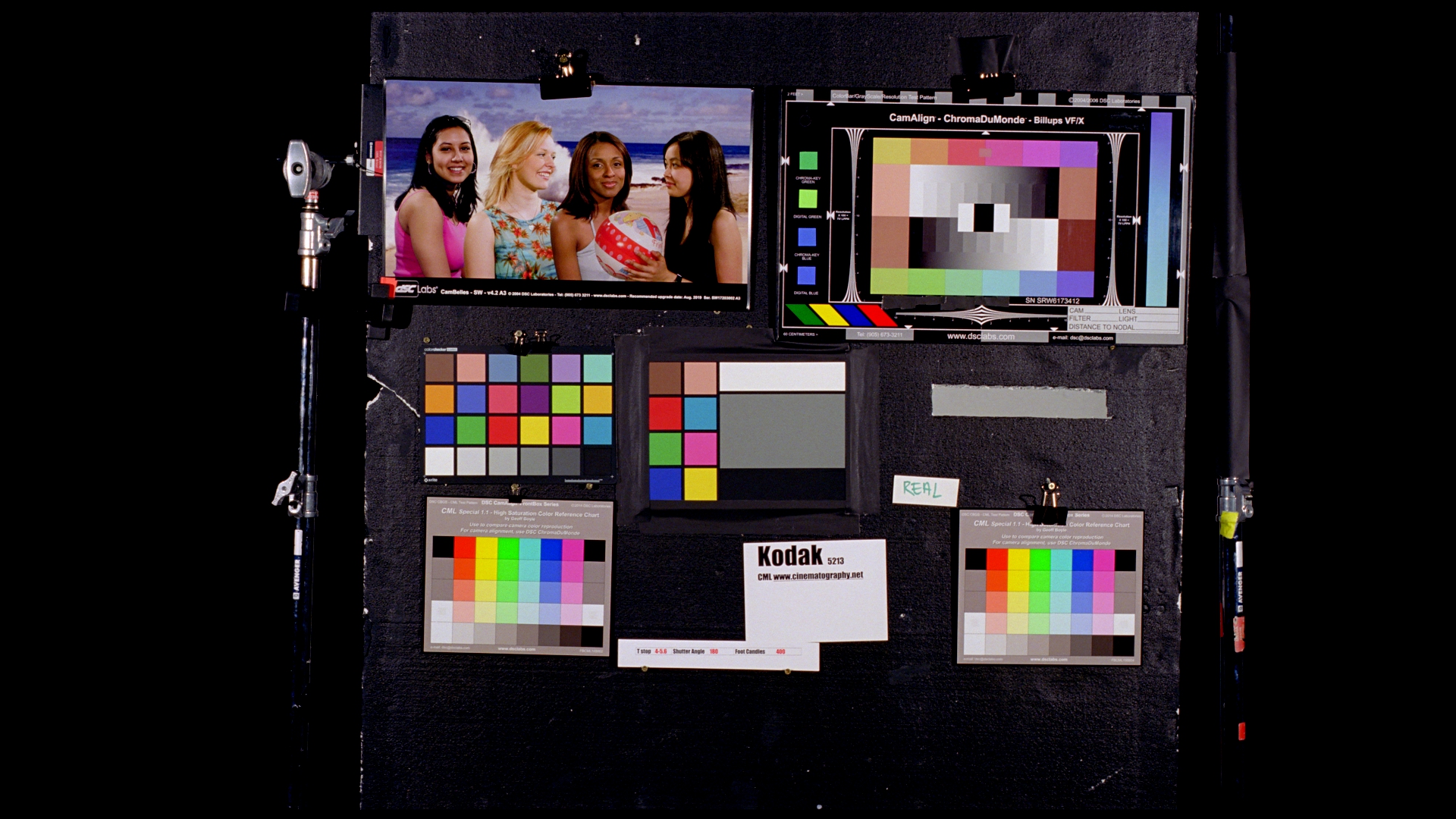
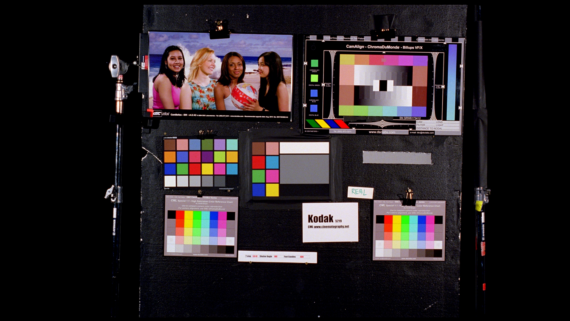
It would also help the colourist immensely if you shot a colour chart, preferably in every setup if you can.
8-bit is fine if it's starting in a 709-like space, and the A73 isn't that bad when you consider that feature films have mixed GoPro footage in with cinema cameras!
-
5 hours ago, tupp said:
I am not sure what you mean. Are you referring to the concept color emulsion layers subtracting from each other during the printing stage while a digital monitor "adds" adjacent pixels?
Keep in mind that there is nothing inherently "subtractive" with "subtractive colors." Likewise, there is nothing inherently "additive" with "additive colors."
Please explain what you mean.
Perhaps these might provide some background to subtractive vs additive colour science.
https://www.dvinfo.net/article/production/camgear/what-alexa-and-watercolors-have-in-common.html
https://www.dvinfo.net/article/post/making-the-sony-f55-look-filmic-with-resolve-9.html
5 hours ago, tupp said:Yes, but the histograms are not drawing the expected lines for the "4.5-bit" image nor for the "5-bit" image. Those images are full 8-bit images.
On the other hand, the "2.5-bit" shows the histogram lines as expected. Did you do something different when making the "2.5-bit" image?
If the culprit is compression, then why is the "2.5-bit" image showing the histogram lines as expected, while the "4.5-bit" and "5-bit" images do not show the histogram lines?
Please just post the 8-bit image and the "4.5-bit" image without the noise/grain/dithering.
Well, I would have, but I was at work. I will post them now, and maybe we can all relax a little.
No bit-crunch:
4.5 bits:
4.0 bits:
In terms of your analysis vs mine, my screenshots are all taken prior to the image being compressed to 8-bit jpg, whereas yours was taken after it was compressed to 8-bit jpg.
Note how much the banding is reduced on the jpg above vs how it looks uncompressed (both at 4.0 bits):
Here's the 5-bit with the noise to show what it looks like before compression:
and without the noise applied:
28 minutes ago, jgharding said:Not really referring to a specific aspect, just the pliability of the image.
Codec implementations are more than the sum of their parts so it's a little bit of a 'war of attrition' to try and pin it down to a number.
All of those things contribute to the pliability of the image. I'm just stating that in general, less-compressed images survive more alteration.Agreed about 'more than the sum of their parts' as it's more like a multiplication - even a 10% loss over many aspects multiplies quickly over many factors.
50 minutes ago, jgharding said:Red's codec is obviously the best here, raw data plus masses of compression and still holds up to abuse. But then the image characteristic of Arri is preferable to me despite ProRes being the most practical codec in there.
Not a fan of ARRIRAW? I've never really compared them, so wouldn't know.
50 minutes ago, jgharding said:If the phrase "thick" and "thin" is this hard to define, perhaps it's better to use different ones whe you're to communicate the nature of an image. These words seem to be open to interpretation and sort of fail to communicate clearly as a result.
Indeed, and that's kind of the point. I'm trying to work out what it is.
-
9 hours ago, hyalinejim said:
This harks back to deezid's point:
From my investigations film does seem to have much more saturated shadows than what a digital image offers. If you match the saturation of the midtones of digital to film, then the shadows will need a boost to also match... maybe by around 25-50% at the lowest parts. It's a shockingly huge saturation boost in the shadow areas (and the highlights would need to come down in saturation slightly). I'm not talking about log images here, I'm talking contrasty Rec709.
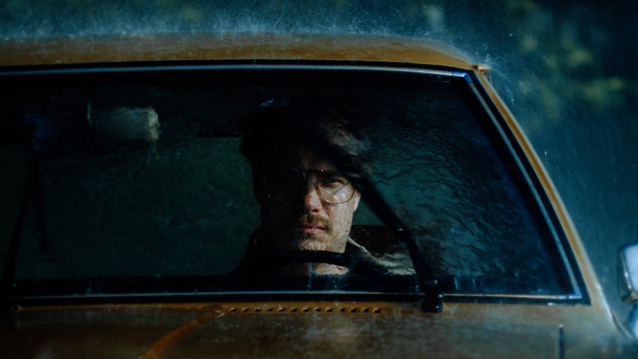
The digital capture is probably closer to being an accurate representation of the level of saturation in reality. But film is transformative. We want our images to look better than reality!
If we talk about memory colours (sky, foliage and skin) the preferences of photographers and middle American shoppers led to altered hue and saturation in Kodak film stocks. So it looks like we prefer skies that are more cyan than in reality, foliage that is cooler and skin that is more uniform, and tending towards tan (Fuji skin tends towards rosy pink).
With 10bit I can get decent, filmic colour out of V-Log! But 8 bit would fall apart.
It does hark back to Deezids point. Lots more aspects to investigate here yet.
Interesting about the saturation of shadows - my impression was that film desaturated both shadows and highlights compared to digital, but maybe when people desaturate digital shadows and highlights they're always done overzealously?
We absolutely want our images to be better than reality - the image of the guy in the car doesn't look like reality at all! One of the things that I see that makes an image 'cinematic' vs realistic is resolution and specifically the lack of it. If you're shooting with a compressed codec then I think some kind of image softening in post is a good strategy. I'm yet to systematically experiment with softening the image with blurs, but it's on my list.
8 hours ago, hyalinejim said:Let me ask a question!
These are ColorChecker patches abstracted from -2, 0 and +2 exposures using film in one case and digital in the other (contrast has been matched). Which colour palette is nicer? Open each in a new tab and flick back and forth.
ONE:
or TWO:
I'll let others comment on this in order to prevent groupthink, but with what I've recently learned about film which one is which is pretty obvious.
7 hours ago, jgharding said:I always think of it as related to compression TBH, AKA how much you can push colour around and have things still look good.
C100 with external recorder for example looked way better than internal, cos the colours didn't go all "thin" and insipid if you pushed it about,
Trying to white balance adjustments on over-compressed footage results in a sort of messy colour wash. I think of this as "thin", the opposite as "thick"When you say 'compression', what are you referring to specifically? Bit-rate? bit-depth? codec? chroma sub-sampling?
6 hours ago, Geoff CB said:When grading files in HDR, I can instantly tell when a file is of lower quality. Grading on a 8-bit timeline doesn't really show the difference, but on a 10 or 12-bit HDR timeline on a HDR panel it is night and day.
So for me for a "Thick" image. is 10-bit 4:2:2 or better with at least 14+ Stops of DR.
Have you noticed exceptions to your 10-bit 422 14-stops rule where something 'lesser' had unexpected thickness, or where things above that threshold didn't? If so, do you have any ideas on what might have tipped the balance in those instances?
2 hours ago, tupp said:If you are referring to "additive" and "subtractive" colors in the typical imaging sense, I don't think that it applies here.
There are many different types of dithering. "Noise" dithering (or "random" dithering) is probably the worst type. One would think that a grain overlay that yields dithering would be random, but I am not sure that is what your grain filter is actually doing.
Regardless, the introducing the variable of grain/dithering is unnecessary for the comparison, and, likely, it is what skewed the results.
Small film formats have a lot of resolution with normal stocks and normal processing.
If you reduce the resolution, you reduce the color depth, so that is probably not wise to do.
Too bad there's no mark-up/mark-down for <code> on this web forum.
The noise/grain/dithering that was introduced is likely what caused the problem -- not the rounding code. Also, I think that the images went through a YUV 4:2:0 pipeline at least once.
I posted the histograms and waveforms that clearly show that the "4.5-bit" image is mostly an 8-bit image, but you can see for yourself. Just take your "4.5-bit" image an put it in your NLE and look at the histogram. Notice that there are spikes with bases that merge, instead of just vertical lines. That means that a vast majority of the image's pixels fall in between the 22 "rounded 4.5-bit" increments.
Yes. The histogram should show equally spaced vertical lines that represent the increments of the lower bit depth (2.5-bits) contained within a larger bit dept (8-bits).
The vertical lines in the waveforms merely show the locations where each scan line trace goes abruptly up and down to delineate a pool of a single color. More gradual and more varied scan line slopes appear with images of a higher bit depth that do not contain large pools of a single color.
I checked the histogram of "2.5-bit" image without the added noise/grain/dithering, and it shows the vertical histogram lines as expected. So, the grain/dithering is the likely culprit.
An unnecessary element (noise/grain/dithering) was added to the "4.5-bit" image that made it a dirty 8-bit image, so we can't really conclude anything from the comparison. Post the "4.5-bit" image without grain/dithering, and we might get a good indication of how "4.5-bits" actually appears.
Using extremes to compare dramatically different outcomes is a good testing method, but you have to control your variables and not introduce any elements that skew the results.
Please post the "4-5-bit" image without any added artificial elements.
Thanks!
Additive vs subtractive colours and mimicking subtractive colours with additive tools may well be relevant here, and I see some of the hallmarks of that mimicry almost everywhere I look.
I did a colour test of the GH5 and BMMCC and I took shots of my face and a colour checker with both cameras, including every colour profile on the GH5. I then took the rec709 image from the GH5 and graded it to match the BMMCC as well as every other colour profile from the GH5.
In EVERY instance I saw adjustments being made that (at least partially) mimicked subtractive colour.
I highly encourage everyone to take their camera, point it at a colourful scene lit with natural light and take a RAW still image and then a short video clip in their favourite colour profile, and then try to match the RAW still to the colour profile. We talk about "just doing a conversion to rec709" or "applying the LUT" like it's nothing - it's actually applying a dozen or more finely crafted adjustments created by professional colour scientists. I have learned an incredible amount by reverse-engineering these things.
It makes sense that the scopes draw lines instead of points, that's also why the vector scope looks like triangles and not points. One less mystery 🙂
I'm happy to re-post the images without the noise added, but you should know that I added the noise before the bit-depth reduction plugin, not after, so the 'dirtying' of the image happened during compression, not by adding the noise.
52 minutes ago, ntblowz said:This youtube is quite interesting on the topic of image thickness from colourist's view, general public vs film maker's expectation is a bit different.
I saw that. His comments about preferring what we're used to were interesting too.
Blind testing is a tool that has its uses, and we don't use it nearly enough.
-
30 minutes ago, zerocool22 said:
canon 5D III ML RAW is 16bit, canon R5 is 12 bit RAW. I am surprised nobody did a comparison between these 2 yet. The colours of the 5D III might still have the edge over the R5. (Allthough resolution, dynamic range and framerates are better now)
I've compared 14-bit vs 12-bit vs 10-bit RAW using ML, and based on the results of my tests I don't feel compelled to even watch a YT video comparing them, let alone do one for myself, even if I had the cameras just sitting there waiting for it.
Have you played with various bit-depths? 12-bit and 14-bit are so similar that it takes some pretty hard pixel-peeping to be able to tell a difference. There is one, of course, but it's so far into diminishing returns that the ROI line is practically horizontal, unless you were doing some spectacularly vicious processing in post.
I have nothing against people using those modes, but it's a very slight difference.
-
3 hours ago, tupp said:
I think that the "thickness" comes primarily from emulsion's color depth and partially from the highlight compression that you mentioned in another thread, from the forgiving latitude of negative film and from film's texture (grain).
It might be, that's interesting. I'm still working on the logic of subtractive vs additive colour and I'm not quite there enough to replicate it in post.
3 hours ago, tupp said:Keep in mind that overlaying "grain" screen on a digital image is not the same as the grain that is integral to forming an image on film emulsion. Grain actually provides the detail and contrast and much of the color depth of an film image.
Agreed. In my bit-depth reductions I added grain to introduce noise to get the effects of dithering:
"Dither is an intentionally applied form of noise used to randomize quantization error, preventing large-scale patterns such as color banding in images. Dither is routinely used in processing of both digital audio and video data, and is often one of the last stages of mastering audio to a CD."
Thickness of an image might have something to do with film grain, but that's not what I was testing (or trying to test anyway).
3 hours ago, tupp said:Home movies shot on Super8 film often have "thick" looking images, if they haven't faded.
Agreed. That's why I haven't been talking about resolution or sharpness, although maybe I should be talking about reducing resolution and sharpness as maybe that will help with thickness?
3 hours ago, tupp said:You didn't create a 5-bit image nor a "4.5-bit" image, nor did you keep all of the shades within 22.6 shade increments ("4.5-bits") of the 255 increments in the final 8-bit image.
Obviously it's possible that I made a mistake, but I don't think so.
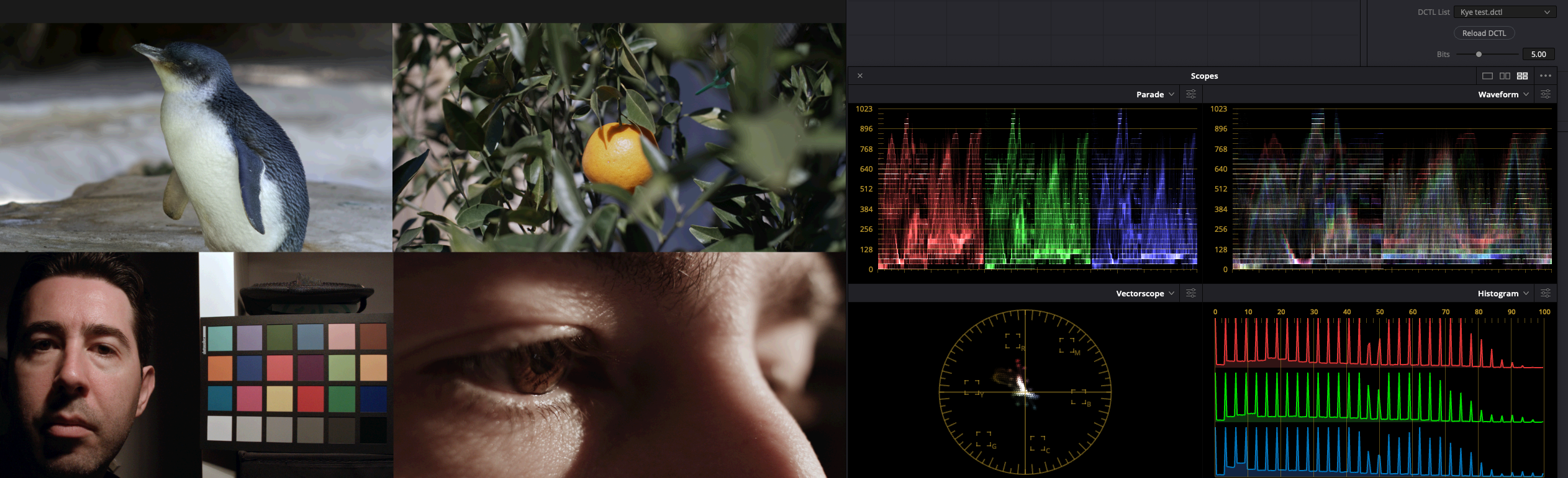
Here's the code:
QuoteDEFINE_UI_PARAMS(Bits, Bits, DCTLUI_SLIDER_FLOAT, 14, 0, 14, 1)
__DEVICE__ float3 transform(int p_Width, int p_Height, int p_X, int p_Y, float p_R, float p_G, float p_B)
{
const float Deg = pow(2,Bits);const float r = round(p_R*Deg)/Deg;
const float g = round(p_G*Deg)/Deg;
const float b = round(p_B*Deg)/Deg;return make_float3(r, g, b);
}Pretty straight-forwards.
Also, if I set it to 2.5bits, then this is what I get:
which looks pretty much what you'd expect.
I suspect the vertical lines in the parade are just an algorithmic artefact of quantised data. If I set it to 1 bit then the image looks like it's not providing any values between the standard ones you'd expect (black, red, green, blue, yellow, cyan, magenta, white).
Happy to hear if you spot a bug.
Also, maybe the image gets given new values when it's compressed? Actually, that sounds like it's quite possible.. hmm.
3 hours ago, tupp said:To do this comparison properly, one should probably shoot an actual "4.5-bit" image, process it in a "4.5-bit" pipeline and display it on a "4.5-bit" monitor.
I wasn't suggesting that a 4.5bit image pipeline would give that exact result, more that we could destroy bit-depth pretty severely and the image didn't fall apart, thus it's unlikely that thickness comes from the bit-depth.
3 hours ago, tupp said:By the way, there is an perceptible difference between the 8-bit image and the "4.5-bit" image.
Indeed there is. and I'd expect there to be! I mean, I bought a GH5 based partly on the internal 10-bit! I'm not regretting my decision, but I'm thinking that it's less important than I used to think it was, especially without using a log profile like I also used to do.
Essentially the test was to go way too far (4.5bits is ridiculous) and see if that had a disastrous effect, which it didn't seem to do.
If we start with the assumption that cheap cameras create images that are thin because of their 8-bit codecs, then by that logic a 5-bit image should be razor thin and completely objectionable, but it wasn't, so it's unlikely that the 8-bit property is the one robbing the cheap cameras of their images thickness.
-
8 hours ago, Geoff CB said:
But those images were not captured in 5-bit, that is an indicator for final compression, it is NOT an indicator of quality of it as the capture format.
The question we're trying to work out here is what aspects of an image make up this subjective thing referred to by some as 'thickness'.
We know that high-end cinema cameras typically have really thick looking images, and that cheap cameras typically do not (although there are exceptions). Therefore this quality of thickness is related to something that differs between these two scenarios.
Images from cheap cameras typically have a range of attributes in common, such as 8-bit, 420, highly compressed, cheaper lenses, less attention paid to lighting, and a range of other things. However, despite all these limitations, the images from these cameras are very good in some senses. A 4K file from a smartphone has a heap of resolution, reasonable colour science, etc, so it's not like we're comparing cinema cameras with a potato.
This means that the concept of image thickness much be fragile. Otherwise consumer cameras would capture it just fine.
If something is fragile, and is only just on the edges of being captured, then if we take a thick image and degrade it in the right ways, then the thickness should evaporate with the slightest degradation.
The fact I can take an image and output it at 8-bits and at 5-bits and for there not to be a night-and-day difference then I must assume one of three things:
- the image wasn't thick to begin with
- it is thick at both 8-bits and 5-bits and therefore bit-depth doesn't matter than much
- it is thick at 8-bit but not at 5-bits and people just didn't notice, in a thread especially about this
I very much doubt that it's #3, because I've had PMs from folks who I trust saying it didn't look much different.
Maybe it's #1, but I also doubt that, because we're routinely judging the thickness of images via stills from YT or Vimeo, which are likely to be 8-bit, 420, and highly compressed. The images of the guy in the car that look great are 8-bit. I don't know where they came from, but if they're screen grabs from a streaming service then they'll be pretty poor quality too. Yet they still look great.
I'm starting to think that maybe image thickness is related to the distribution of tones within a HSL cube, and some areas being nicer than others, or there being synergies between various areas and not others.
-
20 hours ago, majoraxis said:
A good reminder regarding focus and depth of field when shooting household pets. ; )
If I'm testing resolution of a camera mode then I typically shoot something almost stationary, open the aperture right up, focus, then stop down at least 3 stops, normally 4, to get to the sweet spot of whatever lens I'm using, and to also make sure that if I move slightly that the focal plane is deep enough.
Doing that with dogs might be a challenge!
-
20 hours ago, Oliver Daniel said:
Nothing wrong with using intentional natural light. It can sometimes produce amazing results.
But in your reference to dynamic range, I do think it matters how those stops are utilised. For example, on an overcast grey day - using LOG on some cameras may spread the exposure too thinly - whereas one might prefer to use a standard gamma to accomplish a “juicier” looking image.
The image will most certainly look thinner in poor lighting conditions as there’s less information captured by each pixel. Not in all situations but it’s certainly a big factor.
Actually, the fact that an image can be reduced to 5bits and not be visibly ruined, means that the bits aren't as important as we all seem to think.
A bit-depth of 5bits is equivalent to taking an 8-bit image and only using 1/8th of the DR, then expanding that out. Or, shooting a 10-bit image and only exposing using 1/32 of that DR and expanding that out.
Obviously that's not something I'd recommend, and also considering I applied a lot of noise before doing the bit-depth reduction, but the idea that image thickness is related to bit-depth seems to be disproven.
I'm now re-thinking what to test next, but this was an obvious thing and it turned out to be wrong.
-
16 hours ago, BenEricson said:
Not sure where you read this, but you're misinformed.
Which do you agree with - that film has poor DR or that Canon DSLRs have?
I suspect you're talking about film, and this is something I learned about quite recently. In Colour and Mastering for Digital Cinema by Glenn Kennel he shows density graphs for both negative and print films.
The negative film graphs show the 2% black, 18% grey and 90% white points all along the linear segment of the graph, with huge amounts of leeway above the 90% white. He says "The latitude of a typical motion picture negative film is 3.0 log exposure, or a scene contrast of 1000 to 1. This corresponds to approximately 10 camera stops". The highlights extend into a very graceful highlight compression curve.
The print-through curve is a different story, with the 2% black, 18% grey and 90% white points stretching across almost the entire DR of the film. In contrast to the negative film where the range from 2-90% takes up perhaps half of the mostly-linear section of the graph, in the print-through curve the 2% sits very close to clipping, the region between 18% and 90% encompasses the whole shoulder, and the 90% is very close to the other flat point on the curve.
My understanding is that the huge range of leeway in the negative is what people refer to as "latitude" and this is where the reputation film has of having a large DR comes from, because that is true. However, if you're talking about mimicking film then it was a very short period in history where you might shoot on film but process digitally, so you should also take into account the print film positive that would have been used to turn the negative into something you could actually watch.
Glenn goes on to discuss techniques for expanding the DR of the print-through by over-exposing the negative and then printing it differently, which does extend the range in the shadows below the 2% quite significantly.
I tried to find some curves online to replicate what is in the book but couldn't find any. I'd really recommend the book if you're curious to learn more. I learned more in reading the first few chapters than I have in reading free articles on and off for years now.
-
2 hours ago, fuzzynormal said:
Not for me, because they look the same, or are so similar to not matter to my eye.
Maybe I missed something more obvious?
That's what I thought - that there wasn't much visible difference between them and so no-one commented.
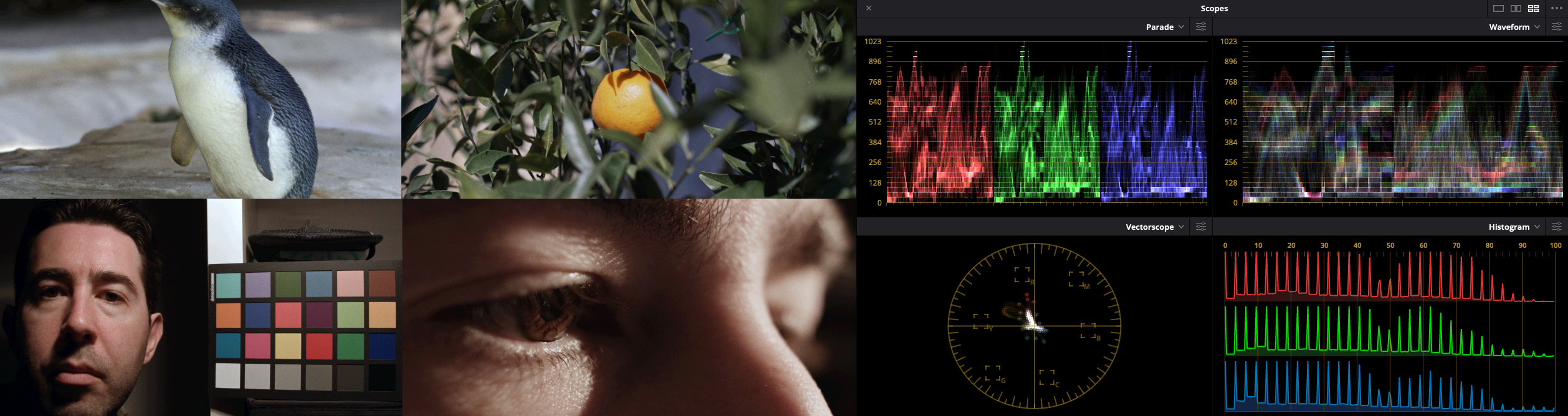
What's interesting is that I crunched some of those images absolutely brutally.
The source images were (clockwise starting top left) 5K 10-bit 420 HLG, 4K 10-bit 422 Cine-D, and 2x RAW 1080p images, which were then graded, put onto a 1080p timeline and then degraded as below:
- First image had film grain applied then JPG export
- Second had film grain then RGB values rounded to 5.5bit depth
- Third had film grain then RGB values rounded to 5.0bit depth
- Fourth had film grain then RGB values rounded to 4.5bit depth
The giveaway is the shadow near the eye on the bottom-right image which at 4.5bits is visibly banding.
What this means is that we're judging image thickness via an image pipeline that isn't that visibly degraded by having the output at 5 bits-per-pixel.
The banding is much more obvious without the film grain I applied, and for the sake of the experiment I tried to push it as far as I could.
Think about that for a second - almost no visible difference making an image 5bits-per-pixel at a data rate of around 200Mbps (each frame is over 1Mb).
-
or how about these... are these super thick?
-
21 hours ago, kye said:
Ok, what do we think about how thick these images are?
vs
vs
vs
No thoughts on how these images compare?
It's not a trick..
-
Ok, what do we think about how thick these images are?
vs
vs
vs
-
On 10/7/2020 at 8:33 PM, hyalinejim said:
1980s Kodak test image from linked article 🙂
I'm not sure if it's the film stock of the 80s fashion that really dominates that image, but wow... the United Colours of
Benetonthe 80s!5 hours ago, leslie said:thats so VIVID i need sunglasses to look at it 😉
Hopefully ray bands - I think they're one of the only 80s approved sunglasses still available.
80s music always sounds best on stereos also made in the 80s. I think there's something we can all take away from that 🙂
4 hours ago, mat33 said:While lighting, bit depth and resolution all play a role what about the bayer matrix and the colour filters themselves? For example some of the 'thickest' most filmic images I have seen are from the Digital Bolex which is 12bit and 2K-I've attached a few examples (sadly not mine) from the D16. I have seen some discussion on the D16 about this: "Color depth and discrimination in Bayer filters is determined by the purity and saturation of the filter dyes used. The Kodak CCD in the D16 uses a patented set of highly saturated filters designed for scientific and industrial applications where accuracy and fine color discrimination are critical, like color matching in textile fabric dye runs, or in the cameras used on the Mars Rovers. Most video cameras use Bayer filters less saturated to get more sensitivity and just cover the video color gamuts. Deeply saturated primary colors can be hard to reproduce. I normally have to desaturate D16 footage 20-30% to eliminate chroma clipping on saturated colors in REC709. This still looks like a fully saturated video image to gamut limits." So could it be the characteristics of the bayer filters are a big part of the colour thickness?
Great images.
Fascinating comments about the D16 having more saturated colours on the bayer filter. The spectral response of film vs digital is something that Glenn Kennel talks about a lot in Colour Mastering for Digital Cinema. If the filters are more saturated then I would imagine that they're either further apart in frequency, or they are narrower, which would mean less cross-talk between the RGB channels.
This paper has some interesting comparisons of RGB responses, including 5218 and 5246 film stocks, BetterLight and Megavision digital backs, and Nikon D70 and Canon 20D cameras: http://www.color.org/documents/CaptureColorAnalysisGamuts_ppt.pdf
The digital sensors all have hugely more cross-talk between RGB channels than either of the film stocks, which is interesting. I'll have to experiment with doing some A/B test images. In the RGB mixer it's easy to apply a negative amount of the other channels to the output of each channel, which should in theory simulate a narrower filter. I'll have to read more about this, but it might be time to start posting images here and seeing what people think.
3 hours ago, Andrew Reid said:In my opinion tonality trumps dynamic range.
You can have very high dynamic range but if the tonality and colour is lacking you get the 'thin' digital low-bit-depth look. A lot of smartphones have it in their HDR modes.
Some of the old CCD sensors produce lovely "thick" files but don't have anywhere near 12 stops dynamic range, not even 11 stops.
And yeah, Digital Bolex was a good example.
You can compare it to the claimed '15 stops' Sony S-LOG and it looks much deeper, more exotic, thicker, more filmic, more organic, despite having noisy shadows and clipped highlights.
I wonder how much having a limited bit-depth is playing into what you're saying. For example, if we get three cameras, one with high-DR and low-colour separation, the second with high-DR / higher colour separation, and the third with low-DR / high colour saturation. We take each camera, film something, then take the 10-bit files from each and normalise them. The first camera will require us to apply a lot of contrast (stretching the bits further apart) and also lots of saturation (stretching the bits apart), the second requires contrast but less saturation, and the third requires no adjustments. This would mean the first would have the least effective bit-depth once in 709 space, the second would have more effective bit-depth, and the third the most in 709 space.
This is something I can easily test, as I wrote a DCTL to simulate bit depth issues, but it's also something that occurs in real footage, like when I did everything wrong and recorded this low-contrast scene (due to cloud cover) with C-Log in 8-bit..
Once you expand the DR and add saturation, you get something like this:
It's easy to see how the bits get stretched apart - this is the vectorscope of the 709 image:
A pretty good example of not having much variation in single hues due to low-contrast and low-bit-depth. I just wish it was coming from a camera test and not from one of my real projects!
-
Another comparison video... spoiler, he plays a little trick and mixes in EOS R 1080p and 720p footage with the 8K, 4K and 1080p from the R5.
As we've established, there is a difference, but it's not that big, compared to downscaled 1080p and through the YT compression.


Lenses
In: Cameras
Posted
What focal lengths and sensor size are you looking for? and what 'look' do you want, ie, the modern look with lots of contrast and sharpness, or a softer rendering?