hyalinejim
-
Posts
970 -
Joined
-
Last visited
Content Type
Profiles
Forums
Articles
Everything posted by hyalinejim
-
If you're doing this creatively or as a hobby it's very daunting to be faced with the best of the world's output. I faced this problem recently when I was starting to post some creative photography on Instagram. One negative thought that I had was, indeed, "what's the point of making and posting work when thousands of others are doing the same thing, only better than me?" The answer for me, in this context, was that there is still a local audience. And while the pics I was posting were nothing spectacular in a global arena, they were pretty good compared to what others were doing in my local area. I built up a respectable following after a while, 99% of which were genuine local followers. Similarly, I used to do a bit of documentary film making, but haven't for a while. But when I was it was fairly easy to get a screening at a local or national film festival, and quite a bit less likely for me to be screened internationally. The local festivals were lots of fun. I met great people and had a great time. The slightly more prestigious international festivals (when I was able to travel to them) were like a special treat in comparison, all the better for being a little bit more rare. So I would say: find your audience. You don't need to be broadcasting to millions or even thousands on YouTube. If you make a video about your granny's cat she'll absolutely love it, and you'll feel good too!
-
I've had a bunch of fun with 35mm film camera bodies, a few rolls of film and my existing lens collection. Started with Olympus OM bodies that I used my manual focus Zuiko's on. Also shot a bunch on Canon EOS bodies with EF lenses. This is autofocus, auto everything, if you want it. Everyone has a Canon lens lying around, right? Give it a go! It's loads of fun. You can still get a crappy Canon for almost nothing. Check out the specs at: https://global.canon/en/c-museum/product_search_result.html?t=camera&s=film&s2=eos&a=E&sort=new
-
I was thinking of a constant correction that you could just apply to all clips and forget about it. For my GH5 I use a lut I made that mimics Portra 400 film. It works fine on the S1 too as long as the input is V-Log V-gamut in a Rec709 colour space. It's quite contrasty so the signal might need adjusting before the lut to bring the image within range (grading should be done on the VLog signal before the lut, not after). But skintones should be very nice: https://drive.google.com/file/d/1WC3uiROs7-088UeBHwPpwPLQxsuzZPju/view?usp=sharing
-
Three major variables (there are others) that affect and explain how and why a given film stock looks different under different circumstances 1. Exposure. Under or over exposure will change the look significantly. Contrast and colour are not linear with regard to exposure. 2. Freshness of the film. Expired film will look underexposed. 3. How it's scanned. This is essentially taking a digital photograph of a piece of celluloid. Different scanners give different results. Brightness, contrast, saturation and white balance can be altered. If these variables are held constant then the results should look the same for a given roll of film.
-
@zerocool22 have you tried adjusting skintone hue in the hue vs. hue control in resolve? If you create 3 anchor points, one on skin tone hue and 2 on either side of it and then just pull the middle point a bit towards green that might be a quick fix, assuming that you're happy with everything else in the conversion.
-
I agree with all of your post, but I have found that film's colours are generally less true to life than contemporary digital video. Absolutely agree. I often blur photos, particularly if I add grain. Otherwise it doesn't look right.
-
Yes, the default conversion from V gamut to Rec709 makes skintones a bit red. This is the way Panasonic designed it, unfortunately.
-
It does if you shoot VLog 🙂 But you have to convert your lut to a specific file type. I think LutCalc can do it, but I might be mis-remembering.
-
Before you invest in a Sony or Canon (which is recommended for better autofocus) it's worth trying a couple of things with the GH5 to see if the autofocus behaviour improves: 1. Update to the latest firmware as AF behaviour has been improved, slightly 2. Shoot at 60 or 50 frames per second (60p or 50p) instead of 30p or 25p 3. Experiment with AF speed and sensitivity in the AF menu 4. Make sure focus mode is set to "continuous" You might need to consult the manual to figure out how to do some or all of these things.
-

What are the 'correct' skintone values in IRE for HLG acquisition?
hyalinejim replied to Mmmbeats's topic in Cameras
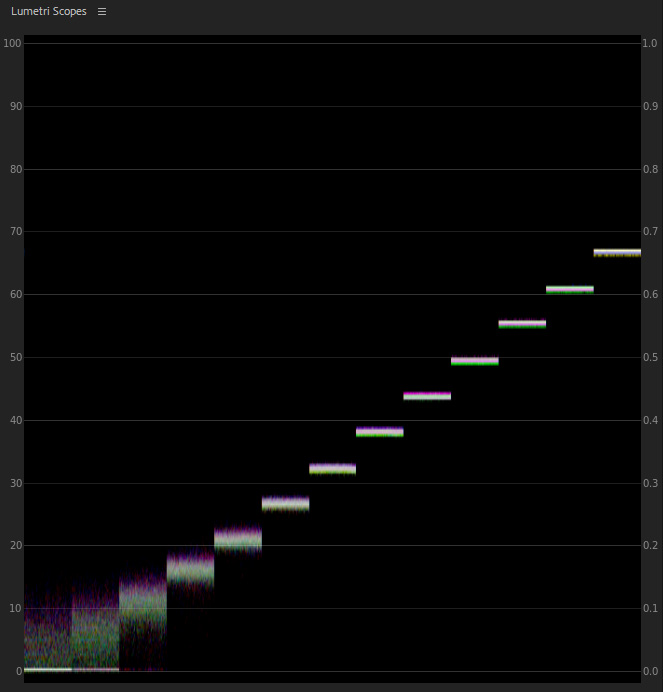
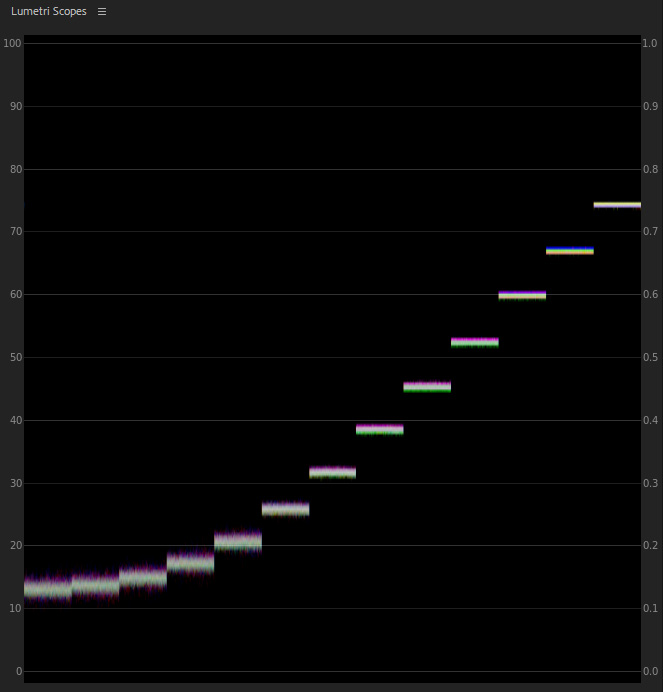
One of the huge advantages of working within ACES is that gaps between stops are equally spaced. Each stop is the same distance apart on the waveform. So it's truly logarithmic (conventional log curves have a significant toe in the shadows) - each doubling of light results in a boost of the same number of IRE units. This makes it incredibly easy to colour correct as any effect that globally affects the waveform will correct your footage as if you were making adjustments to linear RAW data. Here's twelve stops of VLog-L straight out of the camera: And here's that same step wedge in ACES CC colour space: Brightness, contrast and WB adjustments now become easy and accurate. If you're trying to pull something out of the toe of a conventional log curve it's a disaster as the contrast is different to the linear part of the curve. So in that situation where you're metering roughly and your WB is a bit off this workflow will give matched shots that are identical except for noise in underexposed shots and highlight clipping in overexposed shots. BUT it's a pain because it's an extra step. If Premiere could do ACES I would do it there. And for sure you can already do it in Resolve. Incidentally, it's also now very easy to see when things get noisy. How many clean stops for the GH5 shown here? I count 9! This is just based on me noticing that when I'm on evaluative or center weighted metering the thing that makes the meter go wild is having sky in the shot. 18% grey is supposed to be the average reflectance of the average scene, so I think that the ground is much closer on average to 18% than the sky is (although clear north sky is supposed to be 18%.... not where I live lol!) So things like concrete and grass are quite close to 18%. So what I'm talking about here is pretty much just looking at the meter as I take the camera out and switch it on to give me a rough ball park of where I should be, then fine tuning it with zebras, waveform, LCD chimping etc. This is all very much in the same run and gun spirit of what you're talking about - just trying to get shots that are within a stop or two of where they need to be.
-
What are the 'correct' skintone values in IRE for HLG acquisition?
hyalinejim replied to Mmmbeats's topic in Cameras
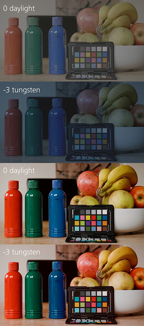
I also do a lot of run and gun type stuff and don't have time to be faffing about with getting perfect exposure. I take a glance at the exposure meter (with the camera pointed towards the ground rather than the sky), the zebras (set to 80 so I can see what's actually clipping in the file) and sometimes I switch on the waveform for a quick look at that. And I also base a decision on the LCD or viewfinder (it's quite easy to see if things are overexposed but underexposed can still look fine, so it can be misleading). So I end up with a variety of exposure levels but I'm usually within one stop. Sometimes it's two stops, which is pushing it a bit, but that's life! When it comes to colour correction, having something two stops off in V-Log can be a real pain in something like Lumetri in Premiere. The exposure slider does not behave like, say, the exposure slider in Lightroom when adjusting RAW. So the best way around that I've found is using an ACES workflow in After Effects, where as if by magic you can reliable make RAW-like (ie; rational and consistent) adjustments to exposure, contrast and white balance. And if I'm feeding the signal into a good LUT, then that's all I need. It's an extra step in the workflow though, so usually I don't bother. Or don't need to, if I've already got exposure and WB quite close while shooting, so that Lumetri doesn't fudge things too much. I imagine that in Resolve it's possible to make proper adjustments to Log or HLG (so that if I underexpose 2 stops I just need to add +2 in post and I get the same image, but noisier, than if I had exposed correctly)... but I haven't made that move to Resolve yet. But it's a real pleasure to be able to do that when needed. Here's an example of the same scene shot at correct exposure with daylight WB, and then 3 stops under with coolest WB. This would be a nightmare to correct with conventional methods but with ACES it's very, very close. There is a red tint in the darkest areas of the corrected underexposed shot, but I think that's due to red chroma noise being boosted.
-
What are the 'correct' skintone values in IRE for HLG acquisition?
hyalinejim replied to Mmmbeats's topic in Cameras
So if you expose that chip so it sits at 42 IRE on the in-camera waveform for VLog-L then that should be the technically correct exposure. Then you can note where the relevant skin tone chips fall on the waveform, and switch over to HLG to cross reference the values. That said, I've found that using an 18% grey reflective target as a guide to exposure gives varying results, for a few reasons. Firstly, the angle you hold the chart at in relation to the light source will raise or lower the brightness of the grey patch quite a bit. Say you've got one key light at 45 degrees above and to the right of the subject. You'll get significantly different readings depending on whether the chart is facing the camera or angled towards the light source. Secondly, in bright contrasty sunlight a grey card exposed at 18% gives results that are far too dark, to my eyes. The more you look into things like this the further you go down the rabbit hole! So I think that grey card metering will get you within a stop or two of where you need to be, but I would always adjust to taste. How about spot metering on skin using the camera's exposure meter? It should work the same regardless of picture profile. Of course, in contrasty lighting skin won't be uniform either... I don't think there's any perfect method of exposure. Even incident metering gives varying results if there's backlighting. I would love to be able to perfectly expose though. It would save that little bit of time in post. -
What are the 'correct' skintone values in IRE for HLG acquisition?
hyalinejim replied to Mmmbeats's topic in Cameras
I don't know for sure, but if X Rite says that the second large chip is "40 IRE" then surely it must be 18% grey. -
Image thickness / density - help me figure out what it is
hyalinejim replied to kye's topic in Cameras
Sorry for the multiple posts, but I keep running out of time to make edits 🙂 To illustrate my points about contrast, the only difference in this comparison is the RGB curve. Here's Adobe Standard with linear curve from ACR: And here's the same shot with a Fuji 400H box speed curve applied so that middle grey remains middle grey. Watch what happens with the shadows and notice highlight roll off on skin is softer: (The shadows are also warmer, but that's just the nature of the shadow colour cast for that particular film stock).
-
Image thickness / density - help me figure out what it is
hyalinejim replied to kye's topic in Cameras
And I think this is one of the ingredients in "image thickness"... but probably not the only one. Anyway, a very interesting discussion with some great examples and a lot to think about here. Another difference I've noticed between film and digital (photos) is that the contrast curve tends to be different. Film has more contrast in the shadows and less in the highlights compared to digital. This makes sense when you consider that film has about four stops under middle grey when shot at box speed, and many more above. For digital it's the opposite: about four stops above middle grey (it varies with camera and with profile, there will be more with log) and many more below. So the film print curve is pushing down those low contrast shadows in the toe of the negative to actually make them black, but the highlight curve is much more restrained so that it can hold onto those 10+ stops that reach up into the shoulder (when shooting Vision3 negative film or Portra 400 or Fuji 400H.... you wouldn't get as much highlight headroom with other film stocks). Finally, that blocking up of the shadows that you get when film is exposed at box speed or slightly underexposed is actually a very useful visual tool because it focuses the eye on the midtones and highlights. -
Image thickness / density - help me figure out what it is
hyalinejim replied to kye's topic in Cameras
The situation with film is complex, as so many things in life are. From my tests, the midtones of a scene shot on negative film are most saturated when exposed at +1 or +2 above box speed, and then brought within range when scanning. Nevertheless and regardless of under or overexposure, a comparison of the same scene shot on film and digital will show that the film has more saturated shadows and more desaturated highlights than the digital, when the contrast of the digital is made to match the film scan and when the global saturation of the digital is altered so that midtone saturation matches. Phew, that was a mouthful! I think what Art Adams was referring to in his article that mentions desaturated shadows on film is with regard to a print film emulation lut. I could be wrong but he seems to be referring to the fashion for lifted and desaturated shadows that seeks to emulate the toe of film. You can see that effect clearly here. This is Fuji 400H exposed at box speed: And this is the same chart exposed at -2 but scanned to bring up the midtones. Note how the shadows are lifted, because the shadow areas of the chart are now very close to the base fog of the emulsion, and are hardly registering at all: Yes, it's a less saturated image than the correctly exposed one. But if you took a digital shot of the same chart at the same exposure level, applied a curve to match the contrast and altered saturation so that the midtones match.... I think you'd still see the same pattern of more saturation in the shadows for film, and less in the highlights. So yes, there is a kind of saturation curve for film: as you increase stops of exposure, saturation increases up to the midtones and then starts to decrease. BUT (!) at each exposure level when proper contrast is applied (either by printing onto paper, projecting onto a screen through transparency, or applying a gamma curve when scanning) the shadows end up more saturated and the highlights less than you would find in a digital file given the same treatment. Now, I'm not exactly sure why that is. It sounds logically impossible, but I've seen the proof of it countless times. Note, I'm basing my observations on scans of negative film from a Noritsu minilab scanner. This is not the same process as negative to print film in the motion picture industry. It might be that the Noritsu is controlling saturation in this way. However, if it is then it's doing so to emulate the behaviour of a darkroom print. Yes, you and @KnightsFan have shown some great examples of this. However, aside from concerns with exposure, lighting, whether the scene is wet or dry etc., it seems to be the case that two cameras can shoot the same scene and be given the same post treatment, yet one camera will yield a "thick" image and the other will yield a "thin" image. What causes it? I think it's the saturation response across the tonal range. Digital images look thin because of the way they (probably accurately) capture saturation from shadows to midtones to highlights. If you want your image to look thicker you need to boost shadows and decrease highlight saturation. But you need enough colour information in the file to do that. -
Image thickness / density - help me figure out what it is
hyalinejim replied to kye's topic in Cameras
Yes, it's this transformation in action, as a lut: So there are hue transforms going on as well as saturation transforms. But the saturation aspect of it you could totally do in Resolve. Art Adams came up with this for matching F55 to Alexa And my point is to do something similar for digital to film, the leftmost point on that curve should be raised to boost the shadows. But I don't know if that curve is Log to Log or whatever, in which case it might be right. I think Rec709 to Rec709 it might possibly need to be more like this: But I haven't tested it extensively, other than to notice that the results of my tinkering weren't as nice as the lut (because the hue changes are important too). So that adjustment is just a guess off the top of my head and not based on testing how it looks. But you get the general idea.... it's not just a highlight roll off, it's a more or less constant change throughout the range.
-
Image thickness / density - help me figure out what it is
hyalinejim replied to kye's topic in Cameras
Here's a pair of images that illustrates my point about shadow saturation more clearly. This is the same digital still with Adobe colour versus film emulation colour. default: film emulation: The highlight roll-off is just about observable on the foreheads in the second image compared to the first, and it's very clear that there is a shadow erm..... roll-on?
-
Image thickness / density - help me figure out what it is
hyalinejim replied to kye's topic in Cameras
Don't forget about shadow saturation! It often gets ignored in talk about highlight rolloff. The Art Adams articles kye posted above are very interesting but he's only concerned with highlight saturation behaviour. Here is a photo taken on film (Kodak Pro Image 100, the same as used in my example above) Here is the same scene shot as a digital RAW still with Adobe default colour but with contrast matched using RGB curves in ACR. You'll notice that at first glance it's more saturated: Now here is the same digital shot with a LUT added to match the saturation and hues of the midtones. These now look like a good match. But look carefully at how desaturated the shadow areas look. The saturation has been globally lowered and the shadows are looking (dare I say it?)..... thin! Finally, here is the same shot with a tweaked lut that boosts saturation in the shadows but keeps midtone and highlight saturation restrained. Now the shadows have deep blues and it looks more like the film shot. Is this a thicker image compared to the version with default colour? I definitely think it looks nicer. Again, open all in tabs to notice the difference. Night mode is good too 🙂
-
Yes please, this would save a lot of scrolling!
-
Is this little hand symbol to show that the member is new?
-
Image thickness / density - help me figure out what it is
hyalinejim replied to kye's topic in Cameras
Let me ask a question! These are ColorChecker patches abstracted from -2, 0 and +2 exposures using film in one case and digital in the other (contrast has been matched). Which colour palette is nicer? Open each in a new tab and flick back and forth. ONE: or TWO:
-
Image thickness / density - help me figure out what it is
hyalinejim replied to kye's topic in Cameras
This harks back to deezid's point: From my investigations film does seem to have much more saturated shadows than what a digital image offers. If you match the saturation of the midtones of digital to film, then the shadows will need a boost to also match... maybe by around 25-50% at the lowest parts. It's a shockingly huge saturation boost in the shadow areas (and the highlights would need to come down in saturation slightly). I'm not talking about log images here, I'm talking contrasty Rec709. The digital capture is probably closer to being an accurate representation of the level of saturation in reality. But film is transformative. We want our images to look better than reality! If we talk about memory colours (sky, foliage and skin) the preferences of photographers and middle American shoppers led to altered hue and saturation in Kodak film stocks. So it looks like we prefer skies that are more cyan than in reality, foliage that is cooler and skin that is more uniform, and tending towards tan (Fuji skin tends towards rosy pink). With 10bit I can get decent, filmic colour out of V-Log! But 8 bit would fall apart. -
Panasonic S5 Entry Level Full Frame seems to be real...
hyalinejim replied to jgharding's topic in Cameras
Is the "link audio and video" timeline button deselected? -
Image thickness / density - help me figure out what it is
hyalinejim replied to kye's topic in Cameras
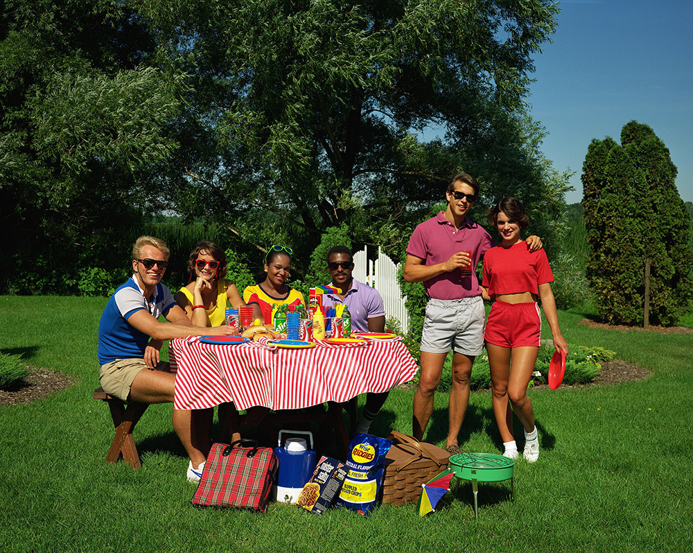
1980s Kodak test image from linked article 🙂