hyalinejim
-
Posts
970 -
Joined
-
Last visited
Content Type
Profiles
Forums
Articles
Everything posted by hyalinejim
-
 This is probably what Adobe were trying to do with the Lumetri colour panel, to provide Lightroom-like controls for video users. The only problem is that it can't tell what the input is, so its behaviour is nothing at all like Lightroom, unfortunately. I'm not sure if this is related or not, but I remember there was a plugin called Logarist (which I never used). The idea was that you tell it what kind of log you're using and then its behaviour is consistent across cameras.
 -
Yes, exactly! If you can get your NLE to make linear adjustments to the data then corrections are a breeze. I force Premiere to do it using LUTs. Log to ACES - corrections - ACES back to Log - Log to look LUT. It's a clunky workaround, but it works!
-
While I agree that it's very pleasant to grade a project where all clips have the same exposure level, I've found that I really like the ACES CC curve - because it's perfectly straight! This makes matching exposure a doddle. I just need to move the whole waveform up or down to match one shot with another. Again, if I could slap on a LUT and walk away I absolutely would - I would even burn it in! But for real world shooting it's incredibly difficult to nail exposure every time. And by "nail" I mean get the exposure that looks best to me. The topic of how to expose correctly is a rabbit hole when shooting outside of the studio: angle of the grey card to the light source, how to use a reflective meter correctly, worrying about K constants etc. Even when shooting negative film, there is always room for adjusting the brightness of the image in the printing or scanning process to compensate for "errors" in exposure. For me, with digital video, the ideal solution is to shoot log, adjust the signal in ACES CC space to balance all clips, and send that to a nice conversion. This is a slightly different approach to what @kye suggests in the first post, I think, which is to not accept a given conversion as is, but to grade each clip to taste after the conversion. Instead, I have a conversion that I feel is nice enough without further tweaking, but I am using ACES to digitally re-work the signal in such a way that it's very similar to what you would get if the scene were brighter/darker, high-key/low-key, warmer/cooler. In this way it's actually very similar to shooting RAW photographs and using a RAW converter. And it allows for conscious decisions such as ETTR strategies, as well as compensating for errors. So my post work involves a brightness slider, a contrast slider and a colour wheel. And that's it!
-
If was able to nail exposure and white balance in every shot I wouldn't need any tweaking other than contrast. But I don't think anyone expects there to be a magic transform that doesn't require some small bit of work. We also want to leave ourselves a bit of flexibility in deferring some decisions until post.
-
Lol! I have used just one LUT for every single client job I've done over the last 5 years. It emulates the colour response of slightly overexposed Portra 400 film. I pop it on and adjust brightness, contrast and white balance in ACES space before the LUT. It takes 15 to 30 seconds to do most clips, and makes matching shots a breeze. I've made a new version for myself every time I get a new camera, so technically it hasn't been just one LUT, it's been three. But it does the same thing for each camera.
-
Yes, I agree. I used that liitle APSC one on a bunch of interviews and ended up blurring the footage.
-
Too late to add an edit, so here it is: Yes, you're right, in development you can adjust the contrast and density (exposure) of the negative. But ECN-2 is a fixed process, there's a recipe to follow. Let's say you didn't have enough light and knew you underexposed the scene. You would have to send an instruction to the lab to push that whole reel 1 stop or whatever. Now, bear in mind that this is my understanding. I could be talking out my ass here!
-
@TomTheDP I think there is a "second exposure" when the negative is exposed to the print film. This is the origin, I seem to remember reading, of the term colour timing - you can control the brightness by adjusting the duration of the exposure. So if you had overexposed your scene to get cleaner shadows, let's say, you would now underexpose it to the print film, I imagine. I guess it was also possible to introduce colour filtration at this stage to correct for "white balance". I'm basing all this on half-recollections of things I read years ago, so take it with a pinch of salt. But certainly when you expose a negative to photographic paper, this is how it's done. I've done a bit of that and it's fun!
-
I went through a phase of trying to find the perfect cheap (non-L) EF zoom to use for film photography. I was looking for something small and relatively lightweight. When I tested them on digital they were all kind of horrible, specifically in terms of veiling flare, which I dislike quite a bit. I guess I am a fan of more contemporary coatings. But it is fun shopping for lenses!
-
Panasonic S5 II (What does Panasonic have up their sleeve?)
hyalinejim replied to newfoundmass's topic in Cameras
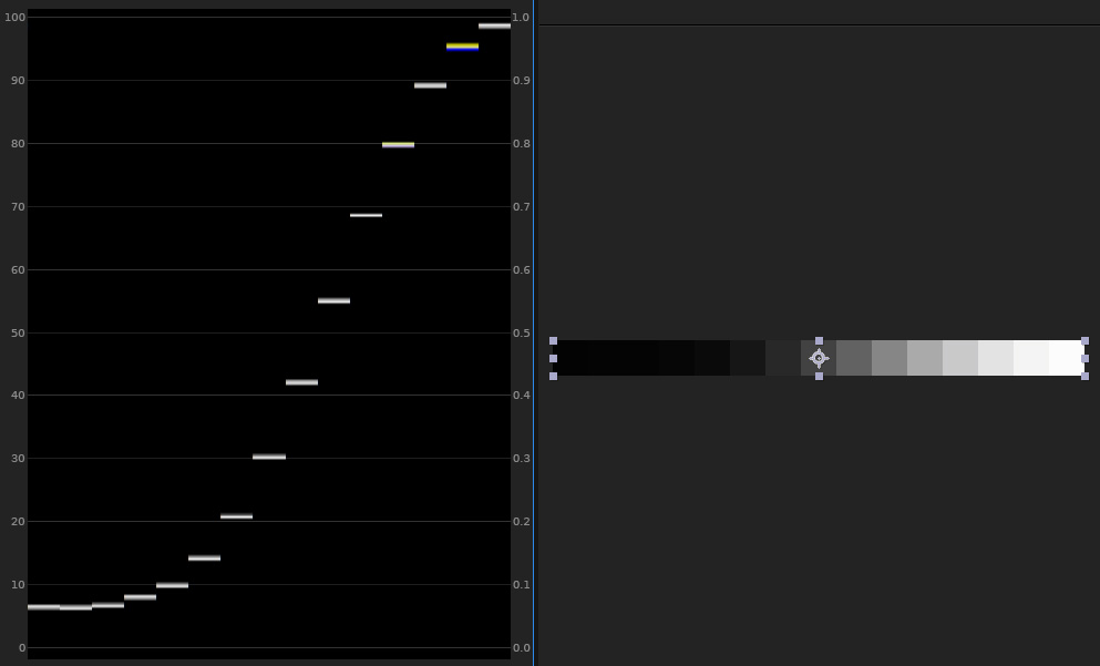
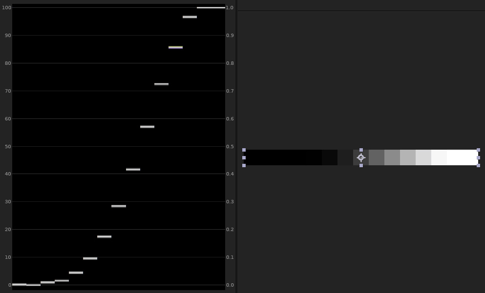
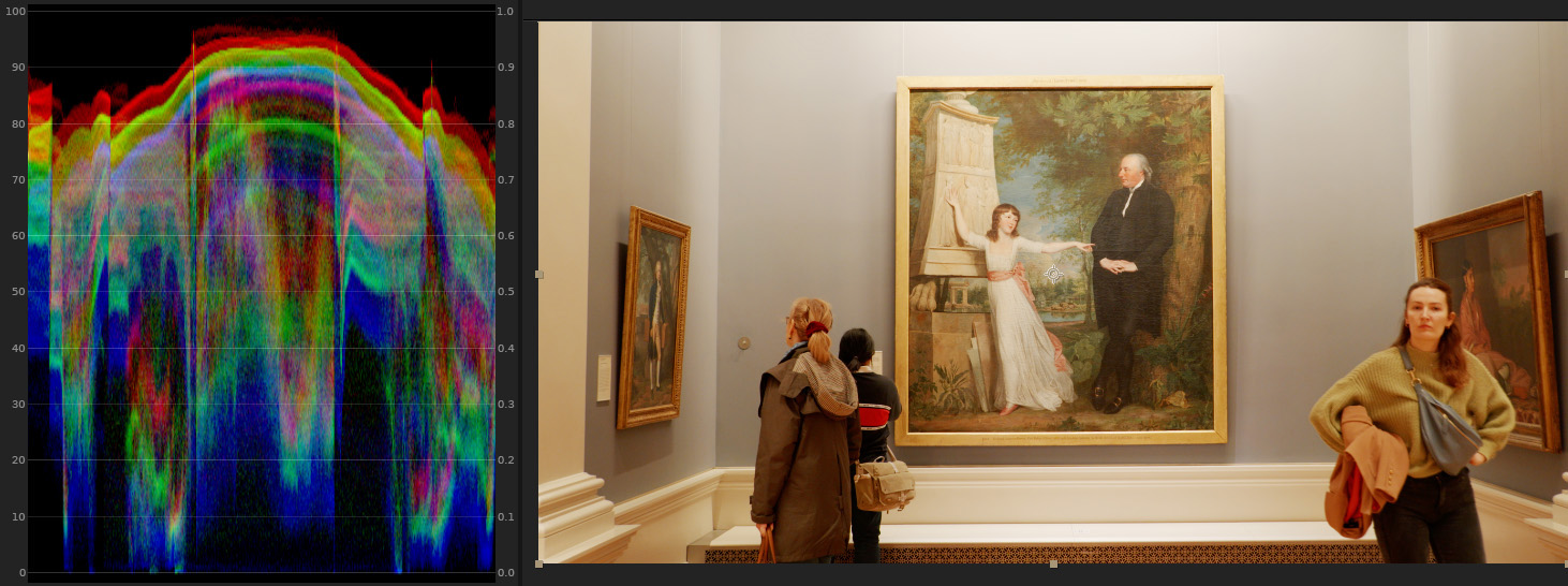
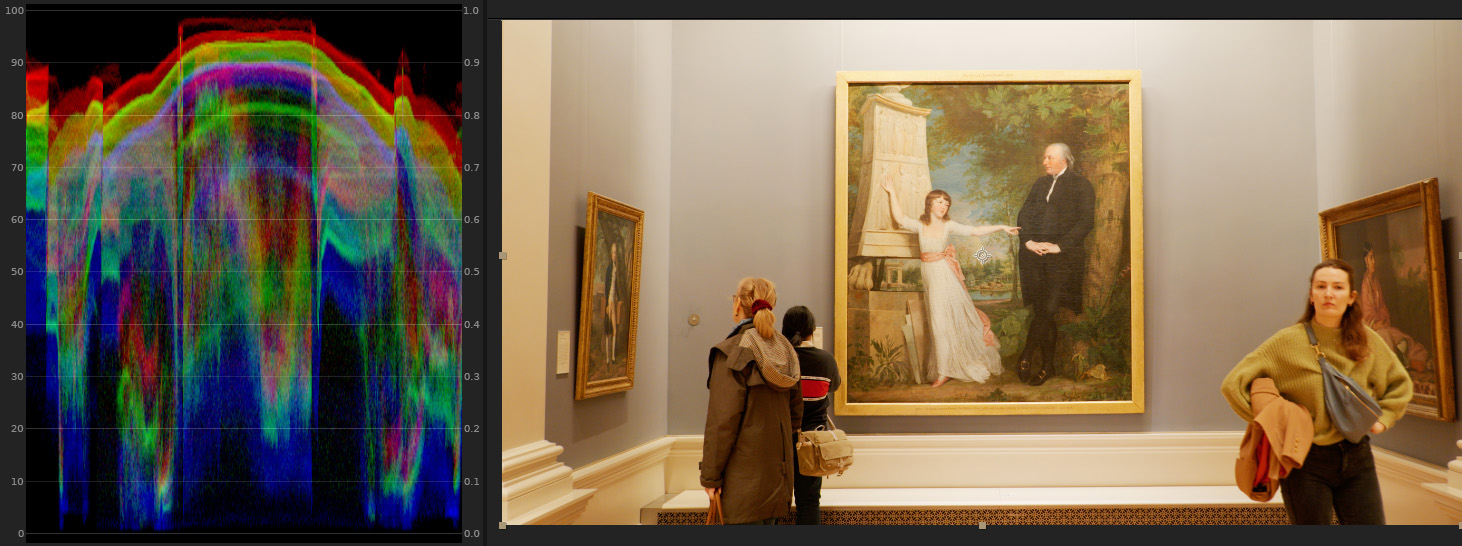
Lol, yes it was! It started off as me saying to myself "Oh, I suppose I might as well knock up an accurate colour lut for my new camera, should probably take an hour or two", but it ended up taking a little bit longer than that! It's an interesting idea that the V35 to V709 LUT is primarily designed for monitoring. It certainly works very well in that regard when it comes to colour because, as you say, there's very little clipping or over-saturation. But I always found the curve a bit weird for these reasons: Middle grey stays at 42 IRE. But middle grey for Rec709 is 49 IRE. The shadows are lifted. It looks OK on a Rec709 display, ie: dark areas do look dark: But on an sRGB display you can never get true black without pulling the shadows down after the LUT. Panasonic says that "Output is in legal range only" but if you convert the output from legal to data levels then the shadows are properly dark, but the highlights go into the superwhites, which is annoying: I had a good long think about what kinds of curves to supply with my conversion. I settled on Panasonic's default curve (for those that are used to it) No curve at all (for those who want to create their own) A flat curve to just de-log the footage but keep highlight and shadow detail (for those who like to tweak exposure and contrast after the LUT. Middle grey = 49 IRE) A really nice, strong filmic curve (for those who like to tweak exposure and contrast before the LUT. Middle grey = 49 IRE) LumaSweet FLAT: LumaSweet FILM: Yes, without any gamut mapping or saturation control the more saturated colours get ugly fast. Here I've put the reference values of the chart as an overlay of little circles. If you can see them there's a discrepancy. Here's ACES V-gamut to Rec709 colour: LumaSweet Lifelike colour: So my conversion handles highly saturated colours pretty well, straight off the bat. Even compared to Panasonic's V709, it is usually better at preventing very bright or saturated colours from slipping off the waveform in the shadow areas, and almost as good in the highlighights: Panasonic V709 colour LumaSweet Lifelike colour
-
If the lens doesn't communicate the focal length metadata to the camera body (which I guess this won't as it's an old lens) then you need to enter it manually. For a zoom, it's a nuisance as you would need to re-enter the focal length every time you change it. There's a way to save a number of lens presets. So you could save 40 and 80 (if you're only going to use those two). Then there might be a way to assign the lens preset menu to a custom button. I'm not sure as I don't have my camera with me right now. But there would still be a few button presses involved. If you were planning to use the lens at the same focal length for the whole shoot then it would be no problem. But switching from one to the other and back again might slow you down.
-
That starting point I posted about in the S5II thread is designed to give reality-accurate colour, but for my own work I use a film emulation. Over the last few years I've profiled around a dozen different films, both negative and slide film. The best of these for the commercial work that I do is Portra 400, which is kind of the world's favourite negative film anyway. Since the GH5, through the GH6 and now the S5II I've used this emulation for colour and contrast. For me it's more convenient to slap on a LUT (a good one though!) rather than having to figure out how to grade each project, scene or clip from scratch. Then, the only grading I need to do is to make adjustments to brightness, contrast and colour balance before the LUT, perhaps saturation sometimes. The engineers at Kodak spent years researching and improving their film stocks to give use a really nice colour palette. It takes a fair bit of time and effort for me to make an emulation that works well. But once it's made I can fly through the grading process in post, which is very useful when there's a deadline, and get great colour. It's very rare that I would need to do intermediate or advanced grading techniques like adjusting individual hue ranges or isolating colours, although of course it's very useful to know how to do those things. I think ever since the days of VisionColor (I might be misremembering the name), a picture profile for the 5DII, I really liked the idea of finding a colour transformation I like for the camera I use and sticking to it.
-
I don't think that's quite right. If you follow the manufacturer's recommendations for development then you should get what you see on the data sheet ie: 16 stops for Vision 3 or whatever amount it is they're claiming, I forget the number. Do you mean the transfer from the neg to the print stock? The print stock would have a much lower dynamic range, because it's for projection, but so does your monitor. You compress the stops for the output device, in both cases.
-
Panasonic S5 II (What does Panasonic have up their sleeve?)
hyalinejim replied to newfoundmass's topic in Cameras
The problem is that there is only one conversion, the V35 to V709, but it's not accurate for all cameras because there are different sensors in them. I don't know if it was even accurate for the V35! Ideally, Panasonic would either calibrate the V-Log colour for each model so that it matches the input that the LUT expects (there is an internal transform from RAW to V-Log), or else create a custom conversion that's specific to each model. If you want an accurate as possible conversion for the S5II or S5IIx then LumaSweet Lifelike will do that job. From what I've seen of other cameras (GH5 and GH6) they're all significantly different from each other, and there's no real pattern to it, other than they all share bright, desaturated blues (though not to the same extent). Reds are all over the place between the three models. People complained about magenta skintones on the GH5. The GH6 has much brighter skintones (which looks nicer) but it's too far towards orange to be accurate. The hue of S5II skin is fairly accurate but it's so dark as to cause blotchiness. The only scope Panasonic has for calibrating colour across models under their current system is in the internal RAW to V-Log conversion for each camera. They're stuck with the problem of varying sensors (or colour filter arrays, IR filter, or whatever other hardware is causing the colour variations). They're stuck with a single conversion LUT. I guess the only thing they can tweak is the matrix that converts RAW colour to V-gamut. This is just a grid of numbers and is a very general kind of correction. Its effect on colour can be a bit like herding cats. And I would guess that this is why the colour varies so much between models. I'd love to know if it's the same problem with Canon and Sony, or whether their implementations of log are a bit more consistent. -
GH6 noise is supposed to be slightly worse than GH5, according to CineD as far as I remember. In the shots above, the lens was mounted to the tripod, not the cameras. So it is a real difference in FOV!
-
If it helps,the two cameras using the same lens on a tripod collar: GH5: GH6: This was a while ago and I think the light might have changed and I adjusted a Vari-ND? Looking at the skylight the pattern of polarisation changes. But it still should serve as a sharpness/detail comparison. It's interesting to note the slightly wider FOV of the GH6! It must be a slightly bigger sensor, or it uses more of the sensor than the GH5.
-
Panasonic S5 II (What does Panasonic have up their sleeve?)
hyalinejim replied to newfoundmass's topic in Cameras
Lol, @kye the amount of time it took me to make that simple video is just ridiculous! And I make videos for a living. I should have known better 😂 I am proud of the colour conversion though. I spent a long time trying to get it as close as possible without breaking the image. And that's the kind of stuff I do actually enjoy. For me, it's the digital equivalent of pottering around in the garden shed. -
Panasonic S5 II (What does Panasonic have up their sleeve?)
hyalinejim replied to newfoundmass's topic in Cameras
Drum roll please.... I've finally got around to creating and releasing a LUT that gives accurate colour on the S5II and S5IIx. Big thanks to @Andrew Reid for allowing me to post about this. It's available here: https://lumasweet.com/shop/p/lumasweetlifelikes5ii I'll get around to doing a write up on it at some stage. In the meantime, here's a YT video (don't laugh!) that I made about it. This might also be of interest to anyone who's interested in camera colour science in general, even if you don't have this camera. -
Well, I think that skies that are more cyan than purple are nicer but I'm not sure that lighter is better for things like sea and sky. When it comes to skin, darker reds and yellows is definitely not good as it makes skin blemishes more obvious. This is a specific problem of the S5II, though. It has darker reds than the GH6, for example. The GH5 has lovely bright reds, they're just too pink! Fuji emulations - I haven't looked into them at all, other than seeing some examples online that looked nice. I'd expect that the manufacturers of some of the most famous film stocks in the world, as well as some of the most famous digital colour workflows (I'm thinking of the much-praised colour output of the Fuji Frontier film scanner) would be able to create some pretty decent film emulations! But who knows! Maybe they're erring on the side of caution a bit too. But it's great to see a manufacturer offering an interesting colour profile for video. Panasonic's set of creative LUTs for V-Log are disappointingly crap. Yes, it's a very interesting question. For me, the colour palette is the first thing to get right. Then, do I want the split-toning (as he calls it) or not? All films have a colour cast in the highlights and shadows, none is perfectly neutral. And it varies from one stock to another, and it varies with exposure level. If I'm doing something stylised, then I'll keep it, if it's a nice cast (for example, Portra 400 exposed at +2 has extremely pink highlights such that some labs tell people not to shoot it like this). But if I'm doing a corporate video I definitely want neutral greys all the way through from shadows to highlights. When it comes to grain, I love it for still images. But for video it will get lost unless you can view a very high bitrate file, so I usually don't bother. I really like halation, but I haven't found a good way of accurately emulating it. Part of the problem is that it proceeds from highlight levels so bright that it exceeds the dynamic range of a digital sensor. Here's a GH6 Iscorama video that I've posted before, with film colour emulation, split toning (in this case blue shadows and orange highlights from Kodak Vision 3 - and I'd guess this particular stock is the source of the orange-teal look, as all speeds of the film seem to have it) and grain that didn't really survive the transition to Vimeo. You can download the original if you're a grain fetishist!
-
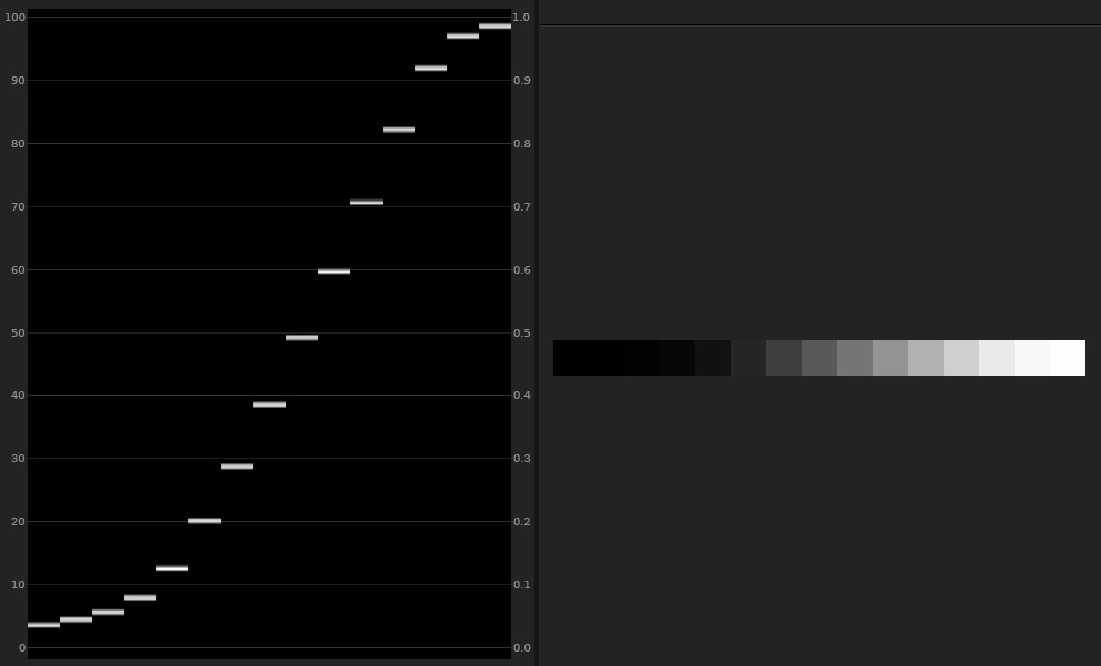
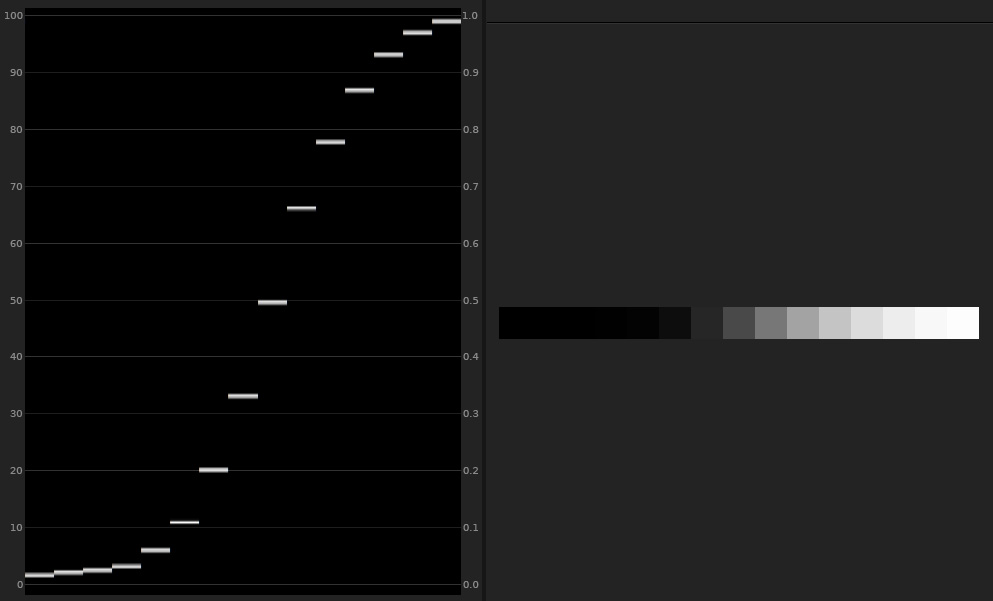
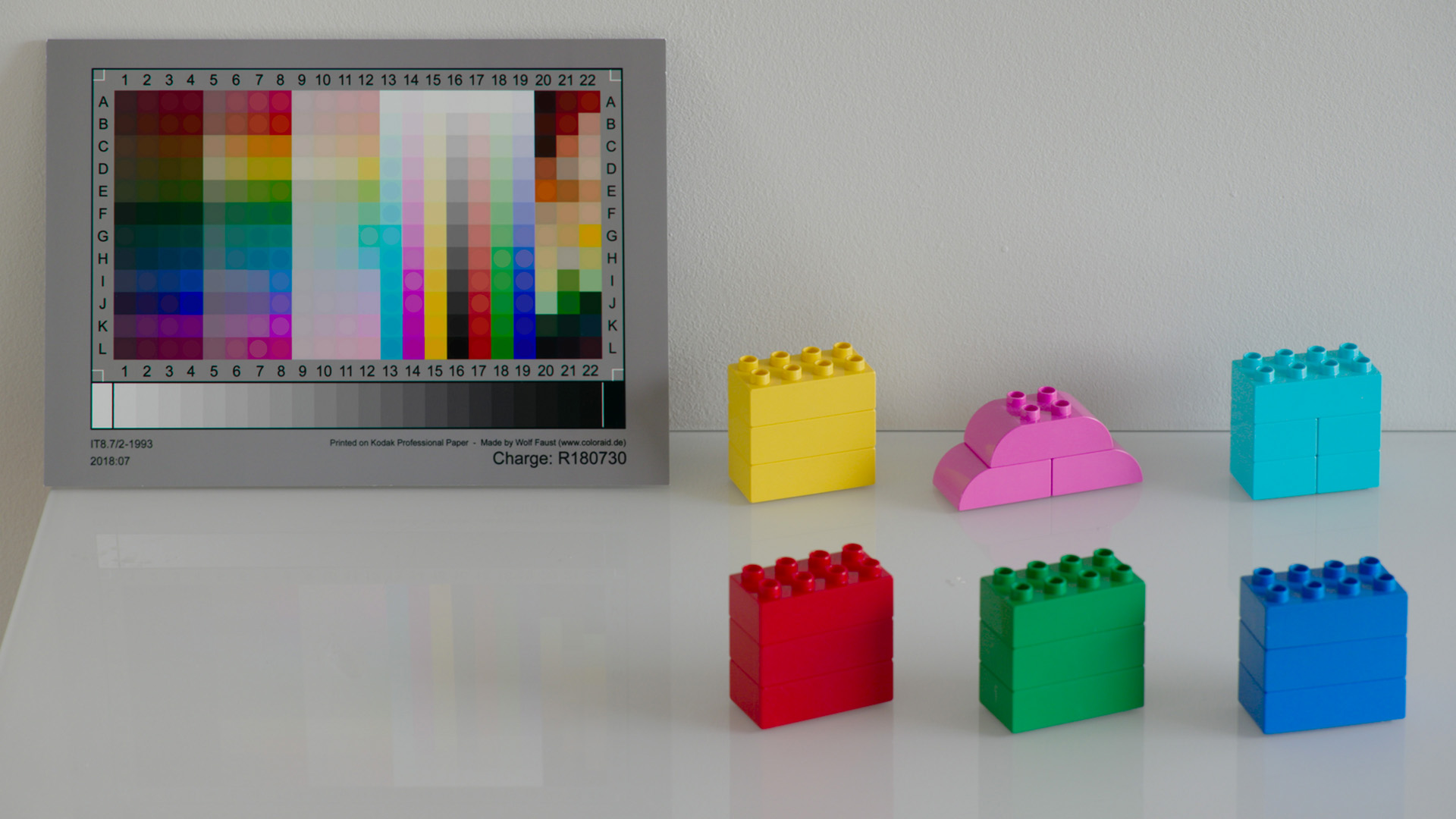
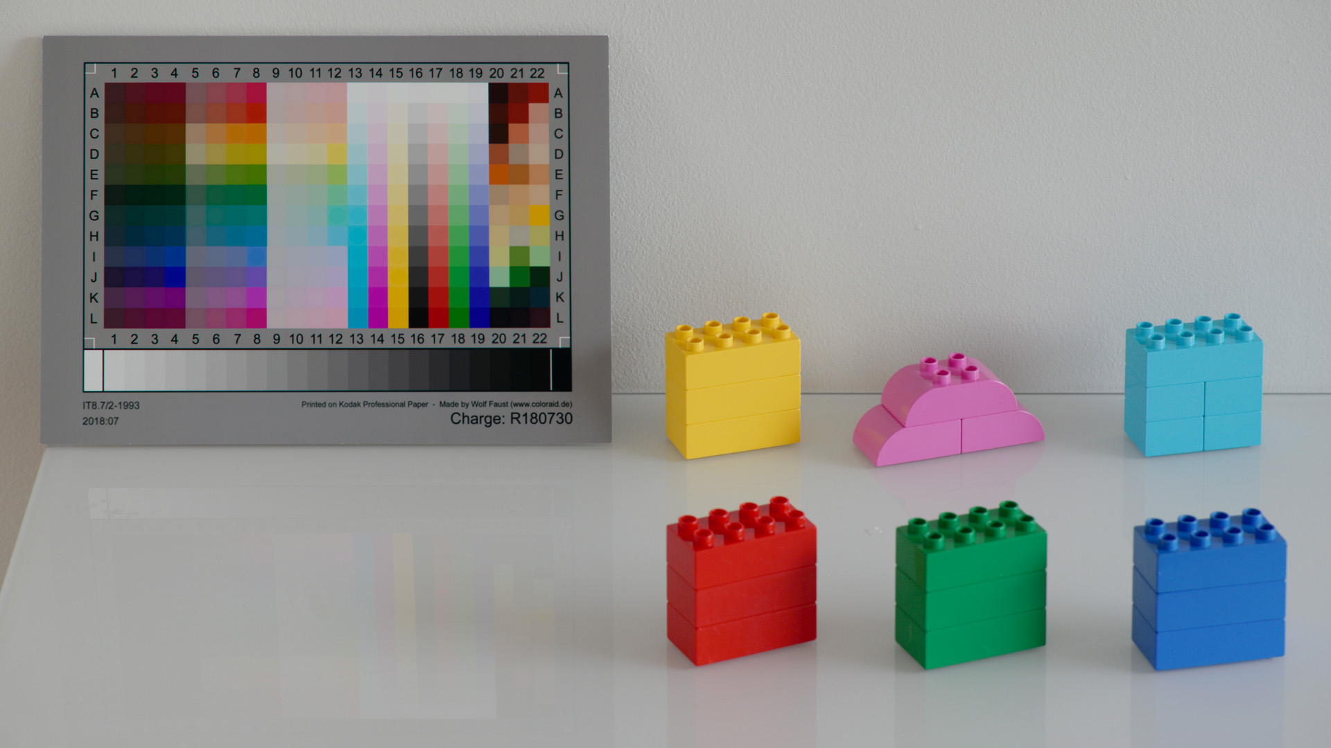
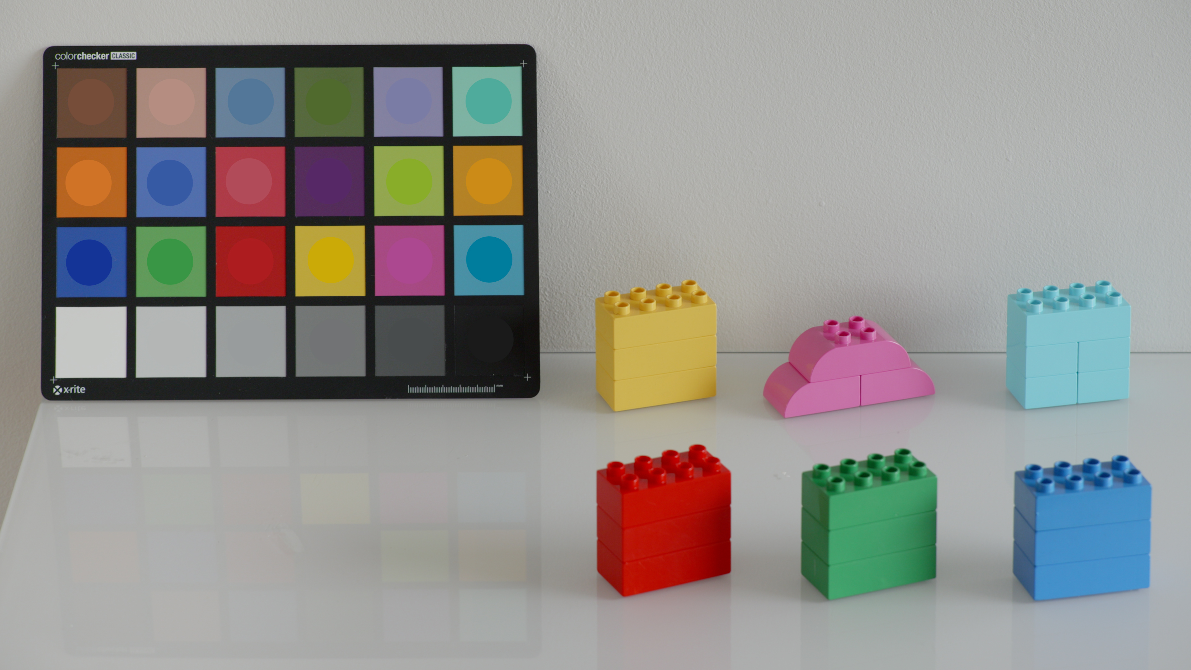
Yeah, I'm pretty happy with the results I can get, at least when it comes to still photography when shooting RAW. Here's Portra 400 at box speed and a digital RAW still with a custom emulation that I made: I can get pretty close with 10 bit log as well, and I use a slightly cleaner variant of this for my corporate videos. It's probably overkill for my clients who would be happy with a digital look, for sure, but it makes the colour grading part of the job much more enjoyable for me. I've mentioned this before, but I think that the people who are delivering colour to the consumers have been playing it safe. They're more concerned with providing colour that is free of artifacts and problems than they are with accurate colour. For example, in Camera Raw and Lightroom the default color profile for each camera is Adobe Standard (the others, Adobe Color, Adobe Neutral etc. are all based on this). Adobe Standard for all cameras has seemed to me get a lot more anaemic looking over the last 10. The reason for this, I would guess, is to avoid ugly colour artifacts like colour blocking, clipping etc. The Canon DSLRs used to have very accurate and properly saturated colour, but they would sometimes demonstrate colour problems in extreme conditions like concert lighting. There was a big thread about this on the Magic Lantern forum at one point. Nowadays, Adobe Standard is a lot more conservative. It's instructive to go to DP Review and download RAW samples of earlier DSLRs and compare them to recent models. I know that the Pacific Northwest (where recent samples were shot) is a bit grey, but so is London (where earlier samples were shot) 😂 Recently, I've been looking at Panasonic's V-Log to V709 conversion LUT which, presumably, is a good starting point for a grade. It's significantly inaccurate for recent Lumix cameras. In this image, the circles are an overlay of the reference colours according to X-Rite: Nevertheless, it's a conversion that is fairly robust. Colour integrity is pretty good in terms of colour blocking and clipping. (It's better on some cameras than others. In this pic, S5II, the reds get a bit blocked up, which you can see in the red lego block, appropriately). I haven't investigated Canon and Sony's log conversions, but I assume that their colour is similarly on the conservative side. If so, it seems that manufacturers are for the most part playing it safe when it comes to colour and leaving it up to the user. This makes sense as it can be damaging in reviews to have a colour transformation that is accurate, or pleasant, but creates colour artifacts. And if a large proportion of users are happy with conservative colour, or don't notice that it is conservative, then why rock the boat? I also think that the anaemic look is in vogue: contemporary TV drama sometimes looks like it's barely been de-logged. So, low contrast and low saturation is rife. In 10 years time this will be dated. It will be like the bleach bypass look of early 00s TV, or the "piss filter" of 00s gaming, or the orange and teal look of blockbuster movies. Of course, Fuji offers film emulations in-camera, so well done to them!
-
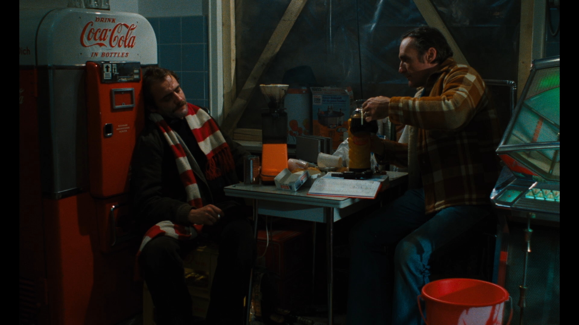
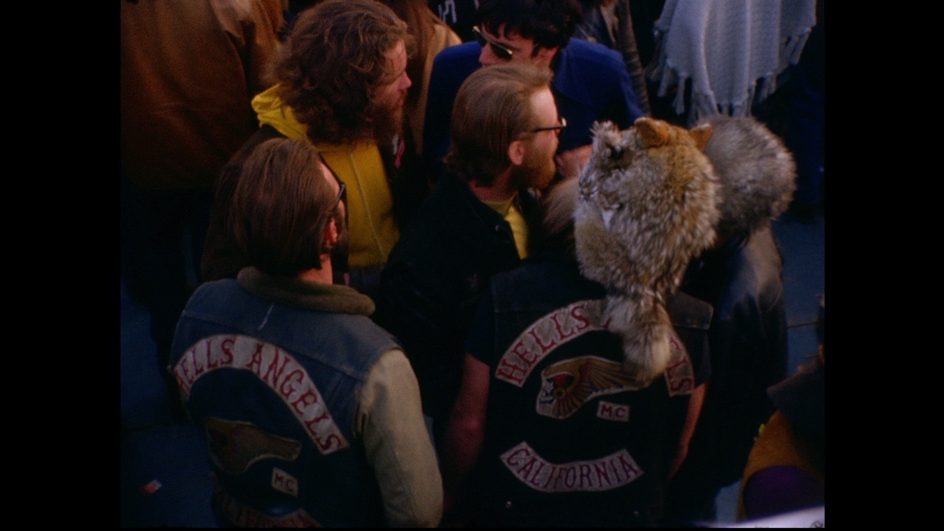
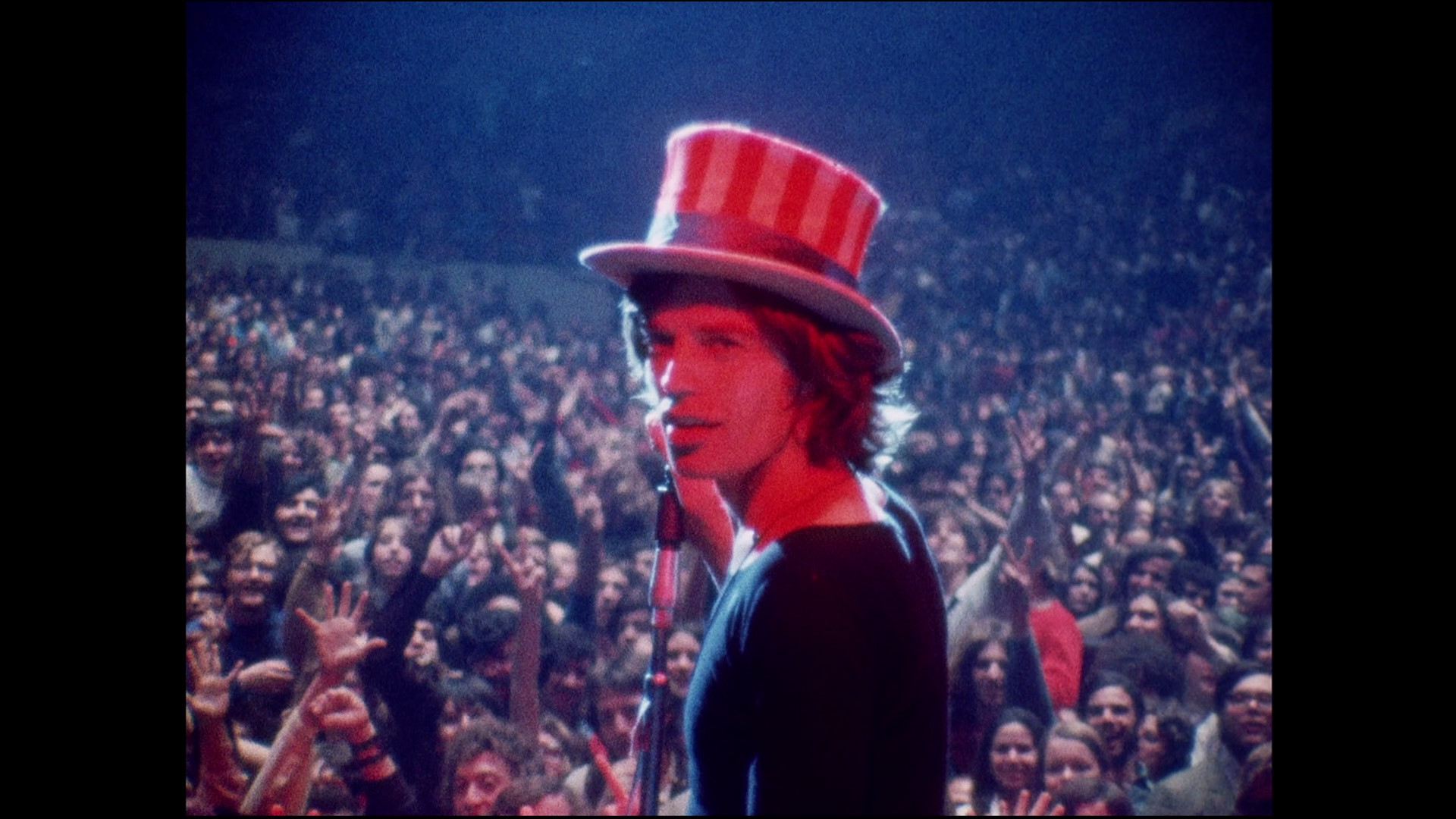
But what about the stills from Gimme Shelter, above? "Albert ran the camera, shooting his subjects with a zoom lens from across the room; David did the sound" https://www.rogerebert.com/mzs/cameras-keep-rolling-at-maysles-films That wasn't 500 people, if was 2, one of whom had a camera that shot film. If it had been a C300 or whatever, the documentary would be just as interesting, but it wouldn't look as good in my view. We should celebrate the look(s) of film, and try to recapture some of the magic that has been lost in the gradual enshittification of colour that has transpired over the last 10 years. I blame log for this btw!
-
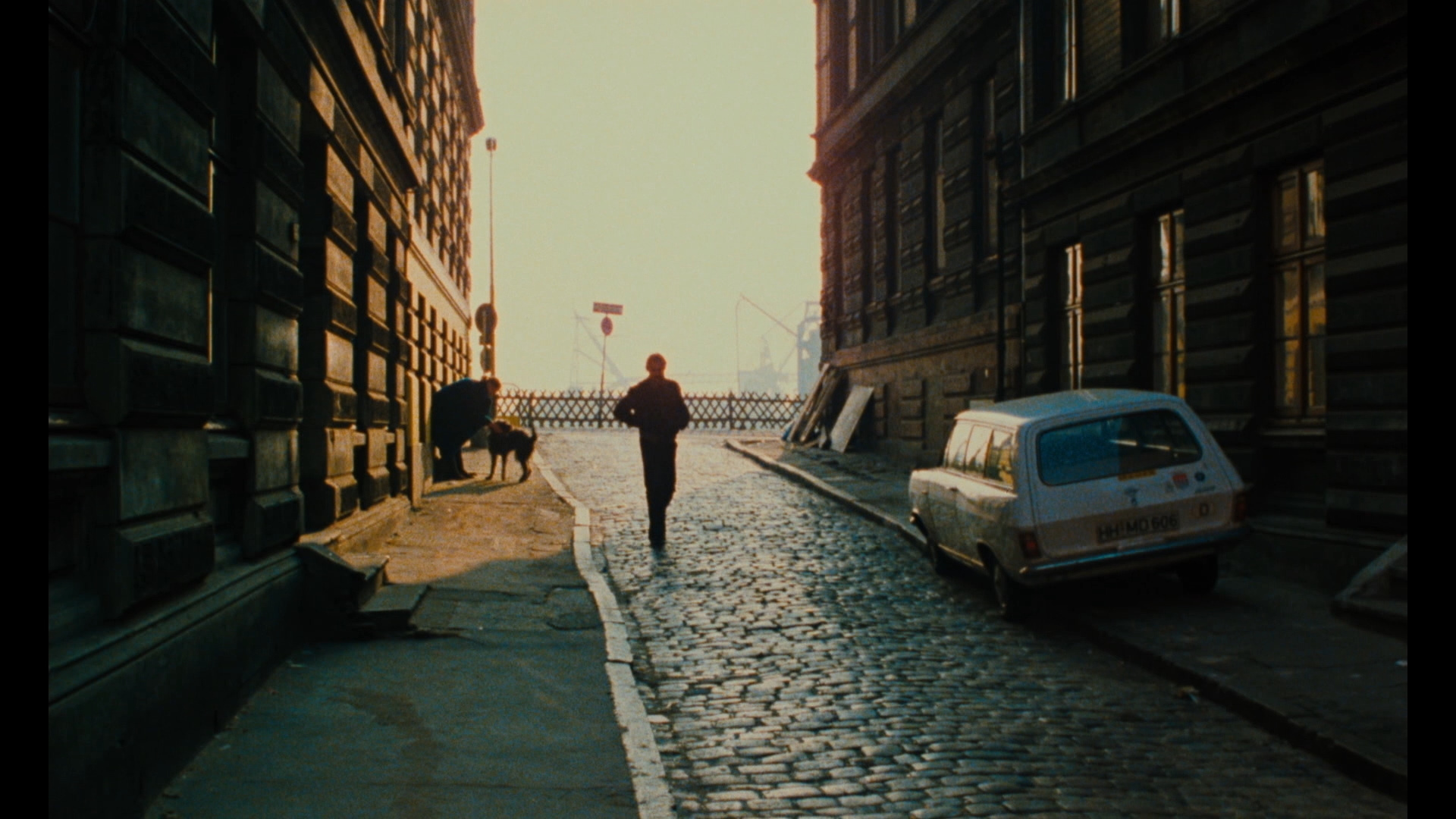
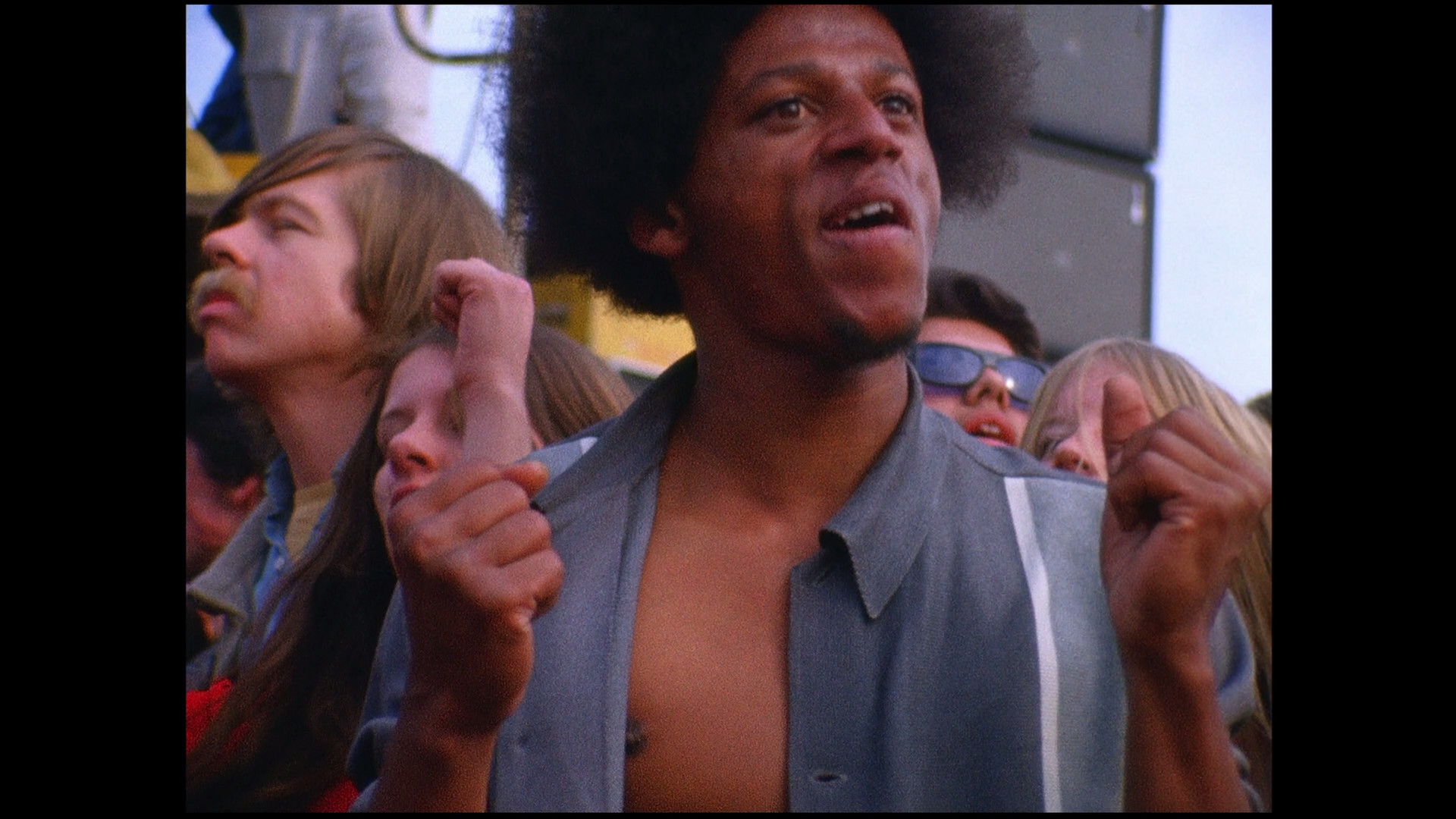
Just to pick one example that struck me recently, The American Friend, Wim Wenders, 1977 It's also interesting to consider documentary. The Maysles brothers were early proponents of cinema verite in the US (or direct cinema, or run and gun you could call it!) So it would have been one of them with a 16mm camera and a sound recordist. Here's Gimme Shelter (1970): If you're interested in cinema (as opposed to endless franchise regurgitations) then the Criterion Channel is incredible. Non-US users can Google how to sign up.
-
Yes, but if that movie had been shot on a digital camera it probably wouldn't have looked as nice. I watch a lot of old movies on the Criterion Channel and am regularly impressed by how good film looked.
-
Home brew and Magic Lantern for me!
-
Panasonic S5 II (What does Panasonic have up their sleeve?)
hyalinejim replied to newfoundmass's topic in Cameras
I shoot V-Log and don't burn the lut in. It definitely makes monitoring easier.