hyalinejim
-
Posts
970 -
Joined
-
Last visited
Content Type
Profiles
Forums
Articles
Everything posted by hyalinejim
-
@kye I'm at risk of slightly derailing this thread and for that I apologise, but here's what I'm talking about Top: WB in ACES (every stop is evenly warmed up) Middle: reference Bottom: WB in Lumetri (the warming correction is concentrated in the highlights)

-
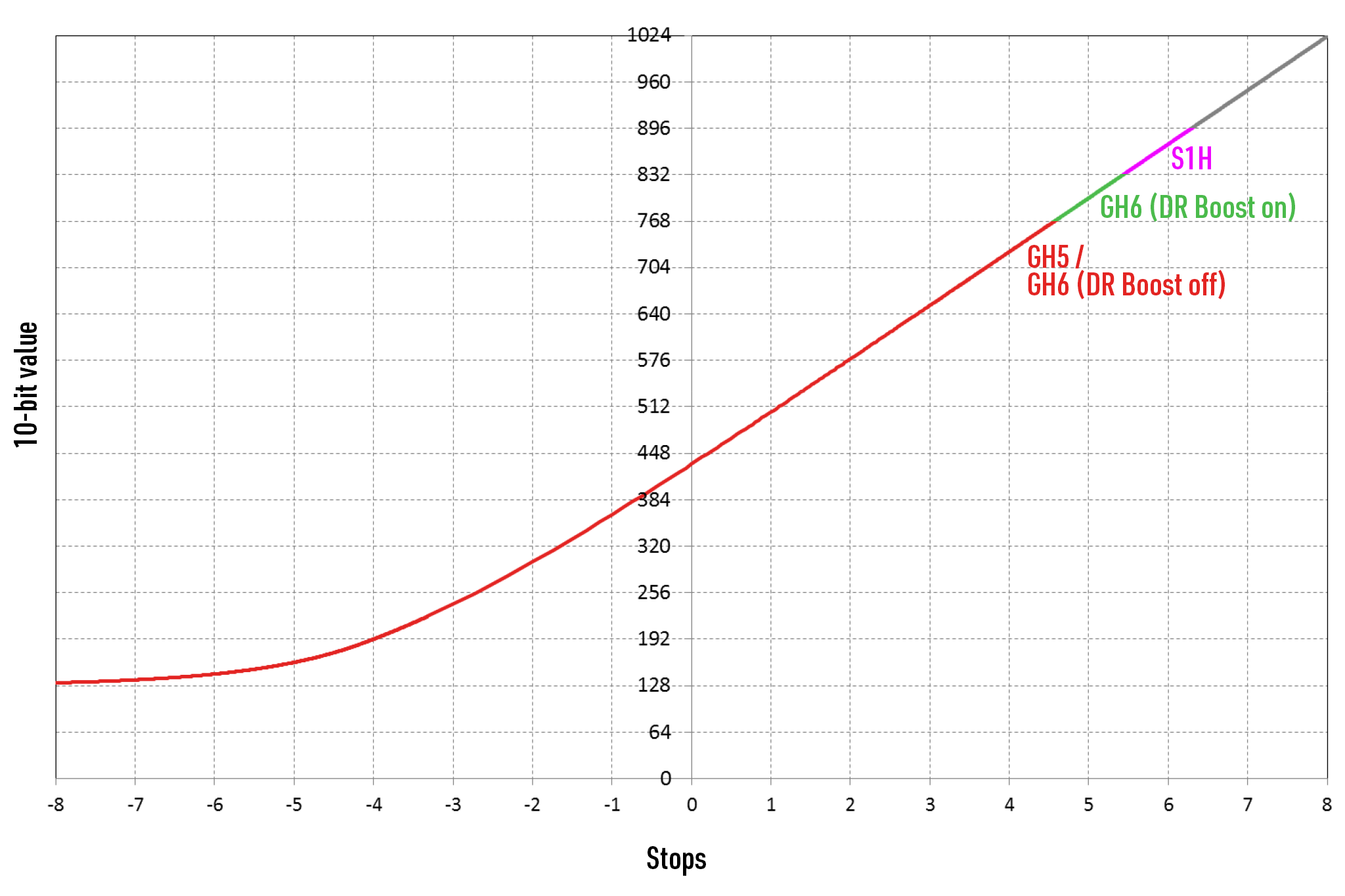
It looks to me like full V-Log is only needed in this case to accommodate the extra stop in the highlights when using DR Boost. In normal V-Log the highlight clipping point is the same as V-Log L. So it might as well be V-Log L. It won't make any difference, other than giving another stop of highlight recovery when using DR Boost. That's because you're using a colour correction tool that operates in a different gamma or contrast curve than the one you're shooting in. A helpful exercise that I think you'd enjoy is to shoot an evenly and constantly lit grey card at one stop increments from clipping to noise floor by adjusting shutter speed. Then extract a crop from each exposure level and distribute them horizontally in the frame. This will give you a step wedge and show you what the contrast curve of your profile looks like. Now look at this on a waveform while you attempt to do some colour balancing. You'll probably notice that, for example, the colour correction takes place mainly in the highlights and hardly at all in the shadows. That's what accounts for your difficulty in colour correcting footage with the wrong WB while avoiding colour casts. You need a colour correction tool that will evenly balance shadows, midtones and highlights. You can do this in RAW or in ACES. Maybe also the log grading tools in Resolve, I haven't checked that out.
-
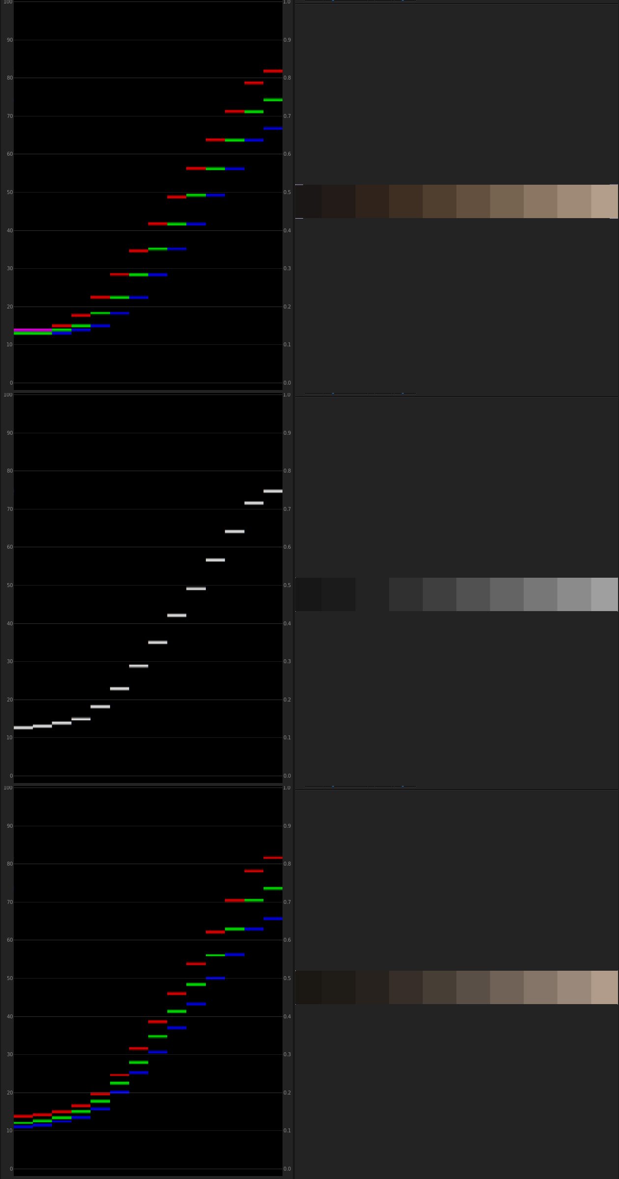
They do have a chart of sorts - it's a few posts back. Short answer: Normal VLog = 4 point something stops above, the rest are below DR Boost VLog = 5 point something stops above, the rest below middle grey
-
I think he's being political here. He doesn't explicitly say that it was an either/or choice. He seems to be saying something like "We did all these great things, and also we weren't able to do PDAF, but let's focus on what we did do. Next question please lol!"
-
Tally light on the back (and front) means no more (or at least fewer!) missed shots due to getting out of sync with the start/stop button cycle. From a comprehensive and short review:
-
The extra DR provided by Boost is nice. However, if you'd like to shoot at f2.8 on a sunny day you'll need 9 stops of ND, by my calculation. My Vari-ND is a maximum of 6.
-
There's no change in highlight retention unless using DR boost (ISO 200) 12ish stops (if we believe the numbers, how much is noise?) at IS0 250 with 4ish above middle grey and 8 below. 13ish stops at ISO 2000, 5ish above and 8 below.
-
This guy usually has some attractive skintones and VLog clips to download. No such luck this time round. Just a few flamingos at sunset: But for anyone hankering after the late noughties / early tweenies test footage vibe it might give you the chills 🙂
-
Yes, but (and for the benefit of anyone reading who might be considering a GH5) if you shoot VLog and get your footage into ACES space there are no WB or exposure quirks. The colour science is not so easily answered, however there is one solution in my other recent thread.
-
Have you tried WBing GH5 10bit VLog in an ACES colour space? You should be able to do it with relative impunity. I know there's no GH5 IDT, but you can sandwich Vlog to ACES to VLog and get your footage back to what it was, but with WB fixed. Incidentally, I don't think that GH5 VLog should be treated as Rec709 gamut. Admittedly, converting to V-Gamut gives slightly wonky colour (slightly pink skin) but leaving it as is gives much worse (horribly green skin).
-
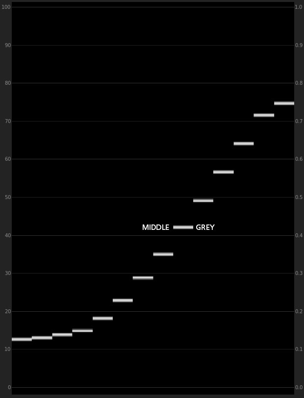
Indeed! In the case of the GH5 there are only four (and a bit!) above middle grey, which is not a lot really. So even though the camera has maybe 11.5 stops in total, most of those are in the shadows. So if you expose normally for a wide dynamic range scene then highlight clipping becomes very apparent.
-
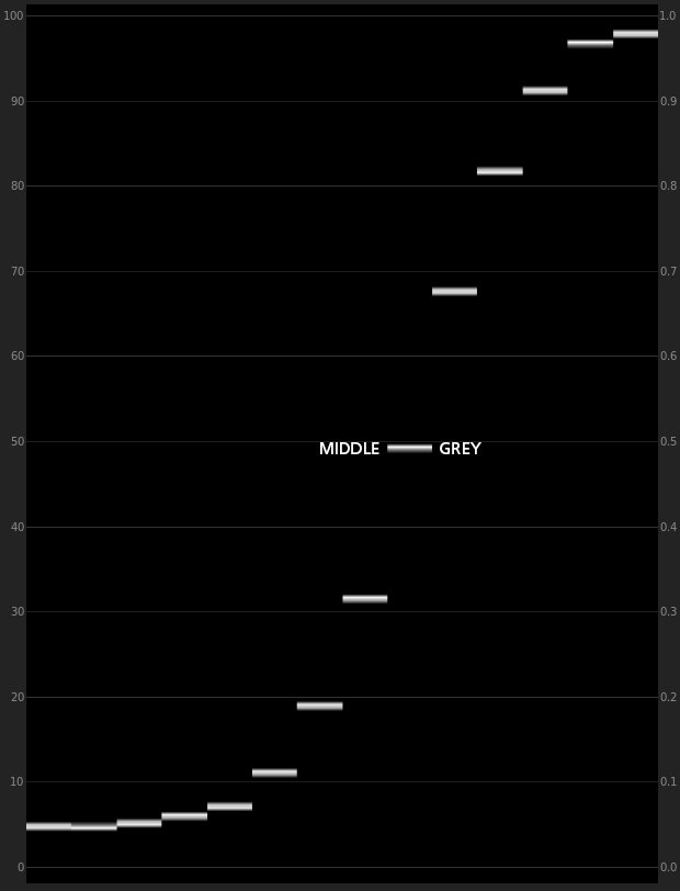
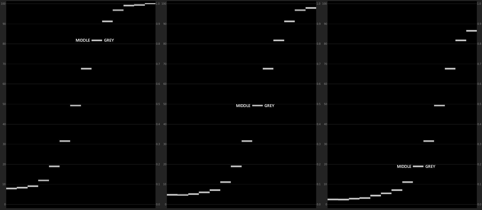
You're right that it's not designed specifically for the S1 but the difference lies in the colour response rather than the contrast response. If the footage is overexposed by 2 stops then yes it would need to be brought down by 2 stops in order to give a usable image. Thanks for trying it. It's the contrast level that I'm most interested in getting feedback on, so thank you for that! The reason that it's so contrasty is because it's emulating how a mini lab scans negative film.... and this is quite contrasty because the intended output medium originally was to make prints on photographic paper. What's very interesting to me is that I have found while making profiles for Lightroom that a level of contrast that's acceptable to me there and is similar to Adobe's defaults appears to be far too contrasty when applied to video. I have a few ideas why this might be so, and it might be a combination of factors - you can get away with more contrast in a photo because it's static, but with video it's likely that light levels are changing within a shot or sequence of shots, people move from light to shade etc. so lower contrast is preferable because these changes aren't as noticeable - perhaps photos have always been more contrasty because their traditional output medium (paper, reflected light) is less contrasty than that of video (tv or screen, projected light) - there is a recent (and in my view, regrettable) trend of doing very low contrast looks. This is either because people's brains have been fooled by looking at log footage for too long and so they don't add "enough" contrast when grading, or because consumer TVs at default settings have their contrast cranked up so much that this is the best way a colourist can get a TV show to look normal lol! I've already reduced the contrast level in this LUT from the scanner's default level. But perhaps it's not enough. On the one hand I want to keep as much contrast as I can built into the LUT, because this is part of the look that I'm trying to emulate. On the other hand I do recognise that feeling of dismay when you see that the detail in the highlights or shadows is no longer clearly visible in your shot. Perhaps, for video, people prefer to hang onto the dynamic range for as long as possible before making the decision to crush the highlights or shadows. Nevertheless, if the average scene brightness range is around 7 stops (which it is often assumed to be) then a LUT that preserves around seven stops of brightness should be sufficient... on average! Let's take a look at the contrast levels in this LUT in more detail, as an illustration of what I'm talking about. Here's a digitally generated 12 stop step wedge for V-Log L. Note the position of middle grey. There are 4 and a bit stops above it (the uppermost stop is the clipping point. Full V-Log would go beyond this). There are 8 stops shown below middle grey. (in reality the eleventh and twelfth bottom-most stops would dissolve into the noise floor) Next, here is the same step wedge with the curve from my LUT applied. Anthing above +2 is pushed into the upper highlights and anything below -2 is pushed into the shadows. The difference between stops is very much expanded around middle grey and compressed in the highlights and shadows But there are still around 7 stops preserved and the transition to highlights and shadows is smooth. However, if the footage is overexposed or underexposed, these exposure "errors" will be amplified by the relatively strong contrast. From left to right: -2 under, correct, +2 over: And here's how that would look on a real world image, in the same order from top to bottom: So with this level of contrast being employed by the LUT, the trick in your colour correcting pipeline is to get that signal within range before applying the LUT, as there's no hope of getting the shadows and highlights back afterwards 🙂 Incidentally, this image provides a good example of my current feelings about contrast (that we shouldn't be afraid of it). If you look at the underexposed image it's clear that the camera captured most of the detail outside the window. A low contrast curve would preserve this detail. But do you need it? I would say no, in this case. So I'm happy for that info to bleed out into white as it does in the "properly" exposed shot, as it's not the subject of the image - the interior decor and the seated figures are. An analogy that might help in understanding how I feel about contrast is to think of motion picture film. Here, the acquisition stock captures up 15 stops of dynamic range. But the print film stock that it's transferred to holds a fraction of that (and it was up to the "film timer" to decide how long to expose the negative to the print film). There's something similar going on here. If you can get the brightness of the log signal right then the results should look good.... most of the time. If it's a genuinely high contrast scene, though, like a white cat in sunlight and a black cat in shade, then the contrast of the log signal will need to be reduced. And actually, this is how I've graded my videos for the last few years, with only three controls (brightness, contrast, colour balance) directly on the log footage and then fed into a contrasty lut. However, having said all that I think I'm going to go and make lower contrast versions of this LUT. I'd like to see if people thing a lower contrast version is better in how it looks and/or easier to work with. Thanks for all the feedback so far!
-
Thanks for doing this, it's interesting to see. This looks very green to me which suggests two factors, where one or both might be at play here: - S1H VLog is not as prone to magenta skintones as the GH5 so a LUT built for the GH5 will give greenish skin when used on S1H. How does my LUT appear for skintones when used on other shots? - There was an abundance of green light reflected from foliage The thing I don't like about grading in Premiere is that Lumetri is not a good tool for working directly on log footage. It was designed for Rec709. If you load up this gradient, which simulates V-Log L values and check the scopes you'll see how Lumetri's sliders interfere with the log signal. If you raise exposure, for example, then the linear part of the curve bends. For small adjustments it's OK and in fact I use it all the time. But, if you want to save a shot that was recorded with the completely wrong colour temperature, to give another example, then it's not particularly accurate as this adjustment affects the highlights more than the shadows. It's certainly true that different LUTs purporting to emulate the same film will look different depending on the age of the film, how it was exposed, how it was developed, how it was scanned and how it was emulated. But I agree with you here this does look very magenta and that shouldn't be how Portra looks in my experience. One thing that's obvious to me when looking at the above is that even though the first screengrab with my LUT needs a bit of colour balancing towards magenta the luminance of the colour is very pretty in comparison to the other offerings. Look particularly at the ivy leaves on the tree trunk and the orange spots on the cardigan. They're very bright with my LUT. This seems to be a characteristic of the Noritsu look (the scanner that I used). Thanks again for making the comparison. If you have a time maybe check out my LUT on some other scenes 🙂
-
Yes, but metamers can still apparently occur even with a high quality light source 😞 In the chart I use I see this a lot with reds, where two similar-ish reds are fighting each other in the LUT. One wants to be bright and saturated and the other wants to be dark and subdued. If I let them both have their way then it breaks the LUT. So there may be some sort of mix-up happening between the actual spectral data of the patches as they are in reality, and how that's recorded (and scanned) on film and on digital acquisition. If you can get your footage into ACES CC or CCt colour space (and you can do this in Resolve or After Effects) then a simple shift of the RGB channels will do a very good job of white balancing, almost as if the footage was RAW. I usually leave my GH5 on Daylight WB and then do this in post. But the footage probably needs to be log and at least 10bit. What do you shoot on the GH5 if you're not shooting log? Great! Let me know what you think about the contrast and saturation and colour in general 🙂 It looks to me like GH5 V-Log is not in Rec709 colour space but certainly lots of people agree that the Panasonic V-Gamut to 709 conversion does not work all that well for GH5. I've tried some LUTs that I built on the GH5 on the S1 and they looked fine to me without making a direct comparison of the same scene shot on buth cameras, but I guess the accuracy of some hues will be a little off.
-
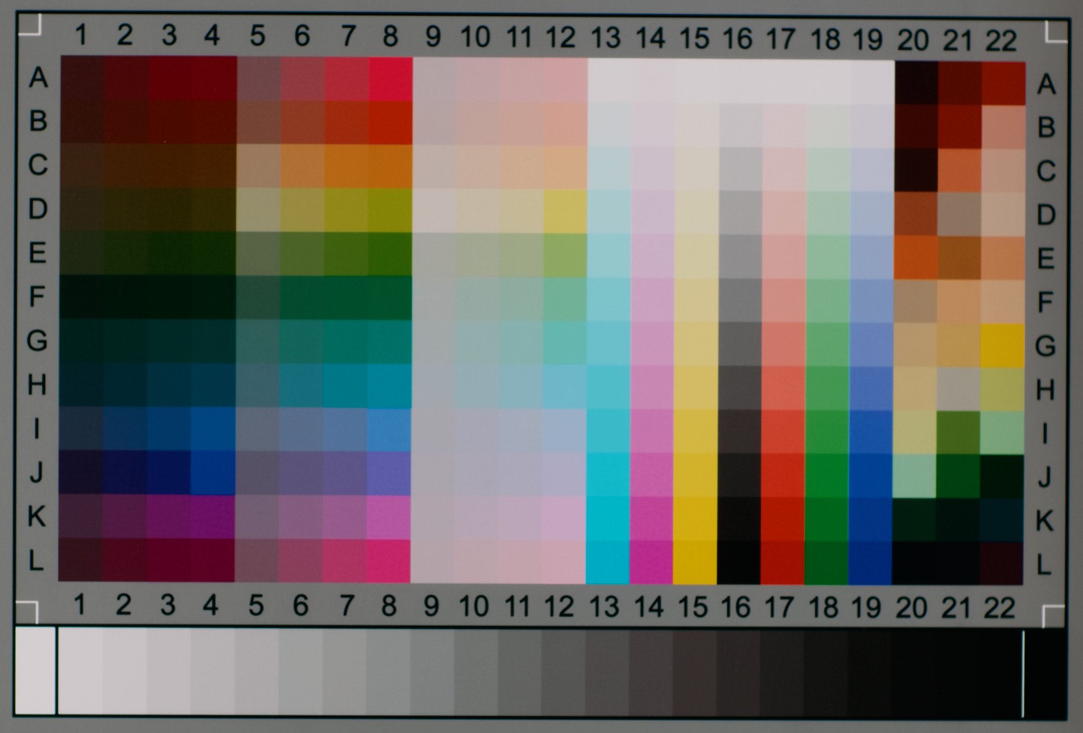
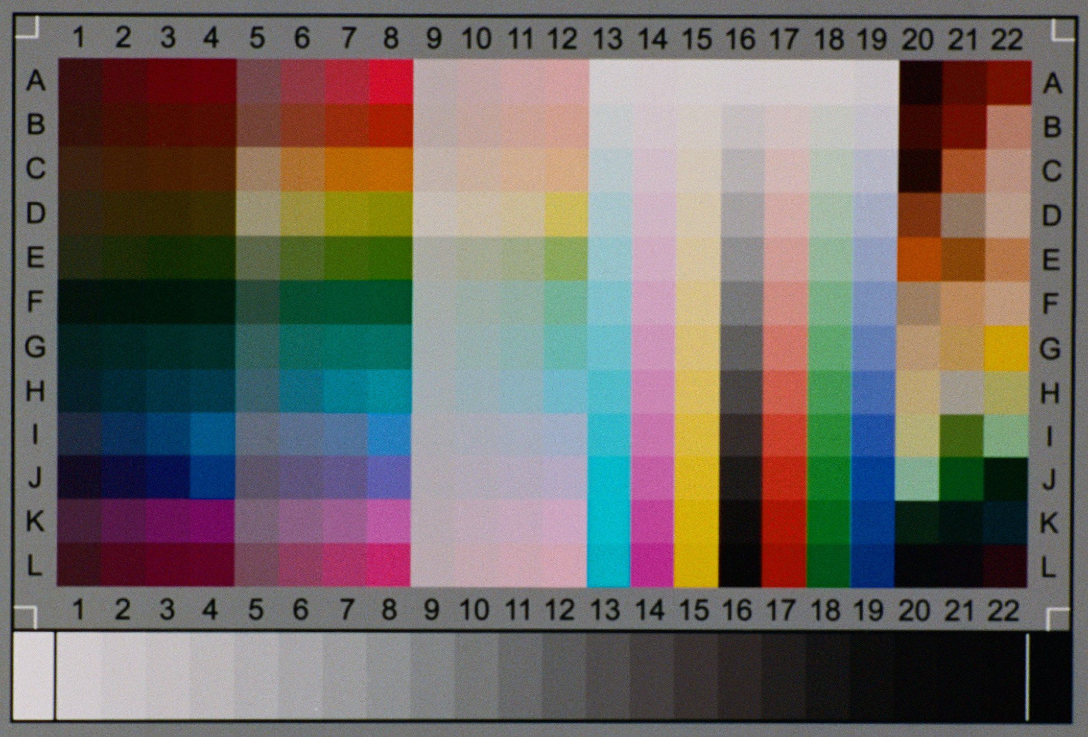
Thanks for the suggestion, but it seems that there are already more than enough skin tone hues on the IT8 chart I'm using, from the point of view that I'm not able to match them all 100% accurately without breaking the image. So having more patches wouldn't necessarily help by any means. A broad problem seems to be that of metamerism: patches that have different spectral frequencies that are erroneously understood by the recording medium to be the same colour, introducing erros. I have already experimented with a range of commercially available charts, as well as attempting to design and digitally print my own. But I've found this one to give the best results. Yes, this is the plan. So for Portra 400 and Fuji 400H you can get a usable exposure, arguably, from -3 to +7. The James Miller style LUTs that were so popular in the last decade and sold a million cups of coffee and other hipster products were very much based on the idea of underexposed film: lifted blacks, muted colours and strong colour casts highlight and shadows. On the other hand, slightly overexposed has been perhaps a bit more in vogue in recent years, in the style of Jose Villa's overexposed Fuji 400H wedding photography. I have something similar that I've been using but will totally check this out. I can live with a little bit of artifacting, perhaps. And in this version of LUT I've posted, there may well be some: the reds might be a bit funky in places when they get saturated. As I've suggested it's totally a trade off between accuracy and image integrity. It's possible to get a 100% match for all patches but the image is destroyed by this. The trick is to hold on to as much accuracy as possible while avoiding banding etc. Yes, but I wouldn't necessarily base an opinion on the colour hue on just one image. It's possible that the ambient light in the room was a bit green or that the WB tint on the cam was off - usually the Panny colours are screaming way too much magenta and in this example look quite reasonable. That said, Portra 400 does skew towards green, especially compared to Fuji 400H which is very much magenta, possibly reflecting the differing tastes in desirable skintones between the American (Kodak) and Japanese (Fuji) markets. You're right about the saturation though. I find it slightly low. Now, Portra is supposed to be relatively low saturation. But bear in mind that what I'm emulating is a specific roll of film, that has degraded since it left the factory according to the conditions it was stored in, that has been developed in a specific chemistry that may deviate more or less from the ideal C-41 recipe. This is a long-winded way of saying that I have seen slightly different results from different rolls of the same film stock shot at different times and developed in different places. It's something I'm going to look into a bit more. With my lut it should be sufficient to do a little bit of white balance tweaking. But I've observed that it's, for example, sometimes towards red and sometimes towards green as you would expect with normal variance of colour temperatures. If you try to globally WB the Panny colours for skin then everything goes green. Absolutely! And I'd guess that what Portra does is push greenish skin and magenta skin more towards the same hue. That's why skin tends to look so uniform with it. Definitely give Portra a go! It's expensive but the results are slightly nicer than the cheaper film stocks. At some stage I will make a set for Camera RAW and Lightroom for digital RAW, but that may not be the preferred workflow these days.
-
Anyway, if anyone who doesn't hate LUTs, is interested in film emulation and does have a Panasonic camera would like to try this out I'd be very interested in hearing from you. No hard feelings, @webrunner5
-
Ok then, @webrunner5 may I politely suggest that in that case this may not be the thread for you?
-
There's more going on here than cat skinning. Try the LUT and you'll see.
-
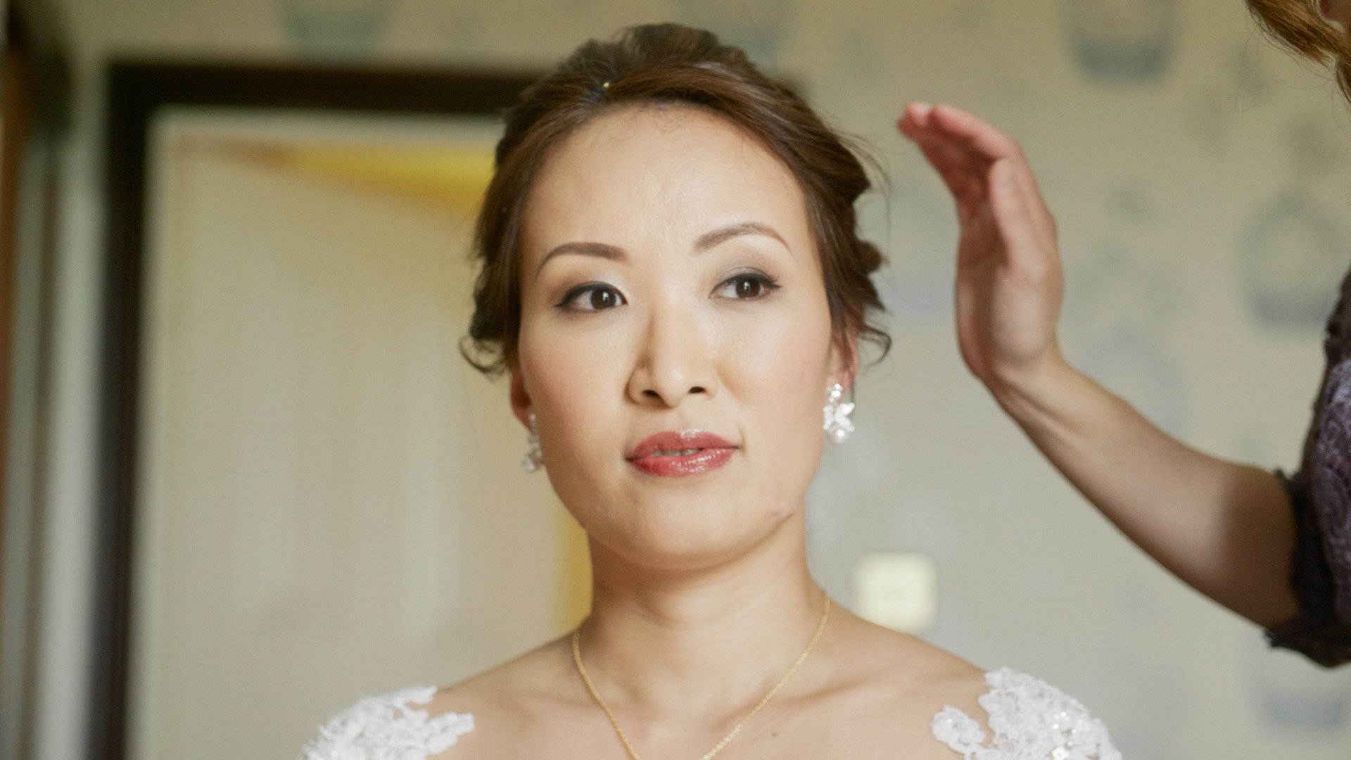
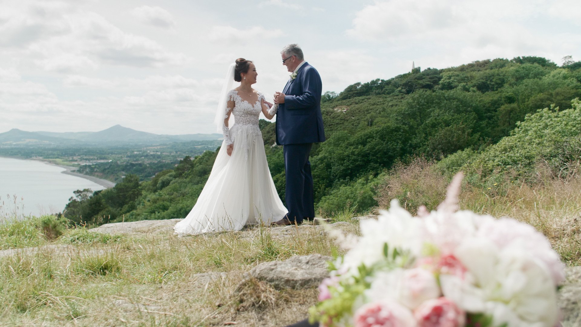
Let's take one aspect of the LUT which is possibly its most important: hue, saturation and lightness of colour and let's leave the contrast constant and compare the film emulation (bottom) to Panasonic's own V-Log to Rec709 colour transform (top). You might agree with me that one of these looks better than the other in terms of luminance and hue of skintones: Portra 400 is famous for its attractive skintone reproduction, offering slightly desaturated, even porcelain-like skin which skews more towards tan than pink in terms of hue.
-
I haven't been active on the forum very much recently, but I've still been reading and following discussions with interest. The main reason I haven't been around much is because I've been busy trying to emulate the colours of 35mm film for digital. I've focused on contemporary photo films (as opposed to motion picture film), trying to get as close to filmic colour as possible in Lightroom/Camera RAW. I've got quite good at it now: I can get a pretty accurate match. And I can use the same method to create LUTs for video that are also pretty accurate. However, post processing photos is a bit different to colour correcting video and I'd like to ask the forum's help in trying to figure out a few things in the LUT design. (To date, I've only tested my technique on GH5 VLog, as that's what I shoot. But the LUT should work on VLog from any Panasonic, although colours will be slightly different as each model has a slightly different colour response.) There are a few different components to my method: 1. Match overall contrast 2. Match hue and saturation of colours 3. Match colour shifts in the shadows and highlights Here is an indicator of its accuracy. On the top is VLog with my LUT and the bottom is the film scan (Portra 400 exposed at +1 stop) Here's a link to a folder with the LUT. It's for Panasonic V-Log and emulates the contrast and colour of Portra 400 overexposed by one stop and scanned on a Noritsu minilab scanner with slightly reduced contrast. However, I've removed the colour cast in the shadows and highlights for the sake of keeping the discussion simple, for now. https://drive.google.com/drive/folders/18RiY7dZ6AO87yMKArUvRDNKfouUVCu8H?usp=sharing My first question for you guys is what do you think about the level of contrast? I've actually reduced it a little bit relative the scanner's default contrast level. But is this the right level of contrast for you? Even though I've lowered the contrast level a little bit, it might still seem quite contrasty. That's because it's not designed as a "wide dynamic range" LUT that preserves much of the log signal, that you would then do further work upon. It's designed to give a "Rec709" level of contrast, so about 7.5 stops (which has traditionally been accepted as the average dynamic range of a scene). That means if you have a high contrast scene you might need to lower the contrast of the log signal before the LUT. Furthermore, it's designed so that middle grey as shot equals 126 RGB in Rec709 (almost 50 IRE) when the LUT is applied, which is what it should be. So any under or overexposure in the log footage will be quite apparent and require an adjustment before the lut. Basically, exposure and contrast and WB corrections should take place before, not after the lut. And, of course, it should be applied in a Rec709 colour space. If you can find a reliable way of making those adjustments directly on the log footage (you can in Resolve and After Effects, you can't in Premiere) then grading becomes very quick and easy. Here are a few VLog stills with the LUT applied to show how it handles skintones, saturation and contrast.
-
You might be able to check this for yourself by downloading raw stills of the studio comparison scene from older and newer cameras and then converting to DNG and then trying each of those workflows.
-
A digression: Canon colour has changed considerably since then. From looking at downloadable raw photo samples from that photography site, in general it looks to me that Canons that shoot CR3 files have high saturation colours that are less (over)saturated than models that shoot CR2. Sometimes the earlier look is favoured (portraits) and sometimes the contemporary look is favoured (flowers, avoid blown out areas). This shift in colour engine that coincides with the introduction of CR3 goes hand in hand with Adobe not being able or willing to provide accurate reverse engineered Canon matching picture profiles for ACR and Lightroom, as they had always done previously. The new colour is probably better if you're going to work on the image a bit. The old colour is probably better if you prefer SOOC for raw. That site's studio scene comparison tool is very revealing if you load up old and new Canons. Contemporary Canon is a lot closer to Sony and Panasonic than it used to be for raw files developed in Adobe Standard/Color/Neutral. Whether that trickles down to EOS picture styles and C-Log, I don't know but I suspect it might in terms of reining in over-saturation.
-

EOSHD is back, and a Merry Christmas from me
hyalinejim replied to Andrew - EOSHD's topic in Cameras
Happy Christmas Andrew! That was an uplifting post to read 🙂 -
I absolutely agree. 10bit 422 VLog is close enough to raw for me. If you can set up your color correction that exposure, contrast and colour adjustments work consistently across the tonal range of the log curve (for example, Premiere's Lumetri doesn't, but an ACES workflow does) then it's effectively giving you the power of raw exposure, contrast and white balance adjustments without breaking the footage and maintaining a good degree of accuracy. But 8 bit would fall apart.
-
My GH5 kit lens, the 12-60 is the only clinical lens I own. The body does distortion and vignetting correction automatically (and sharpness too?). I use it on a gimbal, because it's light. Or I use it for architecture when it's absolutely amazing to have a distortion free image. For anything else I'll put a lens with "character" and "feeling" on there, particularly when shooting people. 90% of the time that is a speedboosted Tamron 24-70.


_3.jpg.cf588efca1b07ac3c2dd1f8a511a3ea1.jpg)
_1_1.jpg.685a4725aabbd20afff9bdd78c806ac5.jpg)
_2_1.jpg.7ca006f4da1a973135651581aa98d00f.jpg)
.jpg.09cbea5f5f2bcc1a8489c067cfb45216.jpg)
_1.jpg.19664f1cd2d0232e61084d58decbc6da.jpg)