

tupp
-
Posts
1,151 -
Joined
-
Last visited
Content Type
Profiles
Forums
Articles
Posts posted by tupp
-
-
On 1/24/2021 at 7:52 PM, kye said:
Balconies are designed so that drunk people partying will be stopped by the fence/railing when they trip or get shoved towards the railing.
This scenario closely approximates the stresses of the rig that @herein2020 and I propose -- a tripod lightly leaning against the rail (or not at all), but with the added safety of earth and/or a tag line.
In contrast, most of the clamping rigs presented in this thread are analogous to standing the drunk people on top of the rail -- precarious and generating stresses for which the rail was not designed.
Also, anyone who shoves someone (drunk or not) toward a balcony railing is way too reckless to be rigging anything higher than one meter above the ground.
On 1/24/2021 at 7:52 PM, kye said:People who fall from balconies do so because they fall over the railing, not that the railing fails!
Yes, but (using your scenario) if you clamp someone standing to the top of the rail, the rail could fail and/or the person could fall.
On 1/24/2021 at 7:52 PM, kye said:I'll take the structural integrity of something designed to hold up 100kg+ falling people over the structural integrity of an aluminium tripod with a rating of 10lb/5kg 🙂
I'd rather set a tripod on top of a balcony that is rated to hold 1000+ Kg, rather than clamp to a piece of glass that was designed to block people from moving laterally off of the balcony.
On 1/24/2021 at 7:52 PM, kye said:Obviously it's important not to over-tighten the clamps, and also to ensure that the teeth or clamping surfaces aren't sharp in any way, which can easily be done by just putting a towel or t-shirt inside the clamp,
Oh boy... I implore you never to rig anything above anyone's head.
On 1/24/2021 at 7:52 PM, kye said:I can also arrange to put a tether around it to catch the setup if the clamp fails, but the orientation I would set it up in would put the centre of mass on the balcony side of the railing so it would tip into the balcony rather than over it anyway.
A tag line is not intended to "catch" the rig if it falls -- it is intended to keep it from moving laterally so it doesn't fall.
Don't clamp anything to the rail that would create torsion or flex stress -- even if the CG is above the balcony (and especially if the rail is supported by a glass panel).
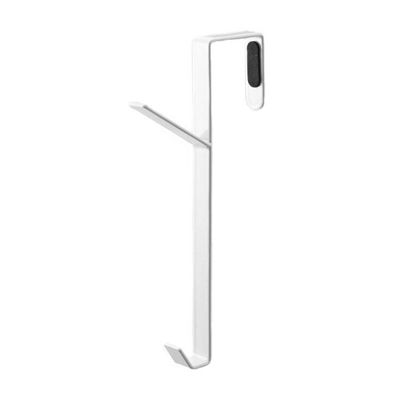
On 1/24/2021 at 7:57 PM, kye said:This hook, which is designed to sit on top of a door, works because all the force is applied to one side of the door, and because the force from gravity is down, which keeps the hook securely on top of the door:

A balcony rail is not a door.
This "hook" is essentially 1/2 of a grip "trombone" or a Tota-mount. Even though those two grip items are exceedingly more secure than your "hook," I wouldn't use either of them on a balcony rail -- especially if it were supported by a glass panel.
Furthermore, never use a single "hook" (such as the one pictured) with the CG above the "hook.
On 1/24/2021 at 7:57 PM, kye said:Obviously the clamps we're talking about can easily rotate if kept loose, but I'm just saying that they don't need to be super tight because they're not fighting gravity, they're working with it.
Yeah... don't set up a rig that generates that kind of stress on a balcony rail above people.
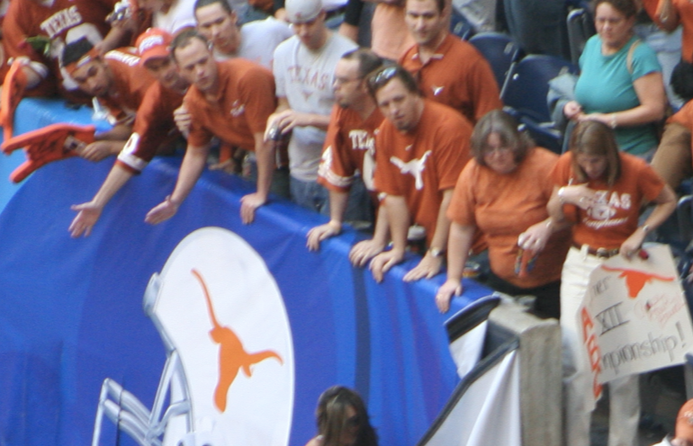
On 1/25/2021 at 5:16 AM, kye said:This picture clearly shows a guardrail that is oval in shape and waaaay larger than 2" in diameter:
A light-weight Space Clamp with a small ball head would work on the rail shown in the above Bevo football photo, and the same rig would also work on balcony rails, but clamping to balcony rails is really not the best option.
On 1/23/2021 at 2:27 AM, kye said:half the battle is knowing the right terminology.
If you don't even know the names of the grip items, perhaps it would be best not to attempt a hazardous rig and just use a small, light tripod and a length of tag line.
I have an inexpensive tripod that weighs 0.75 Kg with it's ball head, and it extends to a height of 1.43 meters. Another advantage of employing a tripod is that you can use it to get other steady shots during your travels.
On 1/24/2021 at 1:22 PM, herein2020 said:I go out of my way not to attach anything to anything I don't own if at all possible
This is basically the creed of most professional grips and most professional set electricians. It prevents damage and injury and avoids liability. Non-professionals would do well to heed this fundamental guideline.
-
2 hours ago, Video Hummus said:
Black Promist is one of the best "mist" filters that preserves contrast, especially in the blacks, hence its name.
The word "Black" in the filter's name refers to the tiny black particles embedded in the filter to absorb light that scatters sideways through the diffusion, thus reducing "glow haze" and "halos."
This black particle technique first appeared in Harrison & Harrison Black Dot diffusion filters.
-
Gel libraries (Rosco and Lee) are already included in the Arri firmware.
Are you trying to use the Arri gel libraries on some other item?
-
-
These rigs on a balcony rail are scary.
I'm with @herein2020 -- use a small "safety'd" tripod gently leaned against the rail. However, in addition to weighing down down the tripod with a bag, also safety it with a tag line(s) attached to something solid (or very heavy) that is further in from the balcony.
Don't even think about clamping to a glass balcony panel or putting any kind of torsion/flex stress on a balcony rail supported by a glass panel. It is probably a good idea to avoid raining shards of glass and loose camera gear/rigging onto hapless pedestrians below.
If you insist on clamping to a rail in lieu of using a tripod, definitely use one or more tag lines as described above, and don't make a hi-CG nor awkwardly offset rig. Keep the rig light-weight, compact, low and well balanced above the rail. That Dedolight clamp is a more expensive and less stable version of the original Tota-Clamp, which has a shorter baby pin that tucks into the clamp for travel. That shorter pin is safer on a balcony rail and there are several compact ways to mount a tilt/ball head to that baby-pin. Tota-Clamps can scratch surfaces if you don't tape the jaws. The Camvate clamp with the ball head could likewise work, but the jaws might be to small (just like the Tota-Clamp). There are other clamps not shown that would work better.
If you don't have a lot of rigging safety experience, it probably would be best to avoid complex grip solutions on the edge of a balcony. Regardless, always use a strong tag line(s) on any gear on a balcony, and don't detach the tag line until the gear/rig is moved safely away or below the balcony rail.
-
On 1/19/2021 at 11:02 PM, Anil Royal said:
Internal 8-bit CLOG recording, when viewed through waveform monitor, showed more room for brightness and darkness adjustments before clipping - compared to the external recordings! Isn't it supposed to be the other way!?!
No. Bit depth and dynamic range are two completely independent properties (as the contrast "discrepancy" readily proves).
Merely mapping two different bit depths to the same contrast range should not change the contrast. Something else is causing the contrast difference in contrast. Note that there is no difference in contrast between the 8-bit and 10-bit images from the recorder, but the internal 8-bit differs. So, the camera is affecting the contrast.
In regards to generally seeing a difference between 8-bit and 10-bit, you would likely see a difference if you compared the 8-bit and 10-bit images on a 10-bit monitor/projector.
-
If no frames were discarded in any of the frame rate changes, the end result is identical to slowing down 119.88 fps footage to 23.976 fps.
However, it sounds like your NLE may have converted 59.97 fps to 23.976 fps without changing the speed of the content. In that case, your apparent slowing would be just 1/2 of normal speed -- equivalent to running 119.88 fps footage at 59.97 fps.
-
3 hours ago, IronFilm said:
My monopod has a fluid head on it.
Ha! Try a Technovision Mk III on your monopod!
-
9 hours ago, KnightsFan said:
@kye isn't talking about undercranking though, right? He's talking about slowing down 24 fps.
Yes. That is why I said this:
12 hours ago, tupp said:It's a dramatic effect that sort of "feels" slow motion, but it is not the same as slowing the frame rate in post.
-
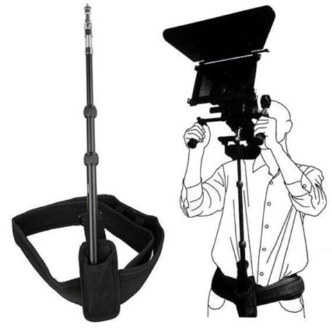
6 hours ago, IronFilm said:
Basically you take a monopod, and stick the bottom of it into a little "pocket" (such as a very strong drink bottle holder) which is attached to a sturdy waist belt.
Yes. A monopod is better than my suggestion of a tripod center column and head. A monopod can telescope to different heights and a full tripod head isn't needed for this rig.
By the way, I think that such a rig was called a "belt pod."
-
In the film days, I under-cranked the camera on a couple projects. It's a dramatic effect that sort of "feels" slow motion, but it is not the same as slowing the frame rate in post.
-
8 hours ago, Pascal Deshayes said:
- I like it pretty run & gun/minimal/compact but how do you stabilize your shots? I don't want to go gimbal (artificially smooth) but some sort of support would be great. Are you guys using EasyRigs or something similar?
As I'm pretty tall, I can't really put cameras on my shoulder or everything will have that downwards look. I usually shoot at chest/waist level.
Try a "belt pole" rig:
If you have a lightweight tripod with a center column, you can try using the center column with the head and make a belt with a pouch. It won't have an adjustable height, but it might put the camera close to where you need it, and you will get a rough idea of how stable such a rig can be.
A shoulder bracket is not necessary, but it allows one to let go of the camera.
-
I catch glimpses of some fairly deep colors in this recent video shot on an EOSM. No details are given in the description, but it could have been captured at 14 bits raw.
I think it would look fine without the fake grain, film gate and sprocket hole.
-
On 5/19/2020 at 5:39 AM, AdrParkinson said:
How would you say it compares with the old Cinestyle profile for Canon? I always found that while it made grading easier, the bitrate just wasn't there to support it and so there were too many artifacts.
On 5/19/2020 at 11:56 AM, tupp said:When I get a chance, I will try to snip out a few seconds from one of the files for download
Better late than never...
Here is a three second clip from a test shoot of the E-M10 III, with the camera's Highlight and Shadow control set to : -1 highlights; 0 mids; and +1 shadows.
Here is a coarsely graded video using the rest of the test footage from that session.
-
On 11/23/2020 at 11:15 PM, TomTheDP said:
Alexa>anything else
I don't know... footage from the F35 looks really good.
On 11/24/2020 at 4:52 AM, zerocool22 said:Looks like a higher framerate. 30fps.
Frame rate and "motion cadence" are significant properties in making video look like film.
-
6 hours ago, seanzzxx said:
eh I think I'll just wait for Tupp to show up and say that it cannot have a dense image as long as it wasn't shot on Kodachrome(tm), seeing how that has been this thread for the last month or so.
LOL!
Well, I think that some of the images that I linked were actually shot on Ektachrome and Kodacolor, but I mostly gave Kodachrome examples, as it is the "extreme" of the color emulsions.
Also, I said early in the thread that color depth was probably the key variable for digital "thickness," so I agree that "dense" digital images can be (and have been) achieved with digital cameras.
On 11/21/2020 at 5:34 PM, kye said:Thoughts on how thin / thick these two trailers are?
Both trailers look good, but the Red footage looks thin/brittle compared to that of the Alexa footage. Of course, much of these looks could result from the grade.
-
13 hours ago, herein2020 said:
Does an APS-C Crop on a FF Sensor Increase Background Compression?
Yes. Anything that narrows the field of view increases "telephoto" compression.
So, cropping into a frame increases telephoto compression.
-
-
If the goal is to convert batches of images from raw to jpeg, there are many free, open-source apps that do so.
Darktable, RawTherapee and and Photivo are powerful raw image developing applications. Digikam is a less powerful photo management program, but it can do batch conversions.
ImageMagick batch converts raw to jpeg. It has a GUI, but most use it on the command line for speed. If you are not trying to do anything fancy in your batch conversions, a simple ImageMagick terminal command is probably the quickest and easiest way to go.
-
On 10/23/2020 at 6:07 PM, KnightsFan said:
I think that simply adding water, thereby increasing specularity, contrast, and color saturation makes a drastic increase in thickness.
It doesn't look "thicker" to me -- just wetter, causing different colors and, in this case, more contrast. If you shot either scene (dry or wet) on Kodachrome, it would look significantly thicker.
Also, the difference in the pattern of dappled light skews the comparison. One can't help but wonder how this test would appear with an overcast sky.
On 10/24/2020 at 2:23 AM, hyalinejim said:You can see that effect clearly here. This is Fuji 400H exposed at box speed:
[snip]
And this is the same chart exposed at -2 but scanned to bring up the midtones.
That's some exceedingly coarse grain in the images of those charts. Huge grain like that significantly reduces color depth, which affects the look of the charts and throws-off the comparison a little.
On 10/24/2020 at 2:23 AM, hyalinejim said:Note how the shadows are lifted, because the shadow areas of the chart are now very close to the base fog of the emulsion, and are hardly registering at all
That's one way to describe it. Another way put it is that, due to the initial underexposure, more of the values from dark-tones to mid-tones are compressed together at the bottom end (along with the base fog). So, when the exposure is boosted to restore the mid-tones to their normal value, the dark tones become brighter than usual, because they remain compressed close to the mid-tones.
On 10/24/2020 at 2:23 AM, hyalinejim said:Yes, it's a less saturated image than the correctly exposed one. But if you took a digital shot of the same chart at the same exposure level, applied a curve to match the contrast and altered saturation so that the midtones match.... I think you'd still see the same pattern of more saturation in the shadows for film, and less in the highlights.
I am not sure what this exposure comparison adds to the idea that the brighter tones in film emulsions generally are less saturated (with the darker tones being relatively more saturated, by default).
On 10/24/2020 at 2:23 AM, hyalinejim said:Digital images look thin because of the way they (probably accurately) capture saturation from shadows to midtones to highlights.
I agree partially -- I think that there are other variables involved in how film renders color. For instance, film generally has more color depth than digital.
On 10/24/2020 at 10:57 AM, KnightsFan said:I don't think you'd get a significantly thicker image out of any two decent digital/film cameras given the same scene and sensible settings.
I disagree. A lot depends on the emulsion. I think that one would see a dramatic difference comparing Kodachrome to digital. Typical print film would yield less of a difference.
-
-
On 10/19/2020 at 6:38 AM, kye said:
One is the ability to render subtle variations in tone, and yet, we're looking at all these test images in 8-bit, and some in less than 8-bit, yet this doesn't seem to be a limiting factor.
Although we disagree on the "less than 8-bit" images, I have been waiting for someone to mention that we are viewing film emulsion images through 8-bit files.
To the eye, the color depth of Kodachrome is considerably more vast than what is shown in these 8-bit images. Kodachrome was one of the rare film processes that added dye to the emulsion during processing, which gave it such deep colors (and which is also more archival). Some of that splendor is captured in these 8-bit scans, so, theoretically, there should be a way to duplicate those captured colors shooting digitally and outputting to 8-bit.
On 10/19/2020 at 6:38 AM, kye said:If you were looking at this scene in real life, these people wouldn't have so much variation in luminance and saturation in their skintones - that baby would have to have been sunbathing for hours but only on the sides of his face and not on the front.
You probably would see the variation in the skin tones if you were there, but, to one's eyes, such variations don't seem so dramatic. Furthermore, Kodachrome usually looked snappier than other reversal films (when normally processed), but when directly viewing a Kodachrome slide, it won't look as contrasty as the 8-bit scans we see in this thread.
Of course, the baby's face (and the parents' faces) is brighter on the front, because of the lighting angle. If the baby has been sunbathing for hours, then the father is crispier than George Hamilton.
-
On 10/16/2020 at 1:09 PM, KnightsFan said:
@tuppMaybe we're disagreeing on what thickness is, but I'd say about 50% of the ones you linked to are what I think of as thick.
To me, the "thickness" of a film image is revealed by a rich, complex color(s). That color is not necessarily saturated nor dark.
That "thickness" of film emulsion has nothing to do with lighting nor with what is showing in the image. Certainly, for the thickness to be revealed, there has to be some object in the frame that reflects a complex color. An image of a white wall will not fully utilize the color depth of an imaging system. However, a small, single color swatch within a mostly neutral image can certainly demonstrate "thickness."
On 10/16/2020 at 11:55 PM, kye said:Long story short, film desaturates both the highlights and the shadows because on negative film the shadows are the highlights! (pretty sure that's the right-way around..)
I don't think that's how it works. Of course, there is also reversal film.
On 10/16/2020 at 11:55 PM, kye said:Yes, if the skin tones are from a bad codec and there is very little hue variation (ie, plastic skin tones) then that's not something that can be recovered from,...
Agreed. Digital tends to make skin tones mushy (plastic?) compared to film.
Look at the complex skin tones in some of these Kodachrome images. There is a lot going on in those skin tones that would be lost with most digital cameras. In addition, observe the richness and complexity of the colors on the inanimate objects.
On 10/16/2020 at 11:55 PM, kye said:but thickness is present in brighter lit images too isn't it?
Yes. Please note that most of the images in the above linked gallery are brightly lit and/or shot during broad daylight.
On 10/16/2020 at 11:55 PM, kye said:Interesting images, and despite the age and lack of resolution and DR, there is definitely some thickness to them.
Agreed. I think that the quality that you seek is inherent in film emulsion, and that quality exists regardless of lighting and regardless of the overall brightness/darkness of an image.
On 10/16/2020 at 11:55 PM, kye said:I wonder if maybe there is a contrast and saturation softness to them, not in the sense of them being low contrast or low saturation, but more that there is a softness to transitions of luma and chroma within the image?
Because of the extensive color depth and the distinctive color rendering of normal film emulsion, variations in tone are often more apparent with film. Not sure if that should be considered to be more of a gradual transition in chroma/luma or to be just higher "color resolution."
On 10/16/2020 at 11:55 PM, kye said:I've been messing with some image processing and made some test images. Curious to hear if these appear thick or not.
Those images are nice, but they seem thinner than the Kodachrome images in the linked gallery above.
On 10/17/2020 at 8:41 AM, KnightsFan said:Here's a frame from The Grandmaster which I think hits peak thickness. Dark, rich colors, a couple highlights, real depth with several layers and a nice falloff of focus that makes things a little more dreamy rather than out of focus.
The image is nicely crafted, but I read that it was shot on Fuji Eterna stock. Nevertheless, to me its colors look "thinner" than those shown in this in this Kodachrome gallery.
On 10/17/2020 at 9:49 AM, BTM_Pix said:In the same vein, this might be a useful resource for you. https://film-grab.com
Great site! Thanks for the link!
On 10/17/2020 at 10:10 AM, KnightsFan said:That's why I say it's mainly about what's in the scene.
I disagree. I think that the "thickness" of film is inherent in how emulsion renders color.
On 10/17/2020 at 10:10 AM, KnightsFan said:The soft diffuse light comign from the side in the Grandmaster really allows every texture to have a smooth gradation from light to dark, whereas your subject in the boat is much more evenly lit from left to right.
The cross-lighting in that "Grandmaster" image seems hard and contrasty to me (which can reveal texture more readily than a softer source). I don't see many smooth gradations/chirascuro.
17 hours ago, mat33 said:I think the light and amount of contrast of the scene makes a huge difference to the image thickness.
Evidently, OP seeks the "thickness" that is inherent in film emulsion, regardless of lighting and contrast.
17 hours ago, mat33 said:Here is a screen shot from the D16 (not mine) which while compressed to heck look 'thick' and alive to me.
Nice shots!
Images from CCD cameras such as the Digital Bolex generally seem to have "thicker" color than their CMOS counterparts.
However, even CCD cameras don't seem to have the same level of thickness as many film emulsions.
5 hours ago, KnightsFan said:I just watched the 12k sample footage from the other thread and I think that it displays thick colors despite being an ultra sharp digital capture.
That certainly is a pretty image.
Keep in mind that higher resolution begets more color depth in an image. Furthermore, if your image was shot with Blackmagic Ursa Min 12K, that sensor is supposedly RGBW (with perhaps a little too much "W"), which probably yields nicer colors.
-
3 hours ago, KnightsFan said:
Got some examples? Because I generally don't see those typical home videos as having thick images
Of course, a lot of home weren't properly exposed and showed scenes with huge contrast range that the emulsion couldn't handle. However, I did find some examples that have decent exposure and aren't too faded.
Here's one from the 1940's showing showing a fairly deep blue, red and yellow, and then showing a rich color on a car.
Thick greens here, and later a brief moment showing solid reds, and some rich cyan and indigo. Unfortunately, someone added a fake gate with a big hair.
A lot of contrast in these shots, but the substantial warm greens and warm skin and wood shine, plus one of the later shots with a better "white balance" shows a nice, complex blue on the eldest child's clothes.
Here is a musical gallery of Kodachrome stills. Much less fading here. I'd like to see these colors duplicated in digital imaging. Please note that Paul Simon's "Kodachrome" lyrics don't exactly refer to the emulsion!
OP's original question concerns getting a certain color richness that is inherent in most film stocks but absent from most digital systems. It doesn't involve lighting, per se, although there has to be enough light to get a good exposure and there can't be to much contrast in the scene.
4 hours ago, KnightsFan said:They're pretty close, I don't really care if there's dithering or compression adding in-between values. You can clearly see the banding, and my point it that while banding is ugly, it isn't the primary factor in thickness.
We have no idea if OP's simulated images are close to how they should actually appear, because 80%-90% of the pixels in those images fall outside of the values dictated by the simulated bit depth. No conclusions can be drawn from those images.
By the way, I agree that banding is not the most crucial consideration here -- banding is just a posterization artifact to which lower bit depths are more susceptible. I maintain that color depth is the primary element of the film "thickness" in question.


Sigma EVF
In: Cameras
Posted
Here is a leaked photo of the EVF prototype, which employs an old Sigma loupe: