tupp
-
Posts
1,154 -
Joined
-
Last visited
Content Type
Profiles
Forums
Articles
Everything posted by tupp
-
A Super/Mafer clamp is like a mini hydraulic press. As I mentioned above, it can crunch through many items/materials that other clamps cannot. Due the heightened leverage involved, clueless folks tightening that type of cam-action clamp have damaged and ruined location pieces and caused material failure resulting in accidents. If one has no experience with such clamps, one should avoid them. Clamps should almost always be tightened to be firm -- not just "sufficient to make sure they won't fall." That might seem like a good idea, but the torsion stress makes such an offset rig precarious and sets it up for failure, which is undesirable and unsafe -- even if the CG is inside the balcony. In addition, with such positioning, the grip items might creep into the bottom of the frame. Do not use fishing line. Use something with a high enough test strength that holds knots well. If you can tie a bowline and a clove hitch, you are good. Extra points if you can tie a trucker's hitch, which is very useful for tag lines. In regards to pick points, the more solid they are, the better. A chair is probably not good for the balcony scenario, unless it is very heavy... likewise with a water bottle. I would first look for pick points that are part of the building structure. They need to be significantly inside from the edge of the balcony, and the higher up, the better. Sometimes two pick points are necessary if there is not one far enough inside. On a balcony the primary safety should be a tag/guy line that prevents a rig from going over the rail -- not a safety cable that "catches" the rig if it falls (as you suggested). Of course, using a safety cable in addition to a tag line is good practice. Actually, the clueless and uninitiated need to "be careful," especially when they contemplate rigging anything at altitude (which they should generally avoid). It is misguided and dangerous to think that rigging a camera on a balcony rail is a "physics problem" or that doing so somehow involves "math." If one has to calculate the stress tolerances of location items, such an endeavor should be abandoned. As Murphy's Law suggests, failure is often more probable than one anticipates -- especially for a cocksure newbie. Additionally, the odds of failure are compounded by all of the unknown variables one encounters at a location. What one really needs when rigging at altitude on location is a strong sense of safety, along with a good deal of experience in anticipating and preventing/avoiding the various failures possible. Such qualities are often found in grips and set electricians who have been around the block a few times. If one doesn't have the proper sense of safety nor rigging experience, it is best to avoid rigging a camera to a balcony rail. However, speaking of physics, I would like to reiterate that the physical properties of tempered glass are complex and that clamping to glass should never be attempted. Here is a lecture on breaking glass cued to the start of the section on tempered glass. Note that the lecturer states that if one tries to modify tempered glass in the slightest, "fun things will happen!" Tempered glass is primed to explode into little pieces. As shown in my above links above, strong flex stress or a tiny tap in the right spot can shatter tempered glass. Here is another video showing that tempered glass can take strong, broad impacts, but a local tap can cause it to shatter. In addition, the risk of shattering is exacerbated by any tiny damage or imperfection in the glass or by any stress added by a rig/clamp. Here is a closeup of the stress on a block of glass generated by a C-clamp, in a photo taken with a polarimeter setup: As more force is applied, the stresses increase. Here is a similar image showing stress lines on a clear block of plastic that deforms more easily than glass: These stresses are not visible when one tightens a Super/Mafer clamp onto a glass balustrade. So, although a drunk person falling on a glass balustrade might not be a problem, a tiny impact and/or clamping force on a local spot of the glass might cause that balustrade to shatter. That could ruin one's day. I have the benefit of years of experience as a member of an IA studio mechanics local working a set electrician and as a grip. If a new guy joined the crew and announced that they had postgraduate level physics and math, they would start out huffing cable, sandbags and carts just like every other newbie. The sense of safety, rigging techniques and set protocols has to be developed. In the meantime, don't put towels or t-shirts inside overhead clamps, always use a substantial tag line (with solid pick points) on a balcony rig, and avoid attaching anything to location structures... oh, and never clamp to glass!
-
Here is a short video on how to "normalize" audio in Resolve. In regards to the breathing and noise, I would guess that there are filters that can reduce that in Resolve, plus you can use eq and compression functions. Here is a short primer. Perhaps someone here who is more knowledgeable in audio could chime in with other tips.
-
Thanks for the link, but the article demonstrates everything that one shouldn't do when rigging on a balcony. Nothing is safety'd, so that fact alone makes the rigs hazardous. Also, the reviewed clamp happens to be a strong cam-action clamp -- they can generate enormous clamping power that can crunch through soft/brittle materials and tubing. Only use Super/Mafer style clamps on solid metal, pipes with a minimum schedule 40 wall thickness or solid wood (be aware that these clamps can leave jaw indentations in wood). Also, the article shows this: There is so much wrong with what is happening in this photo that it is difficult to know where to begin. There is no safety line. The rig's CG is off-axis which suspends most of it's weight precariously beyond the "rail's" edge, and which puts flex stress on a small, local area of the glass. However, the big doosie is that a cam-action clamp that generates huge clamping pressure is tightened onto a sheet of tempered glass. NEVER DO THAT! Glass (and particularly tempered glass) isn't very stable/reliable when subjected to stresses, especially if more than one stress is applied to it simultaneously and/or if one of the stresses is focused on a small local area. If the above clamp is reefed down to set up powerful, unseen stress on the glass and if there is any imperfection in the glass, the pane(s) could shatter if someone merely hits the pane with their wedding ring. Here's what a little tap can do to unstressed tempered glass. Here's what mere flex stress can do to tempered glass. Here's a short primer on what can cause glass to inexplicably shatter (which happens occasionally). Never rig to glass at a location, especially if it is on a balcony! No. It's not the size of the clamp. In fact, if I was forced to mount a camera on a balcony rail of unknown width, I would likely bring a large (relatively light weight) Space Clamp and plan on at least one tag line, with a bailing wire run between the different rig items. The main point is to avoid altogether rigging to a balcony rail. Again, If one doesn't know enough about rigging to even know the names of the grip items, it is probably a really good idea for one not to attempt any rig on a balcony that could pose a hazard and/or possibly cause property damage. Rigging items small or large to a glass balustrade on a balcony hugely complicates the risk. You could have the lightest action cam mounted with a Super Clamp, and that Super Clamp could still crunch right through that tempered glass, or the clamp set up stresses that cause the glass to shatter at an imperfection when someone lightly bumps the pane with a chair. Mount your camera on balcony rail at your own peril, or, more accurately, at the peril of those who venture below your rig.
-
Here is a leaked photo of the EVF prototype, which employs an old Sigma loupe:
-
This scenario closely approximates the stresses of the rig that @herein2020 and I propose -- a tripod lightly leaning against the rail (or not at all), but with the added safety of earth and/or a tag line. In contrast, most of the clamping rigs presented in this thread are analogous to standing the drunk people on top of the rail -- precarious and generating stresses for which the rail was not designed. Also, anyone who shoves someone (drunk or not) toward a balcony railing is way too reckless to be rigging anything higher than one meter above the ground. Yes, but (using your scenario) if you clamp someone standing to the top of the rail, the rail could fail and/or the person could fall. I'd rather set a tripod on top of a balcony that is rated to hold 1000+ Kg, rather than clamp to a piece of glass that was designed to block people from moving laterally off of the balcony. Oh boy... I implore you never to rig anything above anyone's head. A tag line is not intended to "catch" the rig if it falls -- it is intended to keep it from moving laterally so it doesn't fall. Don't clamp anything to the rail that would create torsion or flex stress -- even if the CG is above the balcony (and especially if the rail is supported by a glass panel). A balcony rail is not a door. This "hook" is essentially 1/2 of a grip "trombone" or a Tota-mount. Even though those two grip items are exceedingly more secure than your "hook," I wouldn't use either of them on a balcony rail -- especially if it were supported by a glass panel. Furthermore, never use a single "hook" (such as the one pictured) with the CG above the "hook. Yeah... don't set up a rig that generates that kind of stress on a balcony rail above people. A light-weight Space Clamp with a small ball head would work on the rail shown in the above Bevo football photo, and the same rig would also work on balcony rails, but clamping to balcony rails is really not the best option. If you don't even know the names of the grip items, perhaps it would be best not to attempt a hazardous rig and just use a small, light tripod and a length of tag line. I have an inexpensive tripod that weighs 0.75 Kg with it's ball head, and it extends to a height of 1.43 meters. Another advantage of employing a tripod is that you can use it to get other steady shots during your travels. This is basically the creed of most professional grips and most professional set electricians. It prevents damage and injury and avoids liability. Non-professionals would do well to heed this fundamental guideline.
-
The word "Black" in the filter's name refers to the tiny black particles embedded in the filter to absorb light that scatters sideways through the diffusion, thus reducing "glow haze" and "halos." This black particle technique first appeared in Harrison & Harrison Black Dot diffusion filters.
-
Gel libraries (Rosco and Lee) are already included in the Arri firmware. Are you trying to use the Arri gel libraries on some other item?
-
US$6500... ouch!
-
These rigs on a balcony rail are scary. I'm with @herein2020 -- use a small "safety'd" tripod gently leaned against the rail. However, in addition to weighing down down the tripod with a bag, also safety it with a tag line(s) attached to something solid (or very heavy) that is further in from the balcony. Don't even think about clamping to a glass balcony panel or putting any kind of torsion/flex stress on a balcony rail supported by a glass panel. It is probably a good idea to avoid raining shards of glass and loose camera gear/rigging onto hapless pedestrians below. If you insist on clamping to a rail in lieu of using a tripod, definitely use one or more tag lines as described above, and don't make a hi-CG nor awkwardly offset rig. Keep the rig light-weight, compact, low and well balanced above the rail. That Dedolight clamp is a more expensive and less stable version of the original Tota-Clamp, which has a shorter baby pin that tucks into the clamp for travel. That shorter pin is safer on a balcony rail and there are several compact ways to mount a tilt/ball head to that baby-pin. Tota-Clamps can scratch surfaces if you don't tape the jaws. The Camvate clamp with the ball head could likewise work, but the jaws might be to small (just like the Tota-Clamp). There are other clamps not shown that would work better. If you don't have a lot of rigging safety experience, it probably would be best to avoid complex grip solutions on the edge of a balcony. Regardless, always use a strong tag line(s) on any gear on a balcony, and don't detach the tag line until the gear/rig is moved safely away or below the balcony rail.
-
No. Bit depth and dynamic range are two completely independent properties (as the contrast "discrepancy" readily proves). Merely mapping two different bit depths to the same contrast range should not change the contrast. Something else is causing the contrast difference in contrast. Note that there is no difference in contrast between the 8-bit and 10-bit images from the recorder, but the internal 8-bit differs. So, the camera is affecting the contrast. In regards to generally seeing a difference between 8-bit and 10-bit, you would likely see a difference if you compared the 8-bit and 10-bit images on a 10-bit monitor/projector.
-
If no frames were discarded in any of the frame rate changes, the end result is identical to slowing down 119.88 fps footage to 23.976 fps. However, it sounds like your NLE may have converted 59.97 fps to 23.976 fps without changing the speed of the content. In that case, your apparent slowing would be just 1/2 of normal speed -- equivalent to running 119.88 fps footage at 59.97 fps.
-
Ha! Try a Technovision Mk III on your monopod!
-
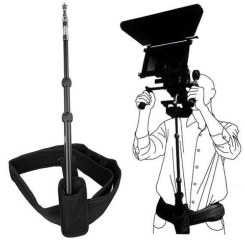
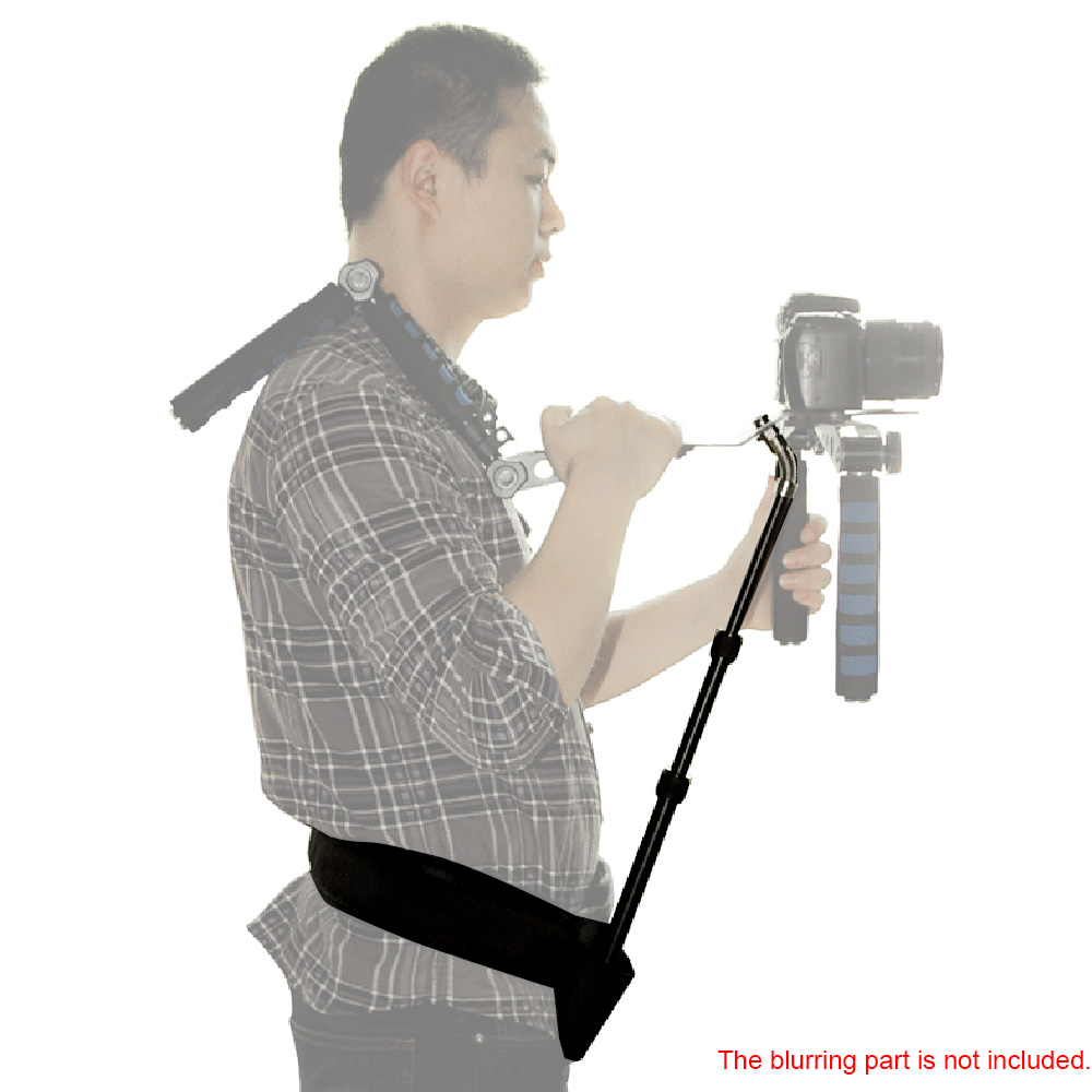
Yes. A monopod is better than my suggestion of a tripod center column and head. A monopod can telescope to different heights and a full tripod head isn't needed for this rig. By the way, I think that such a rig was called a "belt pod."
-
In the film days, I under-cranked the camera on a couple projects. It's a dramatic effect that sort of "feels" slow motion, but it is not the same as slowing the frame rate in post.
-
Try a "belt pole" rig: If you have a lightweight tripod with a center column, you can try using the center column with the head and make a belt with a pouch. It won't have an adjustable height, but it might put the camera close to where you need it, and you will get a rough idea of how stable such a rig can be. A shoulder bracket is not necessary, but it allows one to let go of the camera.

-
I catch glimpses of some fairly deep colors in this recent video shot on an EOSM. No details are given in the description, but it could have been captured at 14 bits raw. I think it would look fine without the fake grain, film gate and sprocket hole.
-
 Better late than never... Here is a three second clip from a test shoot of the E-M10 III, with the camera's Highlight and Shadow control set to : -1 highlights; 0 mids; and +1 shadows. Here is a coarsely graded video using the rest of the test footage from that session.
 -
I don't know... footage from the F35 looks really good. Frame rate and "motion cadence" are significant properties in making video look like film.
-
LOL! Well, I think that some of the images that I linked were actually shot on Ektachrome and Kodacolor, but I mostly gave Kodachrome examples, as it is the "extreme" of the color emulsions. Also, I said early in the thread that color depth was probably the key variable for digital "thickness," so I agree that "dense" digital images can be (and have been) achieved with digital cameras. Both trailers look good, but the Red footage looks thin/brittle compared to that of the Alexa footage. Of course, much of these looks could result from the grade.
-
Does an APS-C Crop on a FF Sensor Increase Background Compression?
tupp replied to herein2020's topic in Cameras
Yes. Anything that narrows the field of view increases "telephoto" compression. So, cropping into a frame increases telephoto compression. -
Ha, ha! Great performances! What is the "12-step program" for B-roll addicts?
-
If the goal is to convert batches of images from raw to jpeg, there are many free, open-source apps that do so. Darktable, RawTherapee and and Photivo are powerful raw image developing applications. Digikam is a less powerful photo management program, but it can do batch conversions. ImageMagick batch converts raw to jpeg. It has a GUI, but most use it on the command line for speed. If you are not trying to do anything fancy in your batch conversions, a simple ImageMagick terminal command is probably the quickest and easiest way to go.
-
It doesn't look "thicker" to me -- just wetter, causing different colors and, in this case, more contrast. If you shot either scene (dry or wet) on Kodachrome, it would look significantly thicker. Also, the difference in the pattern of dappled light skews the comparison. One can't help but wonder how this test would appear with an overcast sky. That's some exceedingly coarse grain in the images of those charts. Huge grain like that significantly reduces color depth, which affects the look of the charts and throws-off the comparison a little. That's one way to describe it. Another way put it is that, due to the initial underexposure, more of the values from dark-tones to mid-tones are compressed together at the bottom end (along with the base fog). So, when the exposure is boosted to restore the mid-tones to their normal value, the dark tones become brighter than usual, because they remain compressed close to the mid-tones. I am not sure what this exposure comparison adds to the idea that the brighter tones in film emulsions generally are less saturated (with the darker tones being relatively more saturated, by default). I agree partially -- I think that there are other variables involved in how film renders color. For instance, film generally has more color depth than digital. I disagree. A lot depends on the emulsion. I think that one would see a dramatic difference comparing Kodachrome to digital. Typical print film would yield less of a difference.
-
Yes, but it is less light on a proportionally smaller area. So, cropping-in on an image circle doesn't change the exposure.