kye
-
Posts
8,217 -
Joined
-
Last visited
Content Type
Profiles
Forums
Articles
Everything posted by kye
-
Agreed. I was referring to a situation where you are putting a noisy restaurant or nightclub ambience over the top. Many years ago when I was helping out student films I was asked to 'fix' dialog tracks with hiss in them and the only way I found to hide the hiss and make them usable was to use a mixture of background noise over the top and a fairly aggressive noise gate on the offending channel. My point in listing it first was that if self-noise on a piece of equipment is high then the rest of its attributes are basically irrelevant.. it could be very very low distortion, have huge bandwidth, large headroom, if it's digital it can be 24/192, etc etc etc, but if it puts unacceptable amounts of hiss into the dialog of a quiet scene then it's game over.
-

Fuji 18-55 f/2.8-4.0 Good Enough For Hand Held Filming?
kye replied to DevonChris's topic in Cameras
I shoot exclusively hand-held and rely on OIS to help me stabilise shots. The way I think about it is that OIS and IBIS 'absorb' a small amount of movement, with good OIS and IBIS absorbing a greater range of movement, but if you move more than they can handle then the movement shows in the footage. The way to improve this is to use some kind of camera stabiliser or mount. You can start at the small end by using a camera strap, adding a handle to your camera, all the way up through using something like a Gorillapod (a small bendy tripod used as a kind of handle) to full rigs like shoulder-mounts or steadicams. I mention the Gorillapod as it's what I use and I find it to be quite effective up to about 100mm or so in combination with OIS. Happy to give you more detail about how I use it if you're interested. -
Maybe - it's a matter of what you're doing. I don't want to pay for, carry, or worry about a fast Zeiss. I want to get the shot, which means that I don't have time to change lenses. A fast Zeiss would likely be a prime, which actually means a set of big, heavy, and expensive lenses. They'd require a pelican case to cart them around too. A fast lens has shallow depth-of-field (unless you use it stopped-down all the time, in which case just buy a slower lens) which means missing focus all the time. I don't want to miss focus all the time - I want to get the shot - having the background blurry in some shots isn't worth the risk of having the subject blurry in other shots. The moral of the story is that everyone has different requirements. It can be quite difficult to hide a noisy audio track though, depending on the situation. If you're recording audio for a scene set in a nightclub or busy restaurant where there will be lots of ambient sound in the scene then you can cover it up, but if you're recording audio for a scene that takes place somewhere quiet then having hiss can ruin the content, or force you to use an ambience track that will compromise the aesthetic of the scene. For me personally I don't mind as my videos are for family and friends and are normally set to music, but if you only had budget for one setup then I'd make sure it didn't have too much hiss. We've covered this before. In your productions there might always be room for a dedicated audio person with a boom mic, but for many of us that isn't the case. Scroll up and read the parts where we're discussing the size of an on-camera microphone attracting too much attention and potentially ruining shots or a whole shoot. Don't confuse your situation for how others are making their films. When we're talking about equipment, the ability for something to record safety tracks is a consideration. Everything else you listed above is either skill (which cannot be purchased) or can be applied digitally in post in virtually any editing software (and therefore a separate topic). What aspect of sound quality do you think it lacks? I heard differences in the sound, but nothing that made me think I needed to spend hundreds of dollars. If I was recording something where the stereo audio was absolutely critical then I'd spend the money, but for most productions (mine included) stereo ambience is something added to the film for an almost subliminal effect. I know a lot about audio so don't dumb-down your answer for me. Feel free to talk about THD+N, IMD, imaging, phase response, macro-dynamic performance, micro-dynamic performance, stereo imaging / width / depth / focus / etc. For any film that is going to have big expensive audio treatments in post they can probably afford to get permission to shoot in locations, etc. Guerilla film-making is more about getting something done with a minimum of budget and resources. Depending on the type of film being made the results might be compromised in quality, however this is part of this type of film-making. If you could get perfection by shooting without getting noticed then why would anyone spend $300M on a film? The words Guerilla and Gorilla have the same pronunciation, so it's similar to saying "hunting gorillas". It's a joke based on this similarity! One thing I see on this forum a lot is that people assume that everyone makes the same types of films they do, or lives in the same type of environment, or has the same quality requirements as they do. Obviously this is false, there are as many different types of film-makers as there are types of films, or types of people for that matter. That is why I put my comments into this thread instead of the one where @IronFilm and others are providing excellent advice. This thread is specifically about films that are being shot on location without permission, which at least implies that they're small productions with limited funding, and I included my comments as part of a discussion about on-camera microphones, which indicates that the production is very small indeed, and therefore willing to compromise quality to a certain degree. If this isn't obvious to someone reading then I apologise, but this is the internet, and everyone should always question and verify everything they read or see on here.
-
In addition to what @John Brawley said, the current write speed performance of SD and CFast cards might be why they put the USB-C on there. Apart from making it super convenient by turning all the small editing SSDs we've got lying around into storage we don't have to re-buy, they might be the only things that can write 4K60 RAW until some of the tech catches up. You'll find that it's hugely easier to design chips that can transfer data at a given speed than those that can read/write that data. It took years for HDD speeds to out-grow the USB v1 and v2 spec, and apparently USB 3.2 is rated at 2500MBps - almost enough to do 4K RAW at 300fps! I wonder if you can buy small USB 3 SSD all-in-one RAID drives? They'd have crazy performance.
-
and the number one thing.... we definitely can't tell if it has MOJO!
-
There is definitely some strange colour splotchiness going on, but my question is what the signal path of the image has been to get it from the camera to my monitor. I agree with @Cinegain that it could be from some wayward processing. The ISO performance on that image is terrible!!! And it's a daylight landscape too!
-
That's a great idea! Velcro is potentially underrated. I do a lot of hifi stuff and vibrations are a source of distortion so isolating components is a thing. During my research I found that a company that makes scanning electron microscopes uses something to isolate from vibrations that is basically the same principle as velcro (which holds the weight but has a bit of give and therefore doesn't transfer all the vibrations).
-
That's very impressive! Well done!!
-
If this camera doesn't make sense then this camera probably isn't for you. I don't understand why people think they're the only people in the world to design cameras for. In fact, why would you even think that it was designed for someone who spoke English? The largest Chinese social network has more than half as many active users as the entire population of the US.
-
Not everyone is as lucky as you... The US: https://petapixel.com/2016/02/25/ive-stopped-20-times-police-camera-tripod/ The UK: https://petapixel.com/2016/07/16/video-photographer-tests-rights-streets-london/ https://petapixel.com/2011/07/20/six-photographers-test-their-right-to-shoot-in-london/ Australia: https://petapixel.com/2015/11/30/top-australian-photographer-fighting-for-rights-after-near-arrest-on-public-land/ Terrorism video warning about photography in public: https://petapixel.com/2012/08/09/terrorism-prevention-video-asks-public-to-report-photographers-to-police/ And if those are too tame, then this one is just great.. https://petapixel.com/2015/04/21/woman-pointing-smartphone-camera-at-police-has-it-snatched-and-smashed/ That was just a few quick searches of one photography website. The moral of the story is don't attract attention.
-
Just listened to it.. I'm assuming it was the 12fps clip? Audio sounded good, but there was nothing in front of the camera making noise so not way to judge isolation / directionality Hmm.. unless they're recording 4 channels of audio it is possibly to control pickup pattern. Promising!
-
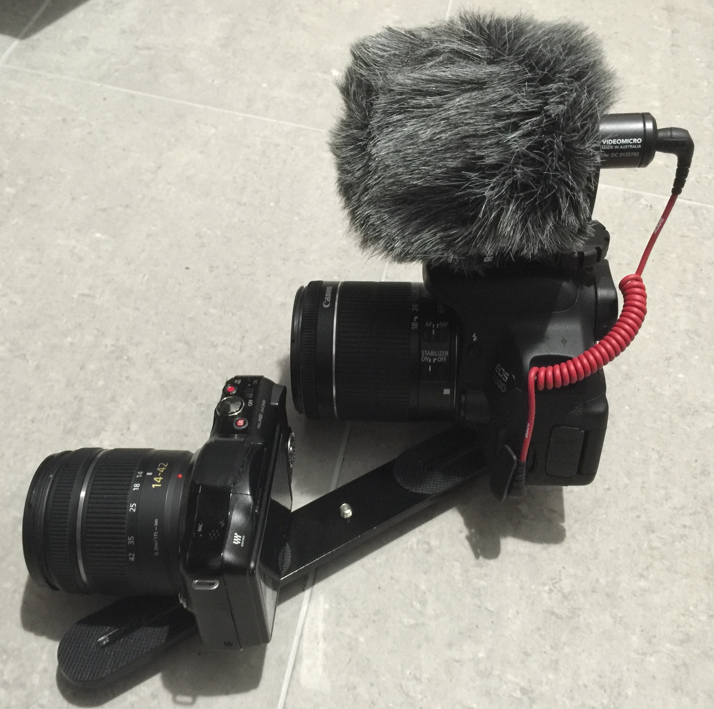
That's a very interesting setup @Don Kotlos - I'd love a photo or description of how it's mounted. The mount that Rode provides works well but is large! I'd like to shrink my setup further if I can.
-
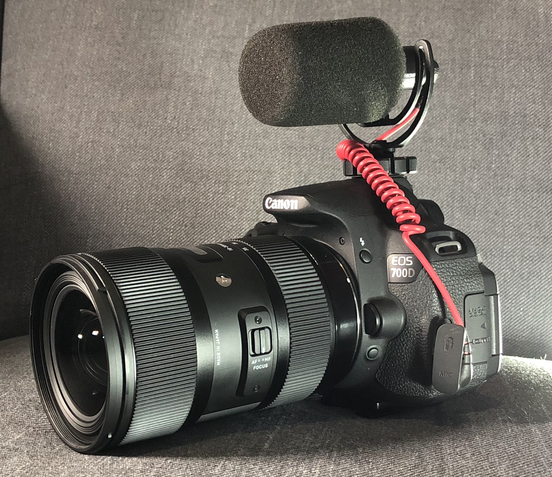
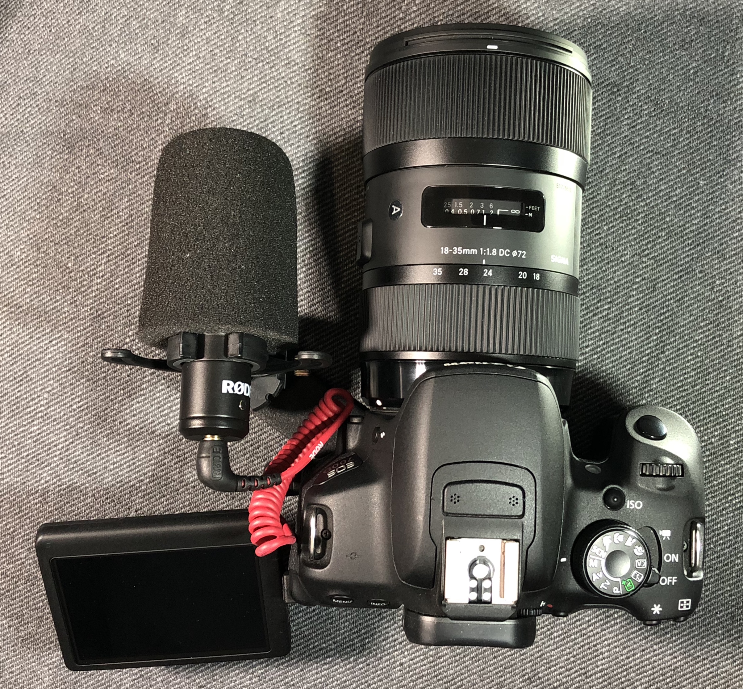
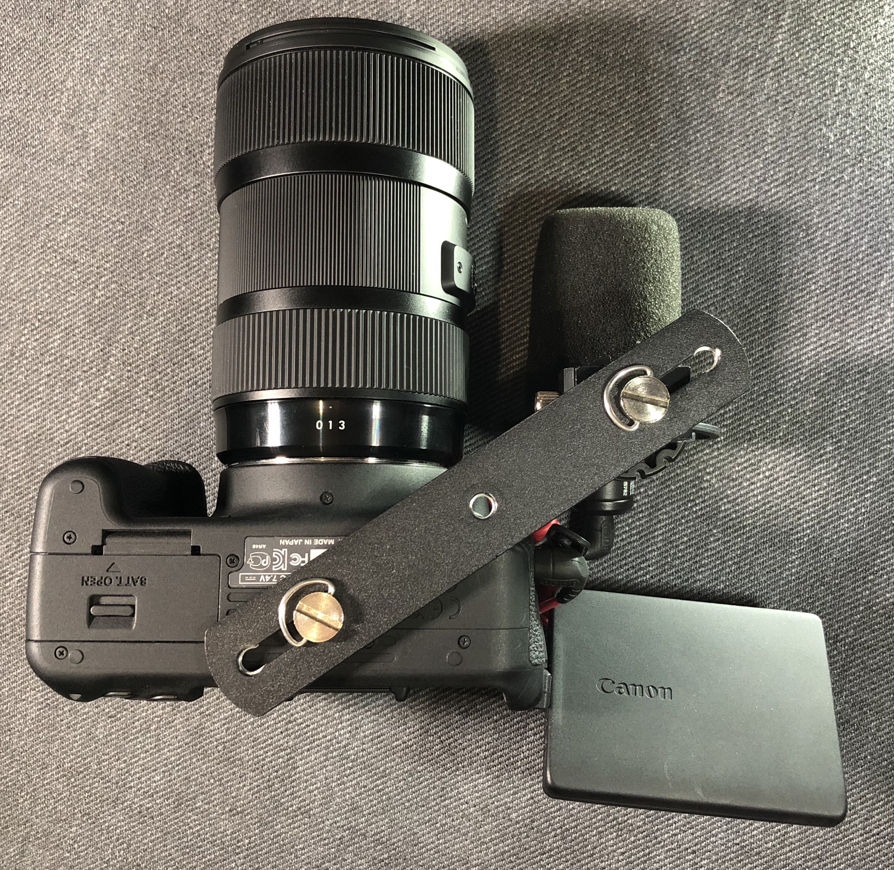
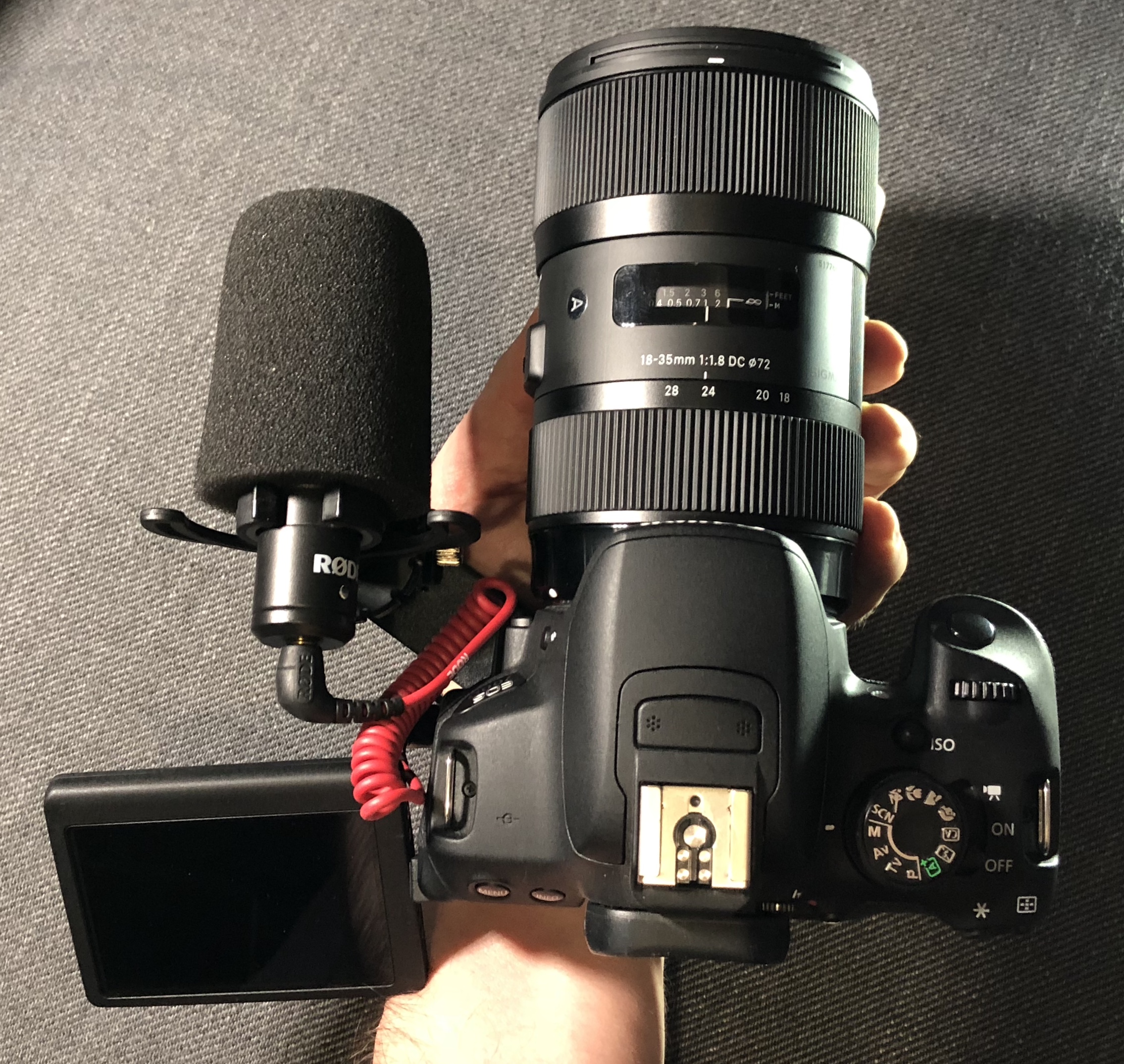
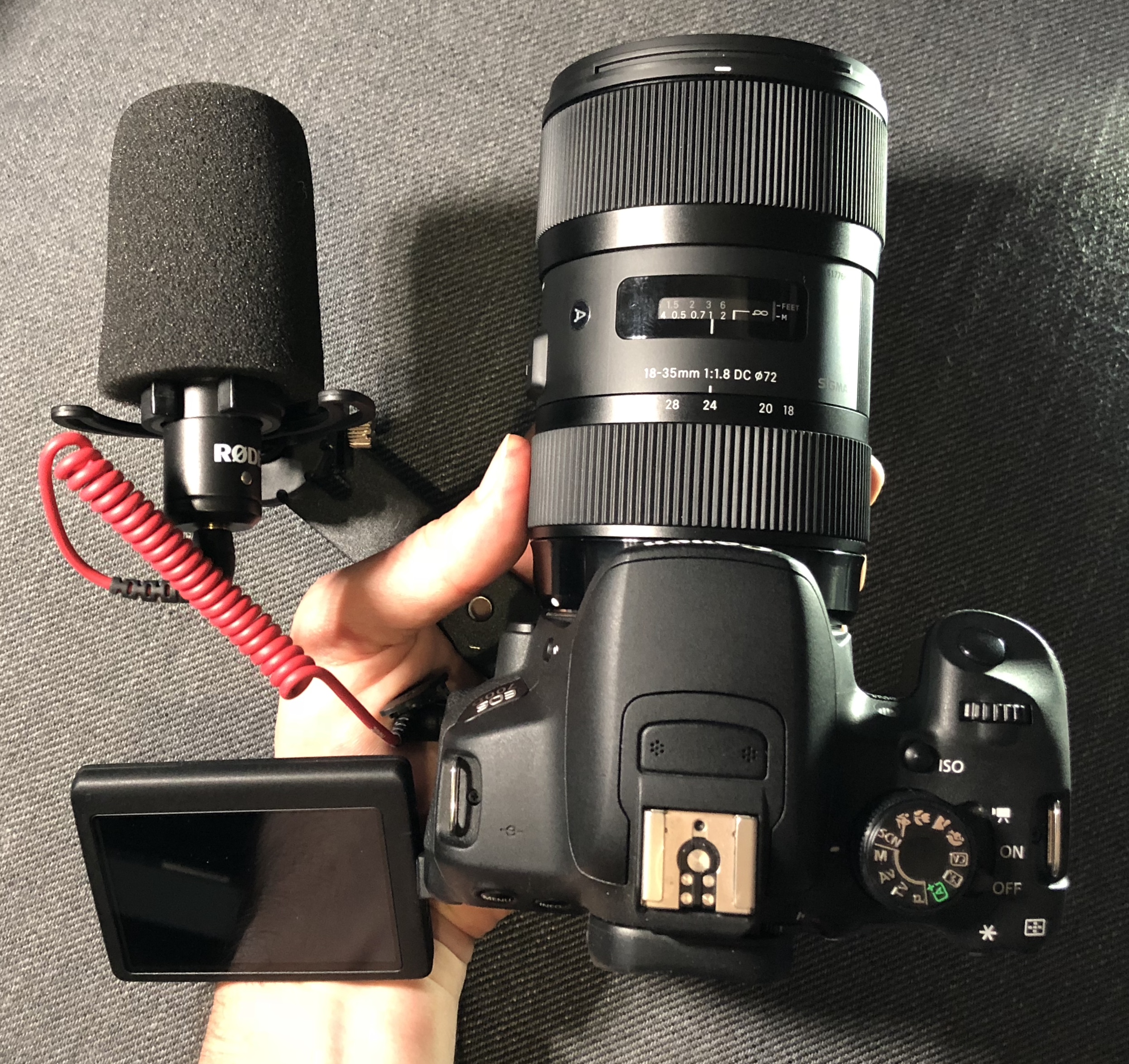
Here's the mic with the foam cover on top of the 700D and Sigma 18-35: With the flash bracket underneath allowing the mic to be mounted on the side: Underneath of the same setup - notice that the flash bracket is one of the smaller ones (15cm long) and it's in its shortest configuration: If you put the whole thing on your palm then you can operate the focus (and maybe the zoom) with your left hand and hold the grip in your right: or, if you extend it, then you can get to the zoom by going in-between the mic and the camera: I've used larger brackets in the past to have multiple cameras when I wanted more than one focal length to enable jump-cuts. This is the only pic I could find, but I'm pretty sure that I actually used it with the mic in the middle like above. The more angle you put on the bracket the nicer it is to hold, but the more likely the mic or other camera will get in shot if you're using a wider lens. On a sound-quality-related note, I have played around with many audio setups too, and found a few interesting things. In terms of quality: The primary thing is self-noise (hiss) which you want to be low, the secondary thing is isolation where you pick up less background sounds, and the third is having a safety-track if something peaks, then last is 'sound quality' When YouTubers (and I assume non-audio people) talk about sound quality they are talking about hiss and then about EQ Talking about EQ is silly because you can adjust it in post in every video editing software known to man - at one point I was wondering about buying an expensive stereo mic for ambience, but I did some tests with the built-in mics on my cameras and they sounded just fine (with some EQ in post!) so I saved myself some money and carrying around a separate microphone, and now when I want some ambience I just unplug my shotgun mic and hit record and use the in-built mics I've got the Beachtek unit mentioned and battery life was just awful - 5 hours with freshly-charged rechargeables. Forget the price of alkalines - it's approaching $1 per hour of use. I ended up buying the Rode VMP+ which has 19 hours of battery life and means I don't need a mic pre-amp at all, plus it charges via USB. If you sleep more than 5 hours a night you can literally just turn it on when you wake up and off when you put it back on charge at night! That makes it much less likely to stuff up a shot by forgetting to turn the mic on. All of the above relates to on-camera shot-gun style sound setups, and for my home videos. I haven't messed with lavs or boom mics, so I'll leave that to Ironfilm in the other thread

-
Who knows how much thought or market research goes into these things... or who their target market might be. They might be planning a killer marketing campaign to address the legitimate needs of users we don't know about on a social media network we're not even on!
-
Interesting - it looks pretty big compared to some m43 cameras. I guess the specs and price will tell us a lot more. I'm not optimistic though. From the article - "The choice of lens mount is likely due to the fact that Yongnuo only makes lenses for Canon and Nikon, but no Micro Four Thirds glass." If you went super-budget and only added their version of the 50mm 1.8 then you'd have the lens in your phone (likely 28mm with comparatively deep depth-of-field) and a 100mm equivalent lens with shallow depth-of-field, which is quite a good complimentary pair of focal-lengths and apertures IMHO.
-
Don't underestimate different parts of the world.. the NZ people I know are quite relaxed, and I'm an Aussie, so that's saying something! There's something about big cities that make them a dog-eat-dog type of environment, and when you have to fight to survive it means that any kind of law-enforcement would toughen up quite a bit. Will post some pics when I get home My sets always have a "most awesome person" (hint - it's always me!)
-
I hope so!! They look quite large to me - considering that a condenser microphone is a very small object. I'm having evil thoughts about them having multiple capsules in there with parabolic reflectors and wired in a way that makes the output more directional. I'm probably completely wrong, but this thread is about taking very little evidence and running wild with it, right?
-
@mercer I quoted this from your audio recorders thread as my reply would have been a bit OT there. I also own the Rode Video Micro and found that you can buy some cheap eBay foam covers that fit quite well and are a lot smaller. I bought a number of them to get the right sizing (the diameter of the Rode VM is on the larger size for the foam covers) but if you buy one that's a bit too big a cable tie or even a twisty-tie would secure it. The one I ended up using was for a long shotgun mic and I trimmed it down to length. I haven't tested them for wind resistance, but it'll be better than nothing and the size difference is huge! Another 'trick' is instead of using them on the hot-shoe (which makes it look tall) you can buy dual flash brackets (eg http://www.ebay.com.au/itm/Dual-Flash-Bracket-Holder-For-1-4-Screw-Studio-Tripod-Light-Stand-Camera-GA-/182389726343?hash=item2a77465c87) and get a tripod to cold-shoe adapter which allows you to mount the mic next to the camera instead of on top, which hides the size a little bit. I found angling the bracket can make it quite ergonomic too. Happy to take some pics of the setup if this is useful.
-
If one lens seems to work fine and others don't then perhaps it could be a bad connection between the lens and the adapter? I'd suggest cleaning the lens contacts on the offending lenses, on the adapter and on the camera as well. It's quick and easy and worst case is the problem persists but now your lenses are a bit cleaner and you've ruled out a possible source of the issue
-
Does anyone know anything about how directional the audio will be? The mics are on the front after all.. If I could ditch my Rode VMP+ that would be another layer of icing on top of the rest of this camera-cake. The XC10 thread was similar.. pages = emotions = things to talk about. If you're familiar with the news media then you'll know that millions of column inches are devoted to BS every day around the world! You could insert a small buffer chip (enough to contain a full sensor readout worth of data) and then you could read from the sensor to the buffer chip quickly and then the processing could happen at a slower rate by reading out of the other side of the chip. These chips have two interfaces - one to write and one to read - and they can run at vastly different speeds. Of course, more chips = more cost = more power consumption etc..
-
Ah! That makes sense.. Thankyou Maybe I should have included a second question about genre - events, narrative, stock, etc.
-
More people have Shotlists and Schedules than Scripts? Really? How does the logic of that work?
-
My understanding is that in terms of internal vs external they can be quite different. As an example the XH internal is 4K 8-bit 4:2:0 at up to 200Mbit, but the HDMI output sends out 4K 8-bit 4:2:2 which the recorder can then save in whatever format and bitrate it supports. Another example to prove the point is that the Sony RX0 can only record 1080 internally but outputs 4K so if you use an external recorder you can record in 4K with it, so they can be quite different.
-
Wouldn't that be for after the shoot? If you drink it before the shoot then you'd be far too relaxed, having too good a time, not be paying attention to annoying people....... hang on a minute - I think you might be onto something here!!