Scott_Warren
-
Posts
55 -
Joined
-
Last visited
Content Type
Profiles
Forums
Articles
Everything posted by Scott_Warren
-
Sigma Fp review and interview / Cinema DNG RAW
Scott_Warren replied to Andrew - EOSHD's topic in Cameras
You learn something new every day! That makes a lot of sense, actually. I assumed that the Blackmagic setting was expecting specific colors from your own color filters and so would produce "wrong" results if you started that way. Thank you for the information :) -
Sigma Fp review and interview / Cinema DNG RAW
Scott_Warren replied to Andrew - EOSHD's topic in Cameras
@imagesfromobjects You'd want to browse to the root of where the DNG sequence lives on your drive in the media browser, then either drag it into the media pool or right-click it and Add to the media pool. From the media pool, you would create a new timeline with it and off you go! It's easier to add DNG sequences through the media pool browser instead of manually adding a folder filled with frames where you'd need to select all the frames, then add... it gets tedious after several clips.
-
Sigma Fp review and interview / Cinema DNG RAW
Scott_Warren replied to Andrew - EOSHD's topic in Cameras
@imagesfromobjects One exercise that helped me get started with Resolve was opening an image in Lightroom and tweaking it to taste, and then opening that same image in Resolve & using the same controls (exposure, contrast, saturation, Hue vs Hue, Hue vs Lum curves, etc.) to try to recreate the same result that I saw in Lightroom. I know that video adjustments tend to exist in their own universe when you dig in to try to make things more technically sound for video compared to a still, but it might be worthwhile to do something similar. With that approach, I could still think in terms of editing a still but developed more of a video mindset to how the controls translate differently between stills and video. Curves still largely function the same, though they tend to be more sensitive in Resolve than Lightroom, and instead of using one master stack for operations, you apply them to nodes which can then be re-wired to create different results depending on the flow of the math. I also had experience with the Unreal Engine material editor for years, so node-based editing and order of operations wasn't a huge leap. I think @paulinventome 's approach with injecting a DNG into the RED IPP2 workflow is one of the faster ways to get to a solid image that I've seen recently. -
Sigma Fp review and interview / Cinema DNG RAW
Scott_Warren replied to Andrew - EOSHD's topic in Cameras
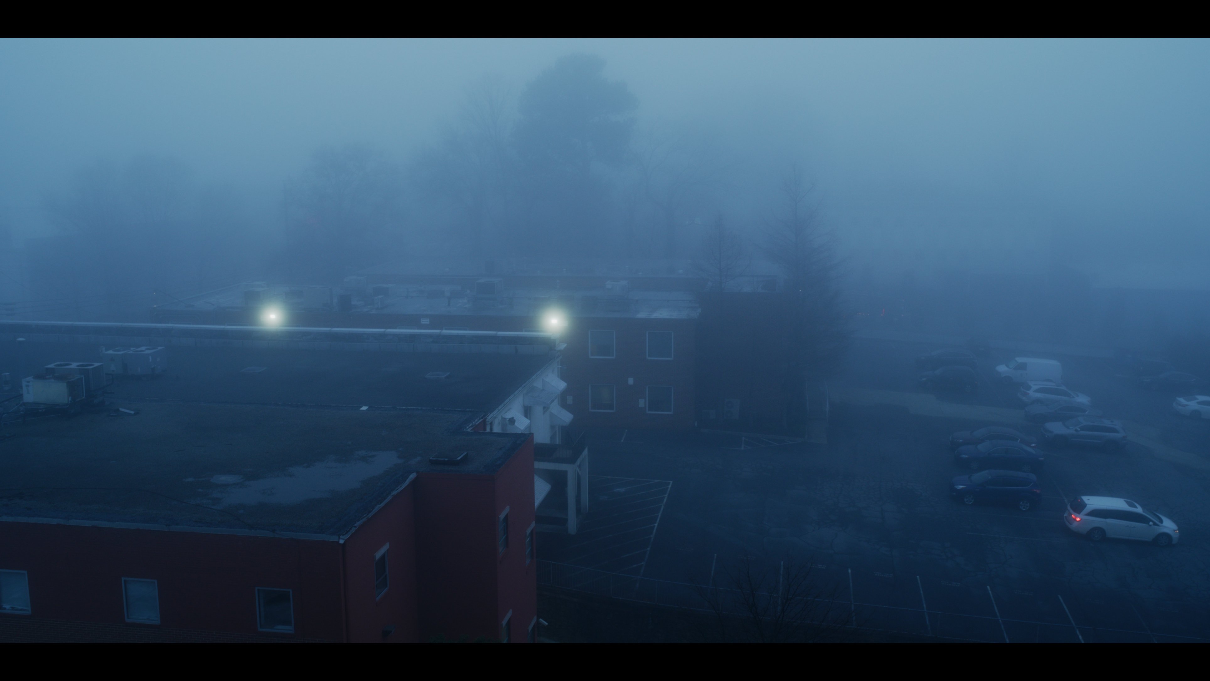
More stills from the progression of the pan. I'd upload a video, but the motion was nothing to write home about. Really just sweeping around finding interesting compositions at random. There's something appealing about the behavior of blues and teals using IPP2. It has a certain iciness to it that's hard to describe.
-
Sigma Fp review and interview / Cinema DNG RAW
Scott_Warren replied to Andrew - EOSHD's topic in Cameras
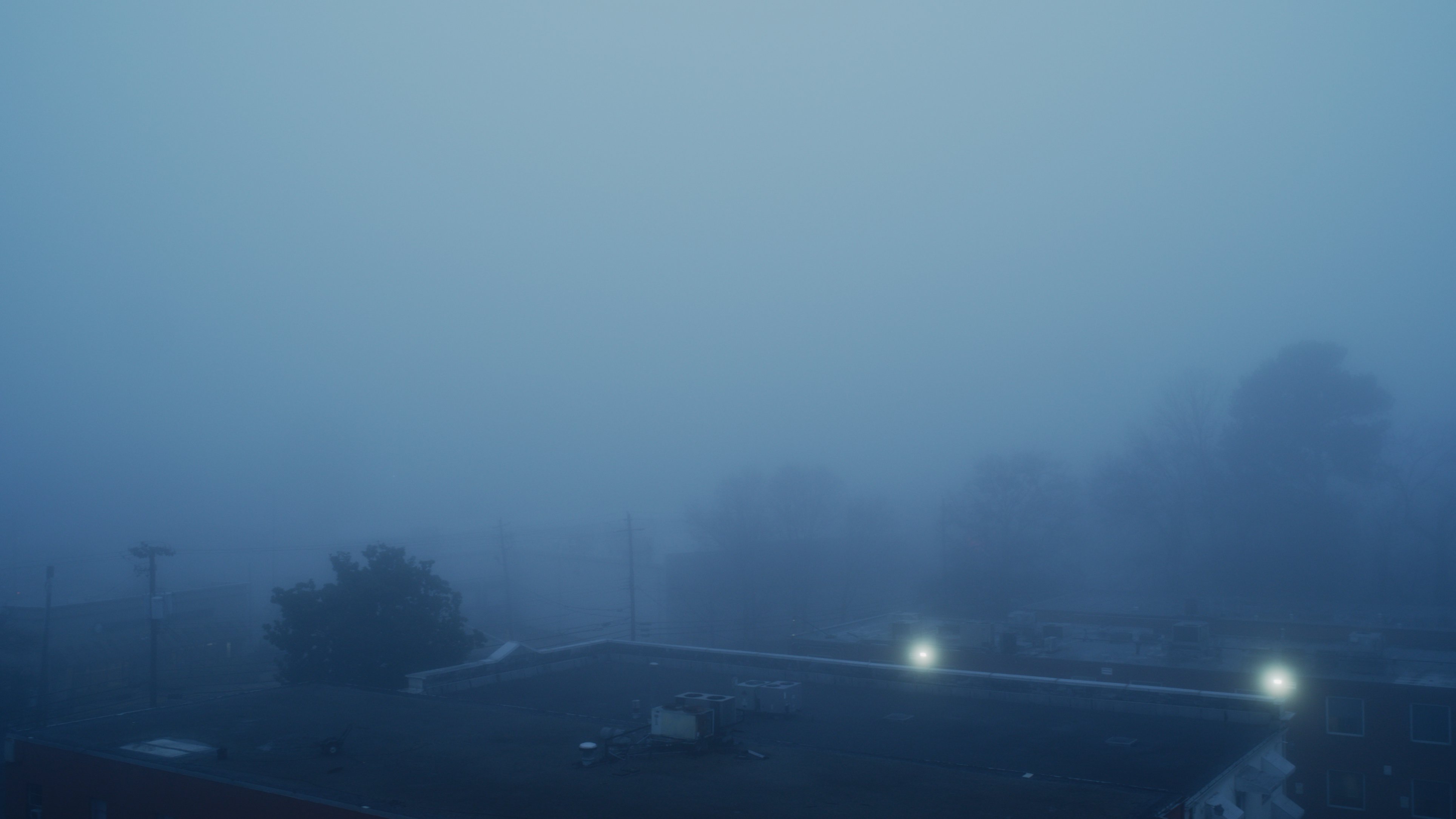
Definitely play around with it, Chris! The highlight roll off control alone allows for range compression depending on what's going on. Kind of seems like a local highlight tonemap operator. For this shot, I used a Soft rolloff to help the roof lights transition more smoothly into the fog. It's acting like an extra diffusion layer on top of the natural fog scatter.
-
Sigma Fp review and interview / Cinema DNG RAW
Scott_Warren replied to Andrew - EOSHD's topic in Cameras
@paulinventome I tried a test using your IPP2 workflow, and I have to say I'm now a huge fan The only thing different is I'm using Hard highlight rolloff since I like the extra snap it gives to light sources, but the color behavior out of the gate + the OneShot chart is just fantastic. Skin is maybe a hair red compared to reality, and a Medium rolloff makes it look more correct, but at the expense of the hotness of the lamp. To my eye, this is what the corner of my TV console looks like in reality. It's actually a bit scary how quickly this approach gets to a solid image, haha. I feel like I'm cheating! IPP2 kind of feels like RED's own baby ACES in that you can control global aspects as you wish. It's super powerful. Huge fan of global operators in place of knob parties!
-
Sigma Fp review and interview / Cinema DNG RAW
Scott_Warren replied to Andrew - EOSHD's topic in Cameras
@paulinventome It turns out the stock X-Rite software doesn't do a super accurate job of calibrating the toe of the display curve for sRGB. It makes it too crunchy. I calibrated with DisplayCAL and can now see into the toe more accurately, so I don't need to compensate in Resolve with using the flatter P3 ODT to offset what was looking too crunchy on both my P3 and sRGB monitors. I can only imagine what a dedicated LUT box would offer! After leaving the fp DNG as-is and then white balancing and pushing saturation right up to the vectorscope target boxes (Saturation set to 80-90 on a node, not the RAW saturation controls which behave weirdly), the AP1 primaries look pretty true to life. I took a low tech approach to adjusting the saturation by eyeballing the corner of the living room and comparing it to the monitor and it looks pretty dead-on at this point. Is the need for pushing saturation dramatically due to the nature of how big the AP1 gamut is compared to sRGB/ 709? No normal monitor can display AP1 so I imagine there has to be some base pushing of saturation in order to get a good starting point within a smaller gamut, unless I have that totally backward. -
Sigma Fp review and interview / Cinema DNG RAW
Scott_Warren replied to Andrew - EOSHD's topic in Cameras
Thanks for being a fountain of information, Paul! The obsession for seeing the ground-truth image is very real, haha. I've dabbled in baby steps of color management with my work in games, so it's great to be made aware of how deep the rabbit hole goes. -
Sigma Fp review and interview / Cinema DNG RAW
Scott_Warren replied to Andrew - EOSHD's topic in Cameras
@paulinventome Here's the link to the folder of DNGs of my colorchecker. Their white balance would be equivalent to Shade, so 7500K, +10 M . Incident exposed at speed with my Sekonic. https://drive.google.com/drive/u/0/folders/1YLY5ls433I-DgaLSbbzE3Lf6MtTKwjKT I do have an X-Rite iDisplay calibrator to help wrangle any of the weirdness Windows might introduce without any help, however. I know it's not scientifically perfect like what could be achieved with higher-end solutions used for film post, but it was close enough for our purposes when I was lighting Call of Duty: WWII that I adopted it for home use as well I've been meaning to check out DisplayCAL to see if that offers anything more precise than X-Rite's own software. -
Sigma Fp review and interview / Cinema DNG RAW
Scott_Warren replied to Andrew - EOSHD's topic in Cameras
@paulinventome I'm viewing and grading on a Dell UP2718Q which does 97% of P3 I suppose what I'm reacting to is the AP1 color primaries versus P3's. P3 definitely reads as warmer with more pleasing hues out of the gate, but it's something I could dial in with AP1 with some knob tweaking if that would be more proper. Of course if I use the OneShot chart to start with, then even AP1 looks great since the colors have all been hue adjusted and saturated accordingly, so I may just need to embrace being a bit more hands on with the process. The joys of learning! -
Sigma Fp review and interview / Cinema DNG RAW
Scott_Warren replied to Andrew - EOSHD's topic in Cameras
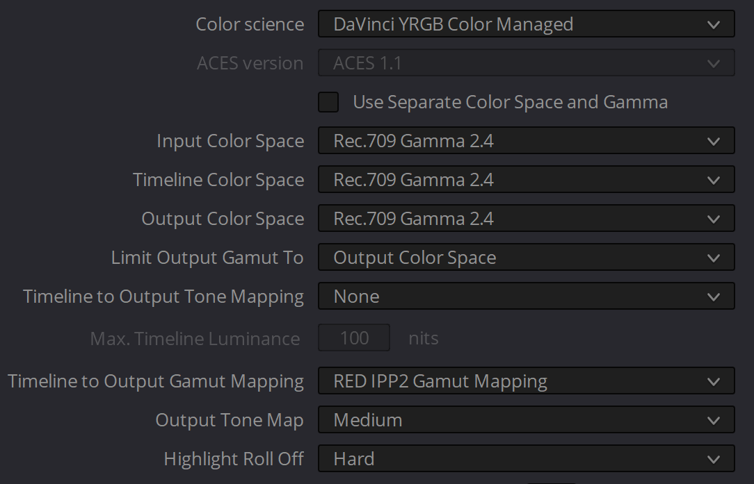
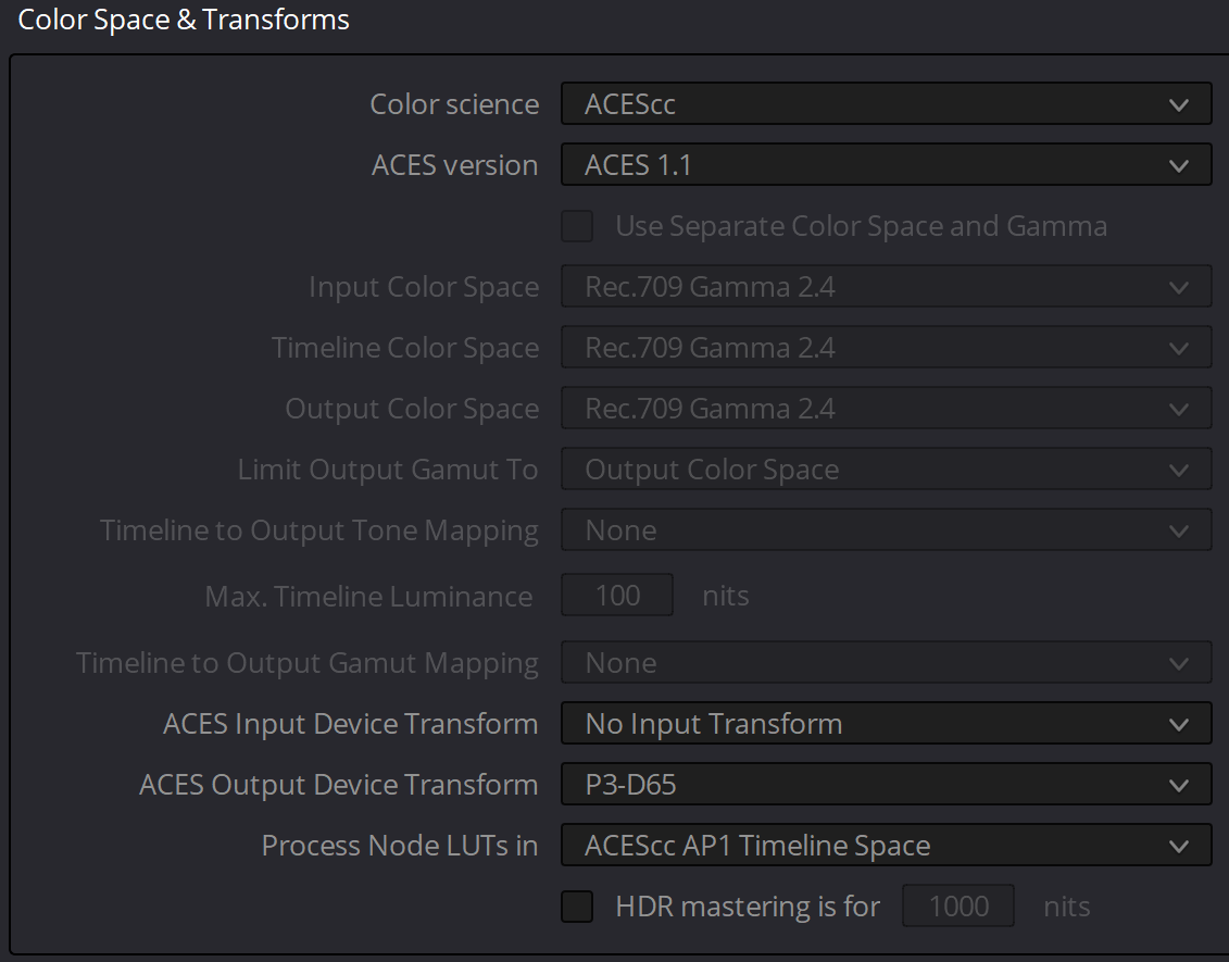
@redepicguy Attached are my current settings. I try to make the initial capture as solid as possible as far as exposure goes to avoid a lot of pushing or pulling in post. In the node chain for the start of a grade, I'll also add a Color Space Transform node to convert the ACES AP1 space down to P3-D65. Allows for more color depth than Rec709, but gives a more natural response with saturation and is supported on more and more devices these days. Also the gamma is a little softer rolling down into shadows which lets me see into darker areas without needing to bend the gamma or use lifts to see it. I try to use a global approach to getting a look in place of tweaking knobs if at all possible. Probably leftover habits of working with film for a while You don't have to convert the colorspace from ACES AP1 to 709 or P3, but I find that AP1 needs to be saturated a LOT in order to feel normal, and pushing saturation can behave weirdly depending on the subject or scene. Using the conversion method adds what I think is a natural boost of color without needing to crank things crazily. Is any of this approach correct? I have no idea. But it seems to work well for the kind of images I like to capture.
-
Sigma Fp review and interview / Cinema DNG RAW
Scott_Warren replied to Andrew - EOSHD's topic in Cameras
Now this is interesting. I wonder why a colorspace change would have such a dramatic effect on shadow colors? I can't imagine the colorimetry of the BM sensors is THAT different from the fp's when it comes down to numbers. Of course I'm also not an engineer! -
Sigma Fp review and interview / Cinema DNG RAW
Scott_Warren replied to Andrew - EOSHD's topic in Cameras
I'd be careful to assume any of us are being judgemental or lecturing, Chris. Online forums, particularly technical ones, tend to have a lot of cut-and-dry information for information's sake. Suggestions from people with different experiences aren't necessarily judgemental. We're all just sharing what we know! I don't have a dog in this fight. I just like making images and sharing what I've learned -
Sigma Fp review and interview / Cinema DNG RAW
Scott_Warren replied to Andrew - EOSHD's topic in Cameras
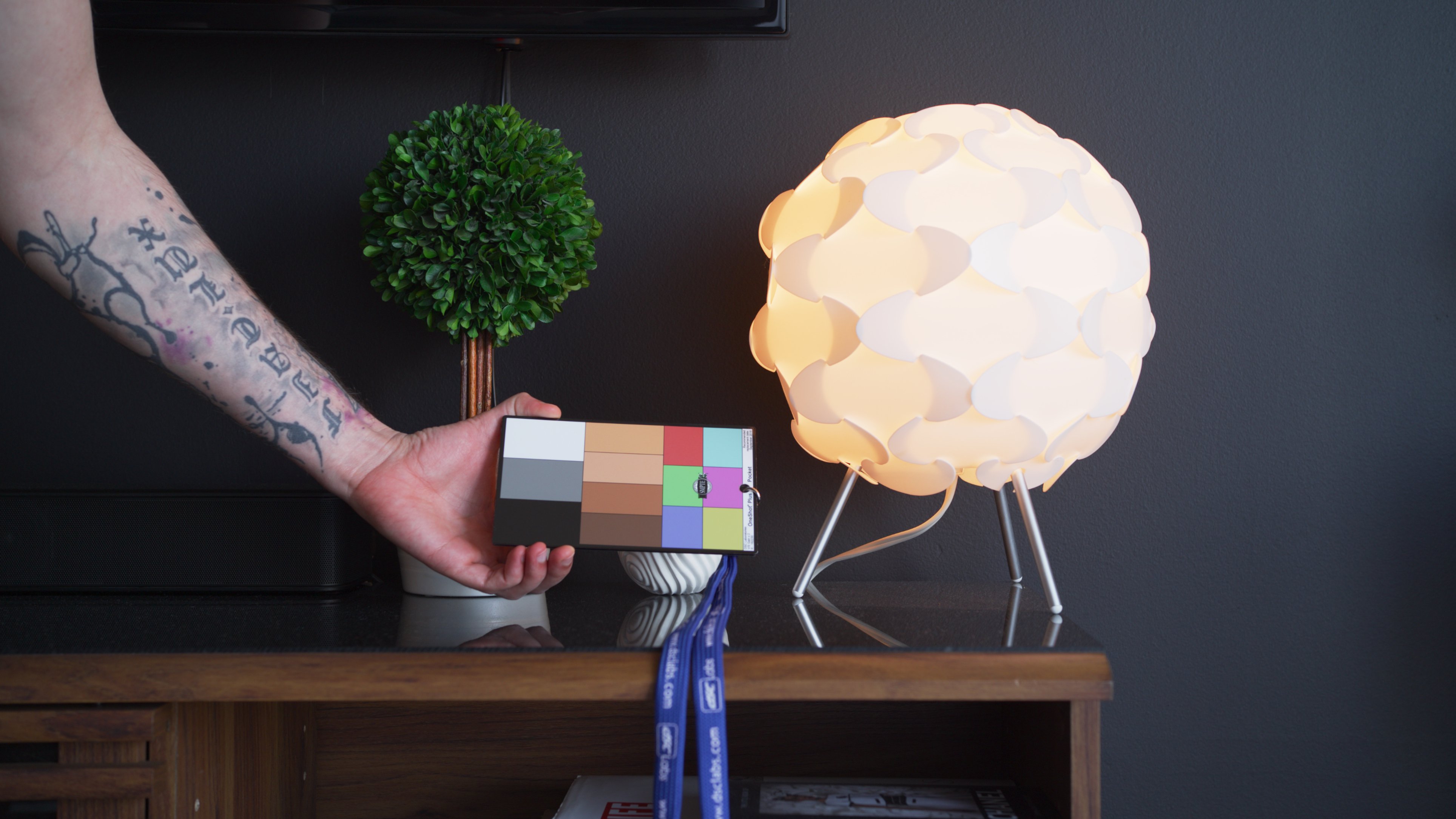
Quick aside about dialing in a better starting point about color, short of having an ACES IDT any time soon: The OneShot chart is one of the cheaper but fantastic options to get to a good starting point to balance shots together, or to make sure everything in a cut is consistent so that a global look can be authored and consistent without shot-to-shot tweaking. The ink colors are calibrated to match 50% of the saturation of the standard video colors in the vectorscope for alignment. It's also glossy, when helps you get true white and black instead of a matte finish which would only give you lifted black values. http://dsclabs.com/product/oneshot-plus-2/ For the clip above, I used the auto-match tool in Resolve followed by a quick refinement of the vector directions after that. Nothing else. ACEScc pipeline with a Rec709 output. -
Sigma Fp review and interview / Cinema DNG RAW
Scott_Warren replied to Andrew - EOSHD's topic in Cameras
Fair enough! The joy of this stuff is there aren't any rules If it looks right, it is right. -
Sigma Fp review and interview / Cinema DNG RAW
Scott_Warren replied to Andrew - EOSHD's topic in Cameras
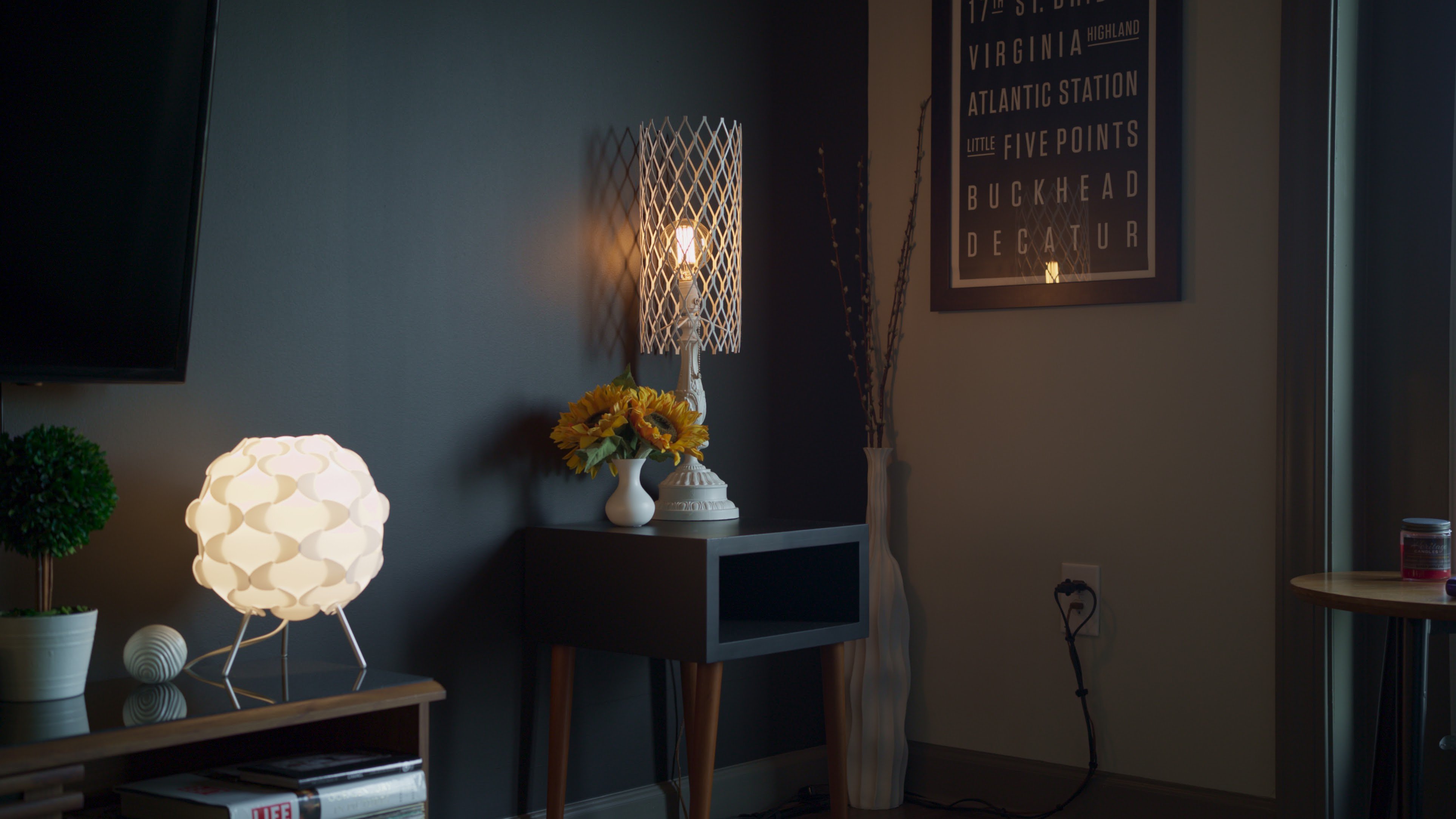
No offense to Crimson Engine, but it's a strange suggestion for people to use an incorrect colorspace as a starting point with a camera that has pretty great color in its own right as Paul has mentioned! (Something can look good with weird settings, but you always want to strive for base technical accuracy + aesthetics in my opinion.) You might also consider using the ACES pipeline since it has a film print like "look" built into the display chain already. It takes the color matrix built into the DNGs and scales them for output for your monitor without weird translations or conversions except to ACES' own massive color space. You'd be free to add in a Colorspace Transform node and try out different camera color sciences to see if something else is more to your liking (Alexa, RED, Sony, etc), but I've found it's a quick and repeatable way to get excellent color out of the camera quickly. The attached shot was achieved just by dropping in the sequence and pushing exposure and saturation a bit to match to what I saw in person. (Metered the window light with an external incident meter as I tend to do.)
-
Sigma Fp review and interview / Cinema DNG RAW
Scott_Warren replied to Andrew - EOSHD's topic in Cameras
At least from what I've seen, the flickering will occur at ISOs just outside of that range. For whatever reason, 100-400 seems to be a fairly "safe" zone with no flickering. Why? Well... X-Files theme begins playing -
Sigma Fp review and interview / Cinema DNG RAW
Scott_Warren replied to Andrew - EOSHD's topic in Cameras
That green shift is weird indeed. 1. Bit depth doesn't seem to affect flicker behavior from what I've seen. 2. All with 4K 12bit capture at 23.98fps and 180 degree (1/50th according to DNG files) shutter: 100-400 = fine 500-2000 = flicker 2500 = fine 3200-4000 = flicker 5000-6400 = fine 3. Overexposed first frames happen on ISO 125, 160, 250, 320. -
Sigma Fp review and interview / Cinema DNG RAW
Scott_Warren replied to Andrew - EOSHD's topic in Cameras
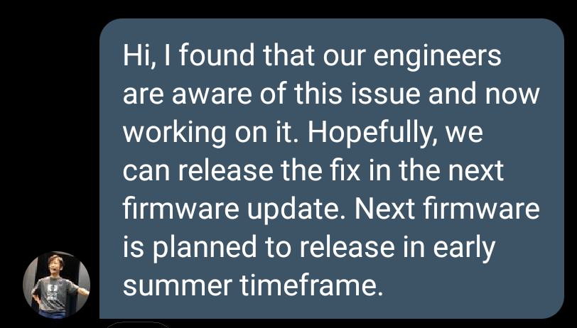
Mr. Yamaki replied again and said the engineers are aware of the flickering issue and are actively working toward a fix. They hope to have it included in the summer firmware release
-
Sigma Fp review and interview / Cinema DNG RAW
Scott_Warren replied to Andrew - EOSHD's topic in Cameras
Thank you Chris! That makes three (4 when Paul confirms) of us so far with a 100% repeatable first frame issue. The flickering will be weirder to group nicely between us, but with that all we can do is send Sigma samples of what we're seeing to let them figure it out on their end. Picking 24 consecutive frames from a sequence that flickers should be enough as sample footage, and would be much smaller to upload for hosting. -
Sigma Fp review and interview / Cinema DNG RAW
Scott_Warren replied to Andrew - EOSHD's topic in Cameras
Oh man, definitely don't want to upload that, haha. I bet money if it's happening at 200, it's happening at the thirds-ISOs below 400. Very odd behavior. -
Sigma Fp review and interview / Cinema DNG RAW
Scott_Warren replied to Andrew - EOSHD's topic in Cameras
Heya Chris, would you mind checking to see if the first frame issue happens with 125, 160, 200, 250, and 320? It doesn't seem to happen at 100 or after 400. That's definitely an annoying bug on its own! -
Sigma Fp review and interview / Cinema DNG RAW
Scott_Warren replied to Andrew - EOSHD's topic in Cameras
It's definitely one of those cameras where the "get" of the image is so good that I think it's worth it for us to keep pushing until it's as great as possible. To be able to push a file almost three stops without issues is mind-blowing to me! This must be similar how the early RED camera adopters felt when they were in their breakneck development phase. -
Sigma Fp review and interview / Cinema DNG RAW
Scott_Warren replied to Andrew - EOSHD's topic in Cameras
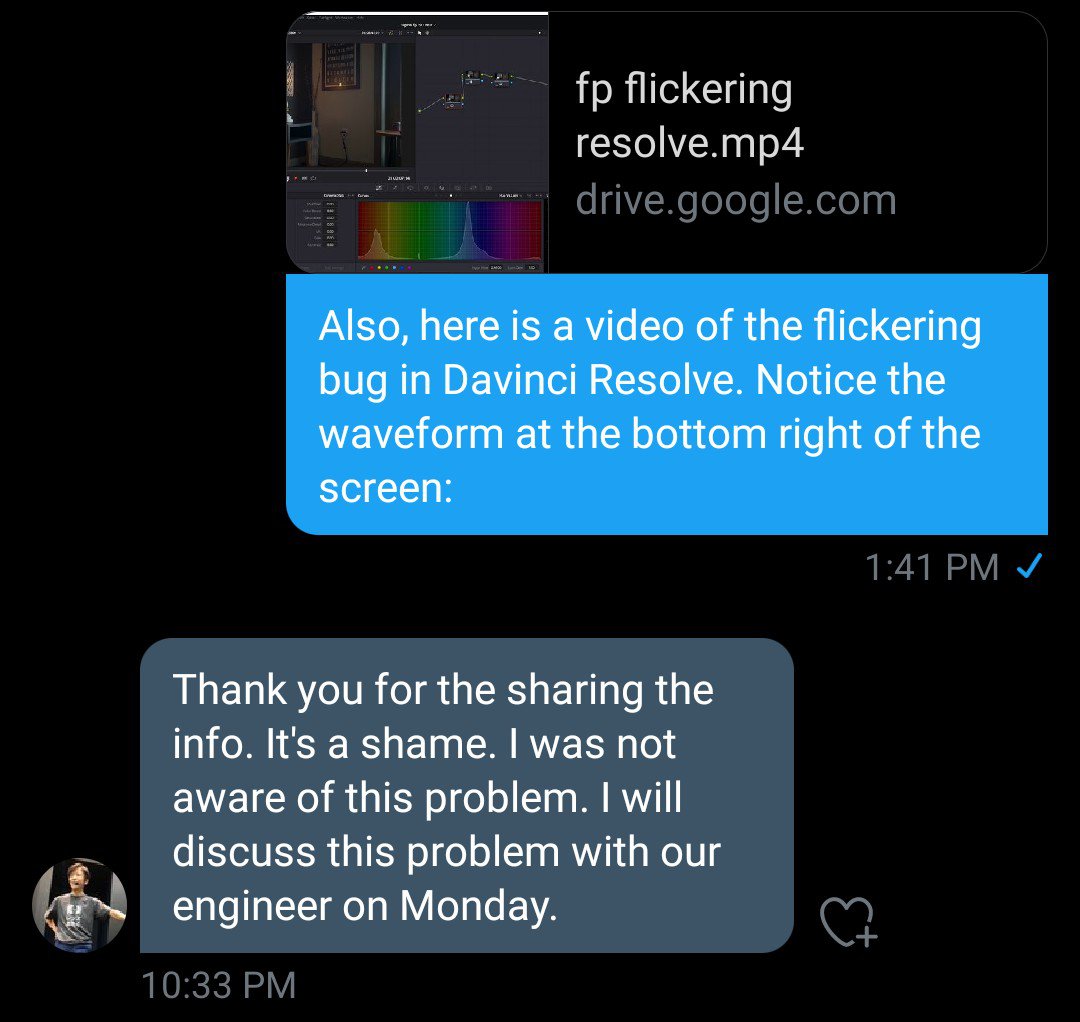
I reached out to Mr. Yamaki on Twitter again and directed him to the previous page of this thread with everything we've found out so far as well as the capture of the flickering happening in Resolve. Fingers crossed
-
Sigma Fp review and interview / Cinema DNG RAW
Scott_Warren replied to Andrew - EOSHD's topic in Cameras
This seems like a good point to package this new round of tests up and send it into Sigma! This thread has become a living and breathing round of research, haha.