Hi all, since a few months I'm using a Sony a6000 - and so far, I've been very happy with it. The stills are great – especially the RAW files - and the video is also quite good. However, I haven't found yet the best colour settings for video. FYI, I particularly like film-like colours, but not overdone. I also like Arri colours. I suppose a lot of you are either using Canon RAW files, Blackmagic stuff or Sony S-Log, but I'm a beginner and not doing this for a professional purpose, and the photo IQ and portability were also important for me. I would like to know what settings you are using, and if possible also what your thoughts are about other settings. Regarding the grading, I've a reasonable good screen (LG IPS), but it hasn't been calibrated yet. - Picture profile: I figured out that the profiles with the most DR are the standard, neutral, portrait and night settings, dialed down to -3 of course. Portrait seems to change the colours more than the other profiles. Currently I use neutral -3 -1 -1 (like Philip Bloom...). - Saturation setting: I use -1, I don't think it's useful to drop this to -3 as long as there's no colour clipping? Or are there colourspace issues? - Sharpness setting: I use -1, and haven't yet used sharpening in post. I read some people use lower values, which results in some softness, which doesn't seem very correctable (without artifacts) in post. - DR Optimizer: for low ISO's I set it to lv5 (maximum), but for the higher sensitivities I turn it off (or set it lower) due to noise in the shadows. - White balance: I found that judging the WB with my eyes doesn't work at all as regularly the WB of my left eye differs from that of my right eye... I currently try to set the WB by pointing the camera at a white object and then setting the kelvin value in such a way the whites (real and LCD) do match. Is this a good way? I also read about using a diffusing filter and pointing the camera at the sun. Haven't used this method yet (don't have that filter), is it much better? - There are also two other colour settings with coordinates, is it necessary to use them too? Haven't used them yet. - There exists an app that gives more in-camera grading possibilities – and a flatter profile - called 'live grading app' . Anyone using it? Does anyone know whether it's possible to use the extra profiles together with another app, e.g. the timelapse app? Does someone also know whether the XAVC-S issue (http://***URL removed***/forums/thread/3906687#forum-post-56586577) has been fixed? - Does sRGB or AdobeRGB make much difference, as the colours for video are maybe always REC-709 (or so...)? I don't have much understanding of colourspaces – just that not all colours are possible in certain spaces and that most non-pro displays are also rather limited in this regard.
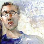
Here are some before and after grading frames. Some feedback about the grading would be really apreciated.
All footage was shot with neutral -3 -1 -1, custom or auto WB, 25p XAVC-S and the two kit lenses. Sometimes I used my variable ND but in other cases I just dialed down the shutterspeed (I know this isn't cinematic). For the editing, I enabled the full luma range and I used bezier curves for the luma values and a slight technicolor effect to make the colours more vivid. In the future I'll use some very old Nikkon S-mount rangefinder primes (50mm F2 and 35mm F3.5), but I have yet to make an adapter (I think I will 3D print them) as available ones are too expensive (60-250$ + taxes). If I succeed, the designs will be made open source. I'm also looking at Canon FD lenses. From what I've read, it seems that in the US these lenses are available in shops everywhere. This doesn't seem to be the case in Europe however. Anyone tips on where to get them, apart from ebay and the like?
Regards, Arne
Note: I just noticed that when the images above are clicked to enlarge, the enlargment has slightly other colours than the in-text image (which looks identical to the one in my files). Maybe the problem is on my side, but could someone do a quick check?


 Blue Fox got a reaction from teddoman in Best settings a6000