
André Eriksson
-
Posts
20 -
Joined
-
Last visited
Content Type
Profiles
Forums
Articles
Posts posted by André Eriksson
-
-
6 hours ago, Kenta said:
Rec.2020 is not the same as DCI-P3. It is a wider color gamut and no current laptop can do Rec.2020 at the moment.
Do you have a source? I handles Youtube HDR...?
I'm very confused about all the different wide gamut/hdr modes. Would be great if somebody has a nice writeup.
Edit: I did some more googeling, and yeah you seem to be correct. Still, would love a guide about all this.
-
26 minutes ago, Ed_David said:
this magazine says the Razer Blade has better color fidelity than the MBP : http://www.laptopmag.com/articles/razer-blade-vs-macbook-pro
That's the old macbook. New one has a DCI-P3 Rec. 2020 display. Not sure what it means for color grading, but I looks amazing in the store.
https://en.wikipedia.org/wiki/DCI-P3
Don't know how it compares to the Blade.
(I will personally try to hold on to my 2012 Macbook Pro for one more year. MacOS actually runs better on it now than it did when I bought it 4,5 years ago.)
-
1 hour ago, Axel said:
Stop lamenting. Learn the scopes and then take pride in lecturing us all!
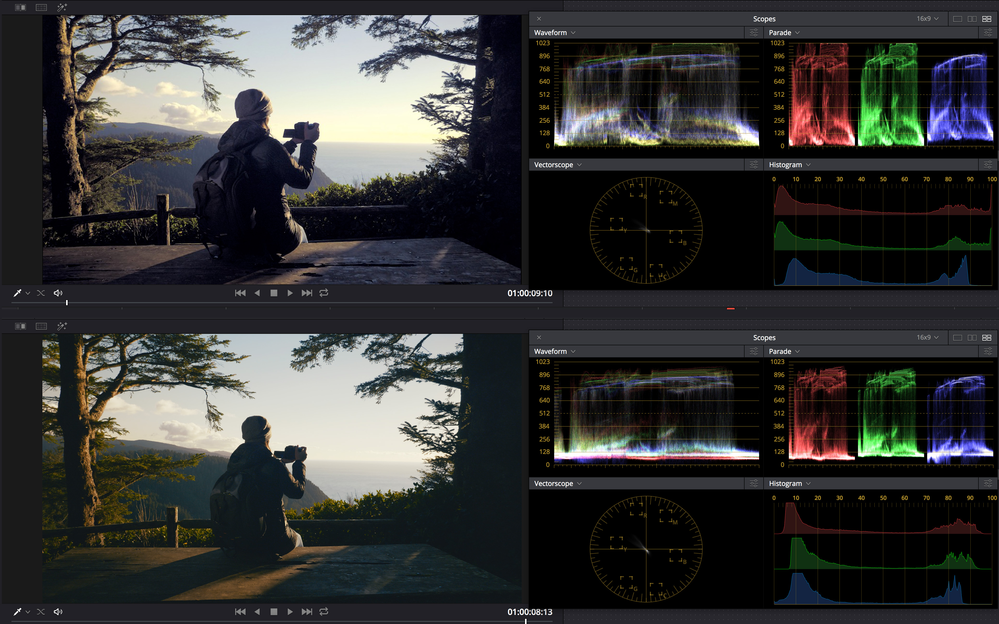
Okay, I'm way out of my league here as I'm as unprofessional as one can be, but to me you grade looks really strange.
If I look at the scopes of your grade (top) there is a huge difference between your blues and red/green. This is also what I see in your image where the shadows looks way to blue, even for this kind of "hollywood cold shadow" look. There is also somethings strange going on in the low mids, which could be why your image looks quite harsh. (Everything also seems to be clipped both in highlights and shadows, but I'm not sure if this is due to jpg/resolve/luminance levels.)
As a comparison I've added my own attempt with a more subtle orange teal look. I am not saying that it is perfect, but what you can see is that the difference in my levels are much smaller, which also makes for a more refined, less harsh look. Scopes are, apart from using them for color correction, also very helpful in seeing how subtle or extreme your grade is.
Another tip is that warmth also comes from the red channel, not only blue. Your grade would have looked much better if you also had adjusted your reds, both in shadows and highlights.

-
Not to be such a downer but this thread really shows the importance of a professional colourist.
Many of you at least need to learn how to use waveforms and scopes. (Including myself, I didn't really bother with them)
(Original Neumann film as has perfectly fine neutral "basic" grade which I think is fitting a product launch movie.)
-
Just a disclaimer, my grade was mostly ment to showcase the breaking point of the file, and is pushed too far.
Note the artifacting in the skin in the second image (8 bit 60p). But I think it would have held up if it were shot in 10 bit!
-
Pushed some of the clips quite hard. Noise will of course appear, but I do not see any compression artefacts at all in the 10 bit clips (first image). Not sure yet what I think about the color science.. its not effortlessly beautiful.

-
Did a short 1 min test with 160 mbit. Camera was very responsive this time. The macroblocking I remember is essentially gone, but the biggest improvement actually seems to be in motion cadence. No tearing or anything even with a manual non-stabilized lens.
Has anybody done any longer stress tests?
I'm thinking of shooting a short film (just a personal project) with this hack tomorrow... but I'm worried about general stability and somehow bricking the camera, running it hacked for two long days. Any advice?
-
First off, great work Vasile!!
I did a very short test and while it certainly worked, the camera got a little bit slow, it also had trouble turning off. It maybe seemed faster at a lower 120 mbps setting, but I got too scared of the whole thing and removed the hack.
I might try again later, just paranoid that it will damage the camera somehow
")
Edit: I can see an extremely small improvement in macro blocking, and maybe slightly more detailed foliage, with the 120 mbps setting.
-
Came across this Tested/Mythbusters clip where they have strapped a Ursa 4,6k to a car with an interesting rig. Quite a long clip, some footage from the camera scattered through out, most of it at the end (8:00 and forward).
-
You'll get there. For learning, maybe try to stay away from the LUTs, they can mess up a lot of things.
-
3 minutes ago, mercer said:
Haha, I'll have to remember that. I was blaming my girlfriend because she kept talking to me while I was trying to nail the skin tones.
But yeah, this Tokina lens is awesome. I didn't expect much from it when I bought it, but I'm a sucker for 28 and/or 35mm f2 lenses.
Those look great, so you didn't use any LUT at all? I was getting the colors close, but they ended up looking too flat, how did you get that finish polish or sheen to it? Is it simply contrast?
Thanks!
Thanks! No LUT. Just DaVinci Resolves lovely gamma wheel, a lot of saturation, some fiddling with the contrast curve, and then I balanced the individual red, green and blue curves in a separate node. It's very easy to get lost with the individual curves though...
-
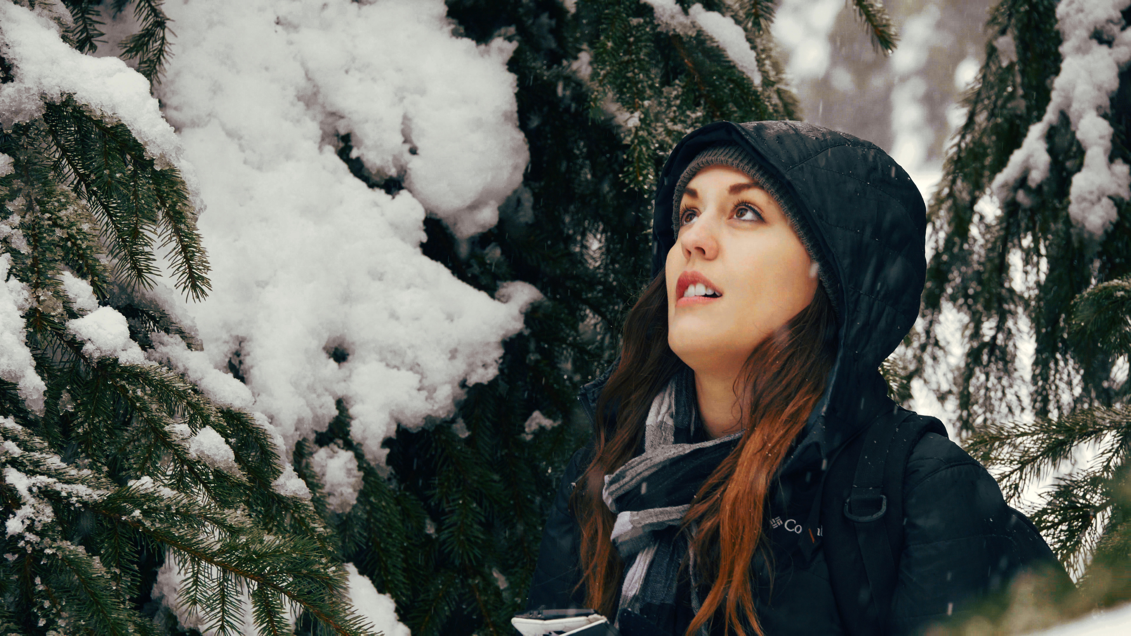
I see now that they turned out quite dark.
Anyway, I think your very first grade looks the best. Maybe a little too orange, I had the same problem. Since I've not seen him in person I'm just gonna assume that he is an orange guy!
-
-
-
I know nothing about the A6000, but I just wanted to stop by and say that I think the grades look really nice. Maybe the reds in the rose are a little bit too orange, but the overall warm look feels good.
-
Its coming to Stockholm!
The theatre managed to borrow a projector from a museum")
I will be there on monday.Saw it in Stockholm a couple of days ago. The 70 mm image was special, but also the atmosphere in the venue, felt like there was an excitement in the crowd.
The movie itself was not Tarantinos best, but the experience was great!
-
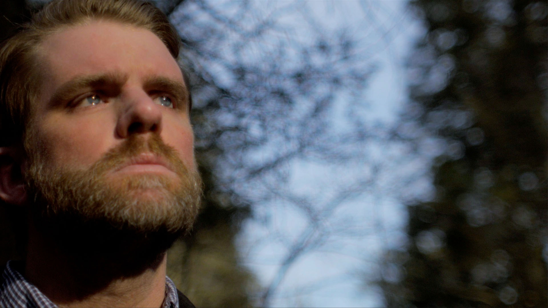
That's pretty much spot on now.
Shame it could not quite hold onto the sky and trees, but I think pretty good for space saving 8bit convenience versus mighty 14bit raw.
Thanks! I'm definitely no grading expert, but it felt like the image held together quite well (at least better than my Nx1). Apart from gamma adjustments and white balance tweaking the major things I changed was to desaturate reds, and shift the blueish greens more towards yellow.
Strange about the highlight though, because it was different in your first jpg, maybe I messed up there.
-
While it was much easier to grade the source clip (could not save the overexposed sky though), I don't think I got the colors that much closer...
-
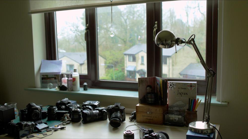
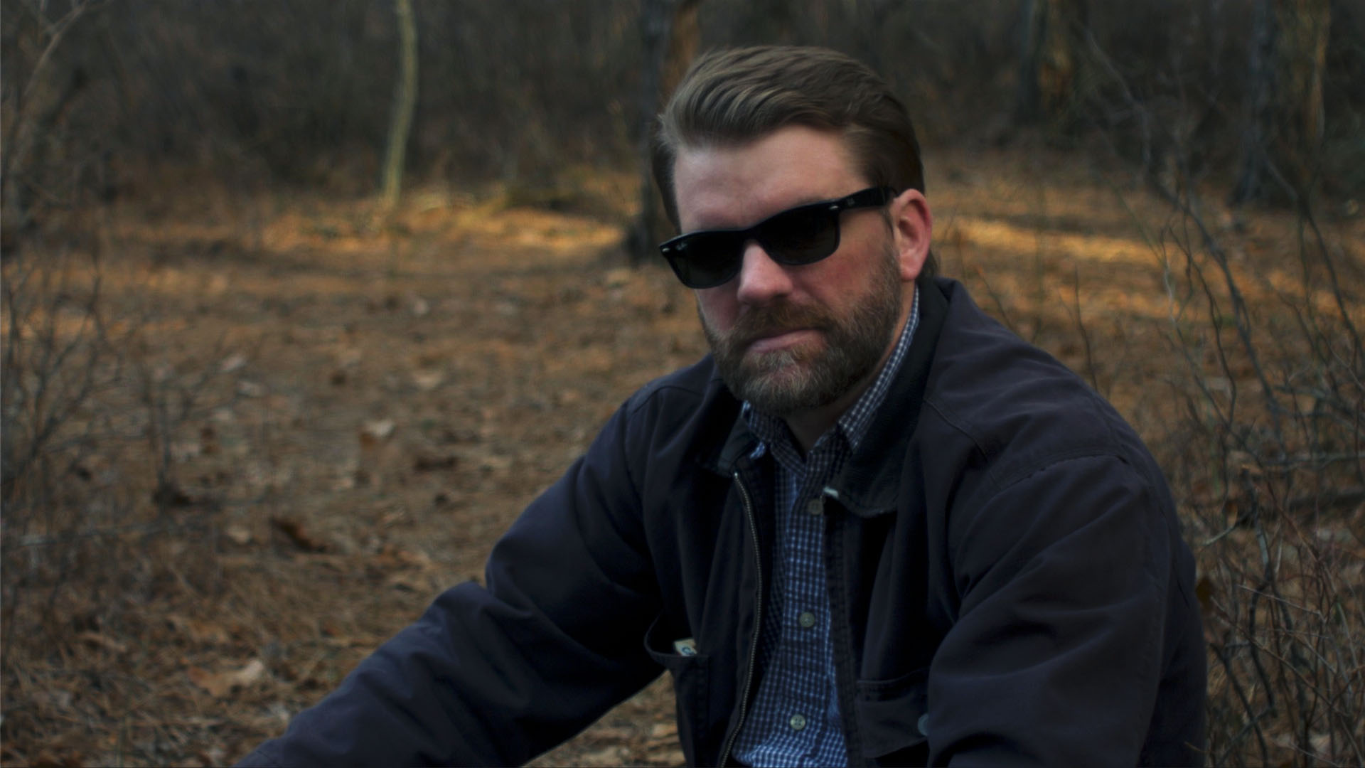
Was bored and tried to match them as best I could, but there's a lot of strange things going on with the Sony image. Especially in the greenery and woods outside, but also in the papers in the window.
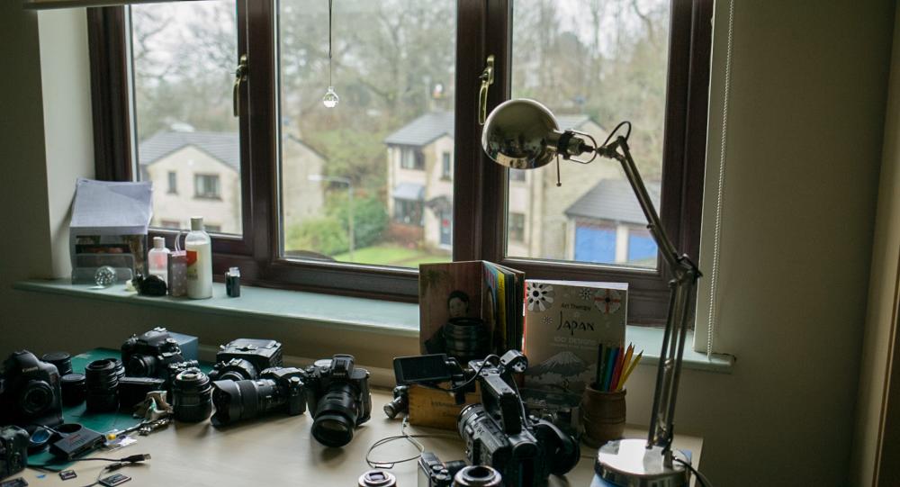

(Hi forum btw, long time reader)
Edit: Messed up the contrast curve slightly, re-uploaded.


")
")


Razer Blade 2016 as an alternative to Macbook Pro
In: Cameras
Posted
Haha thanks! I mean we will have to start grading for HDR at some point...